21 Bookshelf Styling Ideas From a Designer’s Playbook
You stand in front of an empty bookcase. You hold a vase, a candle, and a stack of books. Nothing looks right together.
Every shelf you’ve ever admired in a magazine looks easy. It isn’t, until you know the moves. Designers don’t guess. They follow small, repeatable formulas for balance, height, texture, and empty space.
This playbook gives you those formulas in plain English. You’ll get 21 bookshelf styling ideas, a step-by-step method, and fixes for the most common mistakes. Use them on a built-in, a Billy bookcase, floating shelves, or a cube unit.
Quick answer: To style a bookshelf, fill about two-thirds of each shelf and leave one-third open. Mix horizontal and vertical books, group objects in odd numbers, put heavier pieces low, and repeat a few colors and materials across the whole unit.
Main Ideas
1. The Two-Thirds Rule: Fill Two-Thirds, Leave One-Third Open

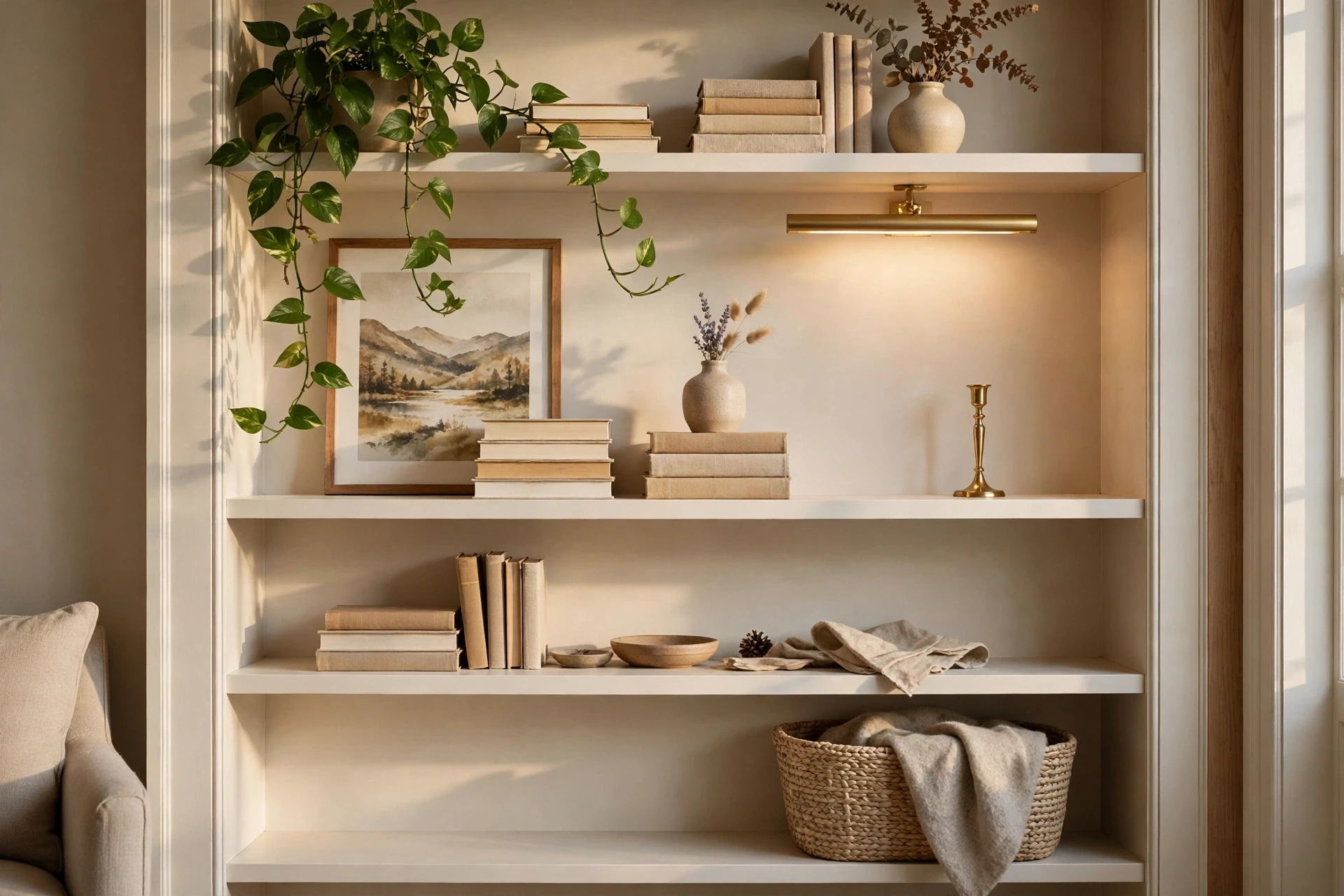
Start with one simple ratio and everything else gets easier. Fill about two-thirds of each shelf with books and objects, and leave about one-third open. Treat this as a starting point, not a law. Competitors and designers use slightly different numbers, but they all agree on the point: space makes your best pieces stand out. When a shelf looks messy, pull one item off before adding anything new.
2. Horizontal Book Stacks as Risers
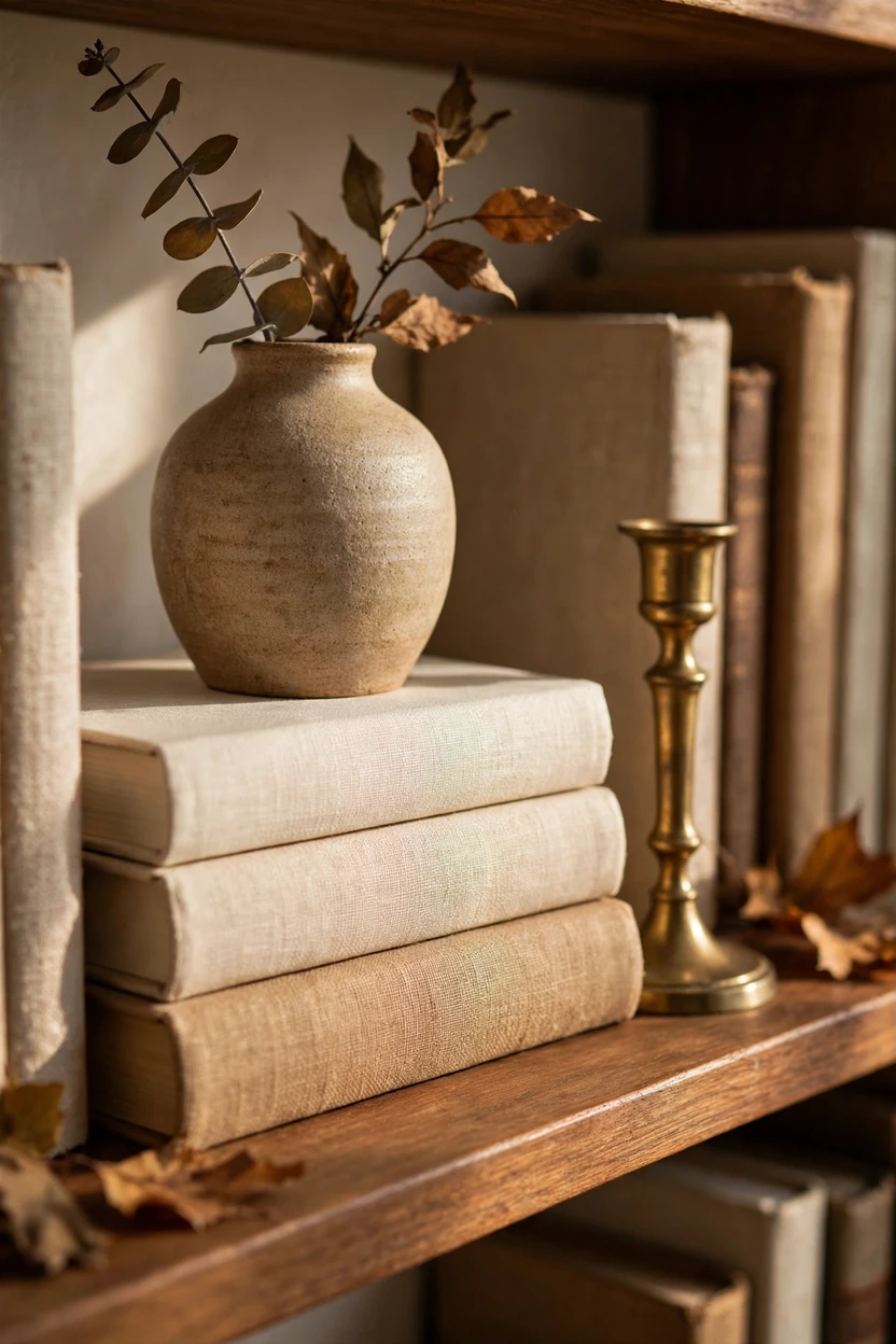
Lay a few books flat and stack them in twos or threes. They become instant risers for a vase, a small bowl, or a candle. This adds height changes without buying anything new. Pick books with solid, plain spines so the stack looks tidy, and put the largest book on the bottom. Turn the stack so the spines face out and the tops of the pages stay hidden.
3. Mixed Vertical and Horizontal Groups With a Bookend

A long row of upright books looks like a library. A row broken by a flat stack looks like a design choice. Line up five to eight books on end, then lay two or three on their sides next to them. Use a stone, brass, or ceramic bookend to hold the upright group in place. This keeps the rhythm going and stops the books from leaning.
4. Color-Grouped Books in a Soft Gradient

Sort books by spine color and the whole shelf reads as one calm picture. Move from warm whites through tans and browns, then add a block of one accent color such as sage or navy. Don’t try to match shades exactly. A little variation inside each color keeps the group from feeling flat. Remove dust jackets that clash, or keep them if the colors suit your room.
5. Spines-In Books for a Calm Look

Turning books so the pages face out gives a quiet, neutral look. The cream pages blend into the shelf and remove loud covers. Use this trick only on books you don’t need to find quickly. Mix in a few spine-out books so the shelf still feels like a home library. It’s a good fix for mismatched paperbacks or bold jackets.
6. Leaning Art Layered Behind Objects

Prop a framed print against the back of the shelf, then place objects in front. The art adds color and a backdrop, and the objects add depth. Use a frame about half as tall as the shelf opening, and keep it slightly off-center. Layer a small vase and a stack of books in front, with each piece overlapping the one behind. Swap the print with the seasons for a quick refresh.
7. The Tall-Medium-Low Triad

Group objects in threes with three different heights. Try a tall vase, a medium book stack, and a low bowl. Odd numbers feel more natural than pairs, and the height steps lead the eye across. Keep the group close together so it reads as one piece. Then leave a gap before the next group.
8. One Heavy Anchor on the Lower Shelf

Put your biggest, heaviest piece low. A large stoneware jar, a stack of coffee table books, or a wide wooden bowl grounds the whole unit. Visual weight sits best at the bottom, and it also keeps the bookcase stable. Lighter items such as glass, small frames, and plants go higher up. Use fewer, larger pieces on top so the upper shelves don’t feel busy.
9. A One-Color Ceramic Collection
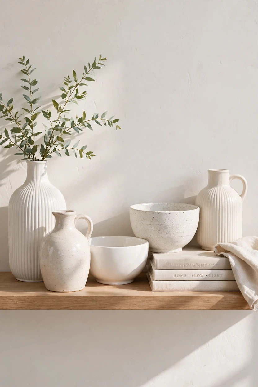
Group similar pieces together and they look planned. White or cream vases, jugs, and bowls read as a collection, even if the shapes differ. Cluster them on one shelf instead of spreading them across the whole unit. Vary the height and surface, such as smooth, ribbed, and speckled. A shared color keeps the display calm.
10. Baskets and Lidded Boxes on the Bottom Shelf

Use lower shelves for storage that looks good. Woven baskets and lidded boxes hide remotes, chargers, and kids’ toys. They also add texture and a break from book spines. Match the material across the unit, such as all seagrass or all linen-wrapped. Label the lids if the family shares the shelf.
11. Trailing Greenery on the Top Shelf

Plants add life and soften the straight lines of shelving. Place a trailing pothos or ivy on the top shelf so the leaves spill down. Use a simple pot in cream or terracotta so the plant stays the focus. Choose plants that suit your light, or use a high-quality faux plant if the spot is dark. One plant per unit is enough.
12. A Painted or Wallpapered Back Panel

Color on the back of the bookcase makes everything in front pop. Paint the panel a deep green, navy, or warm clay, or add a textured wallpaper. Light objects like cream vases and white books look sharp against it. Keep the shelf frame itself light or matching for a clean look. Use removable wallpaper on a Billy or a rental.
13. Picture Light or Library Sconces

Light is the finishing touch. A slim brass picture light above the unit, wall sconces on each side, or small LED strips under the shelves make the display glow. Use warm bulbs, around 2700K, so the colors stay cozy. Hardwire if you can, or choose plug-in versions for a rental. Light turns a shelf into a feature after dark.
14. One Intentionally Empty Shelf

Leave one shelf nearly bare on purpose. Place a single item, such as a brass candlestick or a bowl, in the middle or off to one side. The empty shelf gives your eye a place to rest and makes the full ones look richer. It also keeps tall units from feeling heavy. This is the move most beginners skip, and it makes the biggest difference.
15. Personal Items, One Story Per Shelf

Give each shelf one small story. A shelf for travel finds might hold a shell, a small framed photo, and a postcard. A shelf for family might hold framed photos in matching frames. Keep each story to three or four items so they don’t blur. Personal pieces make a shelf feel like yours rather than a showroom.
16. Small Trays to Corral Little Things
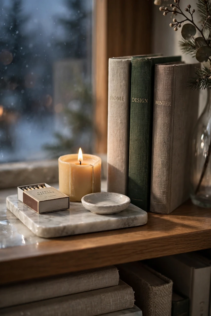
A tray makes small items look intentional. Place a candle, matches, and a tiny dish on a wood or marble tray. The tray also lets you move the group in one lift for dusting. Choose a tray color that matches your base palette. One tray per shelf is plenty.
17. Art on the Shelf Face and a Library Ladder
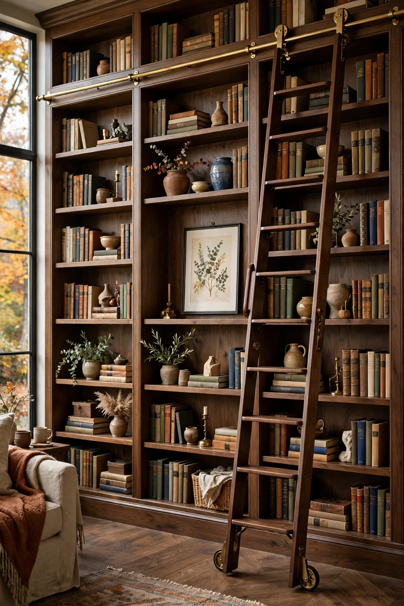
Hang a framed print on the front of the bookcase to break up the grid. It makes a tall unit feel more like a wall feature. If your shelves reach the ceiling, a rolling library ladder adds charm and gives you access. Choose a ladder in a different finish so it stands out. Keep the art light so it doesn’t pull the unit forward.
18. Cover-Out Favorites on Ledges

Show off a few favorite books with the covers facing out. Use a small book stand or lean them on a shelf lip. Pick covers that match your palette, or ones with a story. Limit it to three to five per unit so the display stays crisp. It adds color and points to the books you love.
19. Repeat the Same Three Items Across Bays

In a built-in with several sections, repeat a few items in each bay. Use the same wood, the same metal, and the same plant type. This creates rhythm and ties the whole wall together. Change the arrangement a little in each bay so it doesn’t look copied. Repetition is a quiet designer trick that makes a large wall calm.
20. A One-Shelf Seasonal Swap
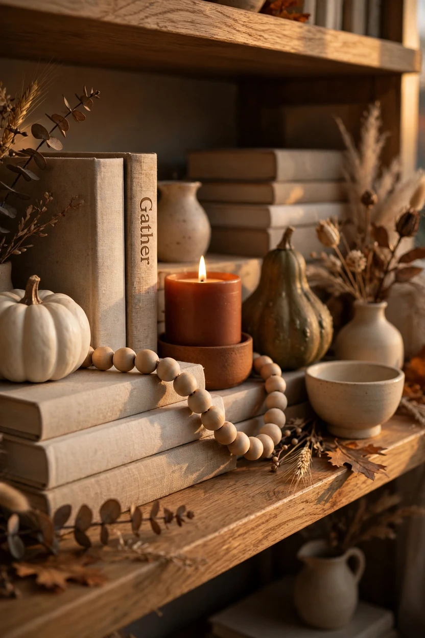
Keep the base styling neutral, then change one shelf each season. In fall, add a small gourd and a wood bead garland. In winter, add a bottle brush tree and a cozy candle. In spring, use fresh stems in a vase. One quick swap keeps the whole unit fresh without a full restyle.
21. Cube Shelves Styled Every Other Cube
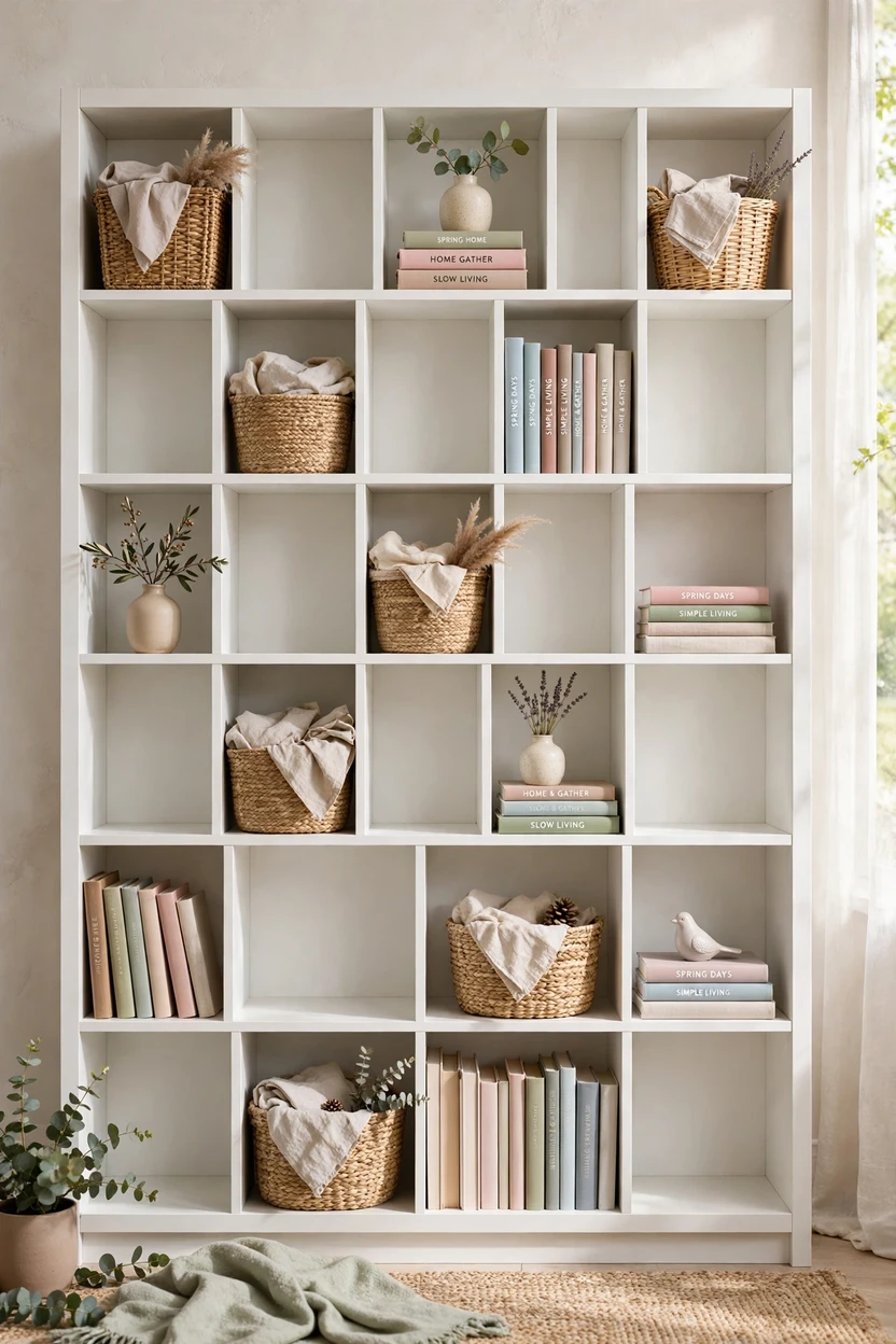
A cube unit can look like a grid of cubbies. Fill every other cube and leave the rest open, in a checkerboard pattern. Use baskets and bins in some, books and a vase in others. This makes the unit lighter and easier to dust. It works for a kids’ room, an office, or a small entry.
Styling Tips
- Pick a palette first. Two or three colors, one metal, and one natural texture.
- Repeat, don’t match. Use the same finish in three places across the unit.
- Heavy low, light high. It looks balanced and keeps the case stable.
- Mix heights. Use stacks, vases, and plants to create a skyline.
- Step back often. Take a photo. The camera shows imbalance fast.
Practical Implementation Ideas (The Playbook)
- Empty everything. Start from a clean slate.
- Edit. Keep only what you love or use. Put the rest away.
- Build the base. Place books first, in stacks and rows.
- Add height. Place vases, plants, and framed pieces.
- Add texture. Bring in baskets, wood, and metal.
- Leave space. Aim for about one-third open per shelf.
- Add light. Warm bulbs, a picture light, or a lamp nearby.
- Edit again. Remove one item per shelf.
Common Mistakes to Avoid
- Filling every gap. Clutter hides your best pieces.
- Using even-numbered groups. Pairs often look stiff.
- Lining everything up in a row. Add depth by layering.
- Using tiny objects. Several small pieces look messy. Group them in a tray or jar.
- Putting heavy items on top shelves. It looks top-heavy and is less safe.
- Skipping wall anchors. Tall bookcases should be secured to the wall with anti-tip hardware. This matters most in homes with kids or pets.
- Forgetting depth. Shallow shelves need small, slim pieces.
Small-Space Alternatives
- Use fewer, larger pieces instead of many small ones.
- Choose a narrow bookcase or floating shelves.
- Keep the palette to two colors.
- Use vertical space and hang art above the shelves.
- Add a plug-in sconce to save floor space.
- Use baskets to hide extras.
Budget-Friendly Alternatives
- Use the books and objects you already own. Shop your home first.
- Thrift vases and bowls, then spray paint them in a matching color.
- Print free art and frame it.
- Choose a Billy bookcase and add a painted back panel, or removable wallpaper.
- Use peel-and-stick LED strips or a plug-in picture light.
- Wrap odd jars in paper or use fabric to cover mismatched boxes.
Pro Styling Recommendations
- Style the tallest shelf first, then match the rest to it.
- Place the focal piece slightly off-center, not in the middle.
- Use three materials per shelf, such as wood, ceramic, and fabric.
- Keep the top third simple, with fewer, larger objects.
- Choose one “wow” item per unit, like a big print or a sculptural vase.
- Re-edit every few months. Good shelves evolve.
FAQs
Conclusion
A styled bookshelf isn’t about owning more. It’s about editing, layering, and leaving room to breathe. Start with one shelf and apply one idea. Step back, move one thing, and see how it feels. Soon the whole unit will look like a place you want to sit beside.