16 Two-Tone Kitchen Cabinet Ideas Done Just Right

Picture this. It’s a gray Sunday morning and the coffee is hot. Soft light slides across a kitchen where the top cabinets are creamy white and the bottom ones are a deep, calm green. Your eyes land on the brass pulls first, then the wood stools tucked under the island. The room feels like someone really thought it through.
That’s the pull of a two-tone kitchen. One color can look flat. Two colors give the room a top and a bottom, a spot to look at and a spot to rest.
The good news is that you don’t need a huge budget or a design degree. You need a plan for where each color goes, a quick check on undertones, and a few small details, like hardware and countertops, to tie it all together.
Below are 16 two-tone kitchen cabinet ideas, each with the colors, finishes, and reasoning behind it. You’ll also find a mistakes list, small-space and budget options, and answers to the questions people ask most. Grab your phone, open a Pinterest board, and start saving.
Quick answer: What are two-tone kitchen cabinets? Two-tone kitchen cabinets use two colors or finishes in one kitchen. Most often, a light shade goes on the upper cabinets and a deeper shade goes on the lower cabinets or the island. The look adds depth, marks work zones, and fits modern, farmhouse, traditional, and transitional kitchens.
Are they still in style? Yes. Designers still reach for two-tone cabinetry, and industry trend reports from the National Kitchen & Bath Association point to green and blue as leading cabinet colors. Warm wood is also gaining ground on all-white kitchens.
Table of Contents
16 Two-Tone Kitchen Cabinet Ideas
Navy Lowers with Soft White Uppers
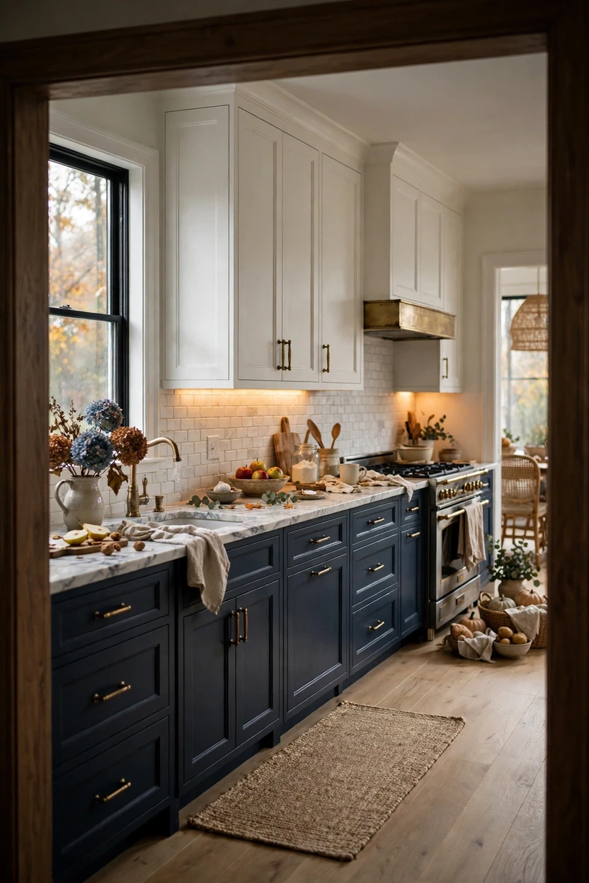
This is the pairing that made two-tone kitchens popular, and it still works. Deep navy on the base cabinets anchors the room. Soft white uppers keep the walls looking open and light. Shades in the Benjamin Moore Hale Navy and Sherwin-Williams Naval family look almost black at night and clearly blue near a sunny window, so the color never feels flat. Pair it with a crisp, cool white such as Benjamin Moore Chantilly Lace, then add brass pulls for warmth and a marble-look quartz counter in soft gray to tie the two colors together. Under-cabinet lighting keeps the work surface bright so the dark base doesn’t swallow the room.
White Oak Lowers with Warm White Uppers
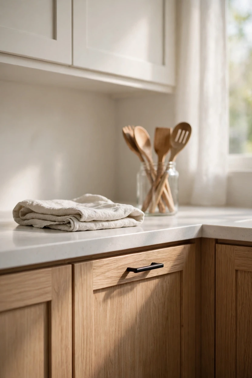
Wood plus white is the easiest two-tone for anyone nervous about color. Rift-sawn white oak lowers with a matte clear finish show a fine, straight grain that looks calm instead of busy. Warm white uppers, like Benjamin Moore White Dove, keep the wood from feeling heavy. Wood acts like a neutral, so it pairs with almost any countertop, from honed quartz to soapstone-look slabs. Check the wood’s undertone against your floor, and keep the two a few shades apart so the cabinets don’t melt into the boards.
Sage Green Island with White Perimeter Cabinets
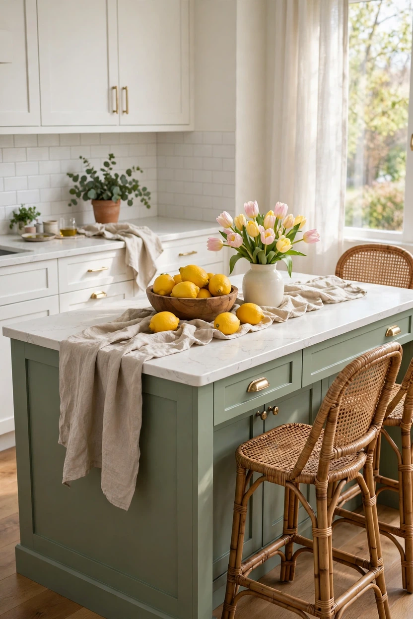
If a full two-tone kitchen feels like a big leap, start with the island. Painting one island in sage gives the room a clear center without touching the rest of the cabinets. Soft gray-greens like Sherwin-Williams Sea Salt feel gentler than navy and lighter than forest green, so they suit small and mid-size kitchens. Keep the surrounding cabinets in a warm white so the green looks creamy, not cold. Add oak or rattan stools and a simple white backsplash, and let the island carry the color story.
Forest Green Lowers with Cream Uppers and Brass
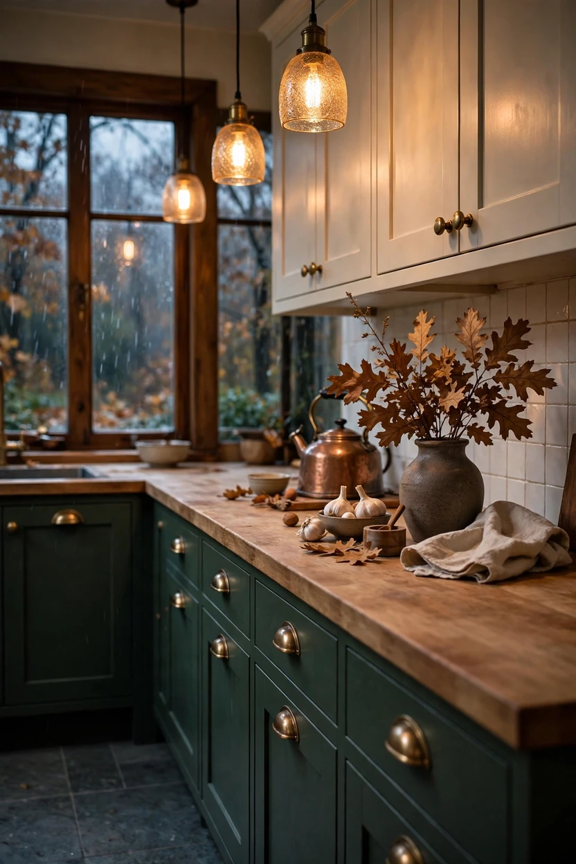
Dark green lowers feel cozy in a way few colors do. Deep shades like Farrow & Ball Studio Green read very dark in low light and richly green by a window. Warm greens look better with cream than with stark white, so choose a creamy upper color to keep the mood soft. Unlacquered brass pulls darken over time, which suits the moody feel. A butcher block or creamy quartz counter works well here, and slate-look floor tile gives the room an earthy base.
Charcoal Lowers with White Uppers (Modern Farmhouse)
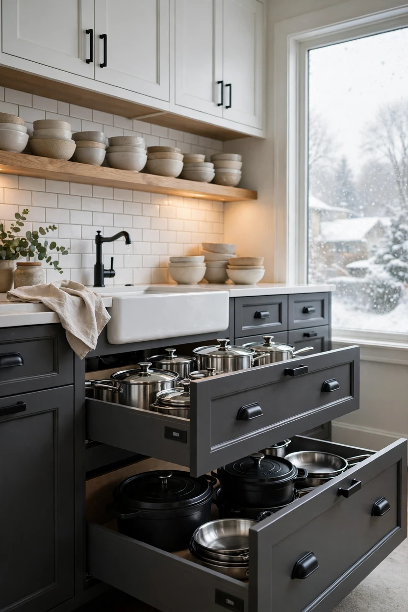
Charcoal and white is a modern farmhouse favorite because it looks crisp without feeling stark. A color like Benjamin Moore Kendall Charcoal is soft enough to skip the harshness of true black. Shaker doors, black bin pulls, and an apron-front sink keep the farmhouse feel. There’s a practical bonus too. Base cabinets take the most knocks, splashes, and shoe scuffs, and a deeper color hides that wear better than white. Open oak shelves above the counter add warmth and a spot for everyday dishes.
Walnut Island with a Painted Perimeter
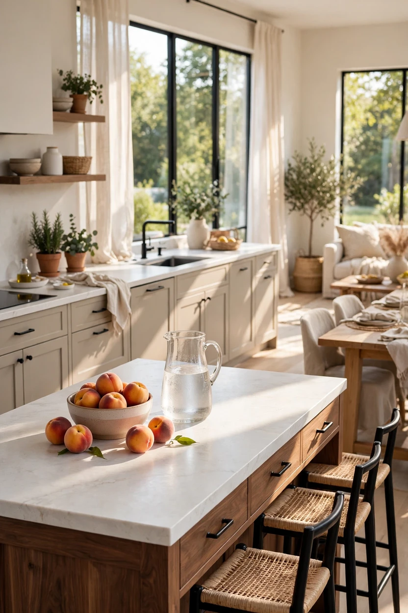
Want warmth without painting a single door? Use a wood island. A walnut island with a greige perimeter, such as Benjamin Moore Pale Oak, makes the island look like a piece of furniture. Wood also forgives daily wear, since small marks blend into the grain. Repeat the walnut tone once or twice elsewhere, like in the stools or a cutting board, so it doesn’t feel random. A thick quartz or stone counter on the perimeter keeps the cooking zone clean and practical.
Tone-on-Tone Greige and Creamy White
Not everyone wants contrast, and that’s fine. A tone-on-tone kitchen uses two shades from one color family, like greige lowers and cream uppers. The difference is soft, so the room feels layered and quiet instead of busy. This approach is easy to live with and friendly to resale. Let texture do the work with a handmade zellige-style tile, a linen roman shade, and a wood cutting board. Keep the wall color close to the upper cabinets so the whole room reads as one calm space.

The Flipped Formula: Dark Uppers, Light Lowers
Most two-tone kitchens put the dark color low, so flipping it feels bold. Deep green or matte black uppers draw the eye up and make a tall ceiling look intentional. White or pale wood lowers keep the work area bright. This works best when the ceiling is about nine feet or taller and the room gets good window light. In a small, dim kitchen, dark uppers can make the space feel like it’s closing in. Add an LED strip under the uppers so the dark color glows instead of looming.

A Color-Blocked Pantry Wall
A tall pantry wall in a deeper color is a smart way to try two tones without redoing the whole kitchen. Tall cabinets hold the most storage, so painting them gives that block of the room a clear job and a clear look. Pick a rich shade like a deep blue-green and keep the other cabinets white. The contrast also breaks up a long cabinet run that might otherwise read as one flat wall of doors. If you have a panel-ready fridge, the color can wrap around it for a built-in look.

Painted Cabinets with Warm Wood Open Shelving
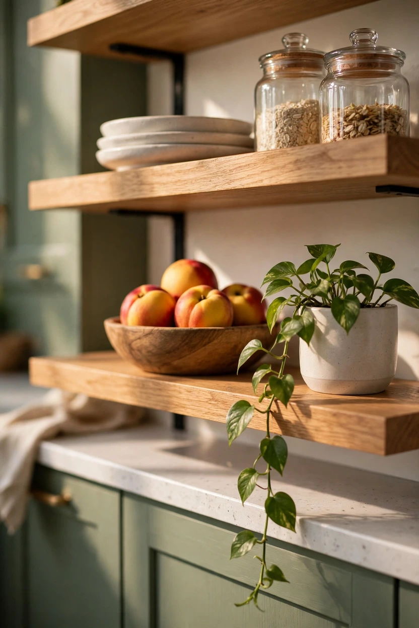
Two-tone doesn’t have to mean two cabinet colors. Swap a few upper cabinets for floating oak shelves, and you get a second tone, a second texture, and an easy display spot. Painted cabinets in soft white, sage, or clay look good beside the wood. Shelves cost less than a second row of doors and make a small kitchen feel wider. Keep what you display to two or three colors, like white plates, glass jars, and a few wood bowls, so the shelves look calm instead of cluttered. Hide the brackets or choose slim black ones for a clean line.
Terracotta Lowers with Warm White Uppers
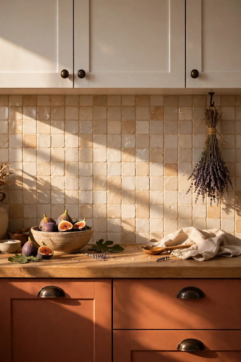
Earth tones are having a moment, and terracotta is the warmest of them. A clay shade like Sherwin-Williams Cavern Clay on the base cabinets looks sun-baked and friendly, especially against warm white uppers. Handmade tile in cream or soft sand supports the color without competing with it. Pair it with aged brass or dark bronze pulls and a wood or warm stone counter. Because terracotta leans warm, skip cool gray counters and bluish whites, which can make the clay look dull.
Matte and Gloss in One Color Family
Two-tone can come from finish alone. Use a matte finish on the lower cabinets to ground the room, and a gloss finish on the uppers to bounce light around. Using the same soft color in both sheens keeps things quiet, yet the difference in shine adds depth. Gloss shows fingerprints, so it works best on uppers, where hands land less often. Choose a gentle color like soft taupe or pale gray-green so the sheen is the star and the color stays in the background.

Opposite Walls, Opposite Colors
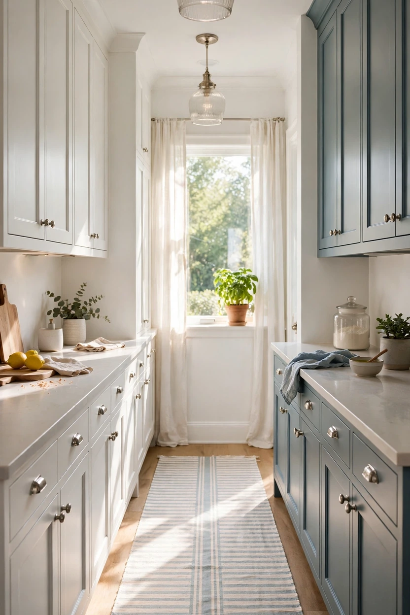
In a galley or two-wall kitchen, give each wall its own color. White on one side and muted blue or sage on the other makes a balanced layout that doesn’t depend on an upper-versus-lower split. The color change can also mark zones, with cooking and cleanup on one side and a coffee bar and storage on the other. Keep the countertop the same material on both sides so the kitchen reads as one room. A long runner rug and matching pendant finishes pull the two sides together.
Dark Frames with White Doors
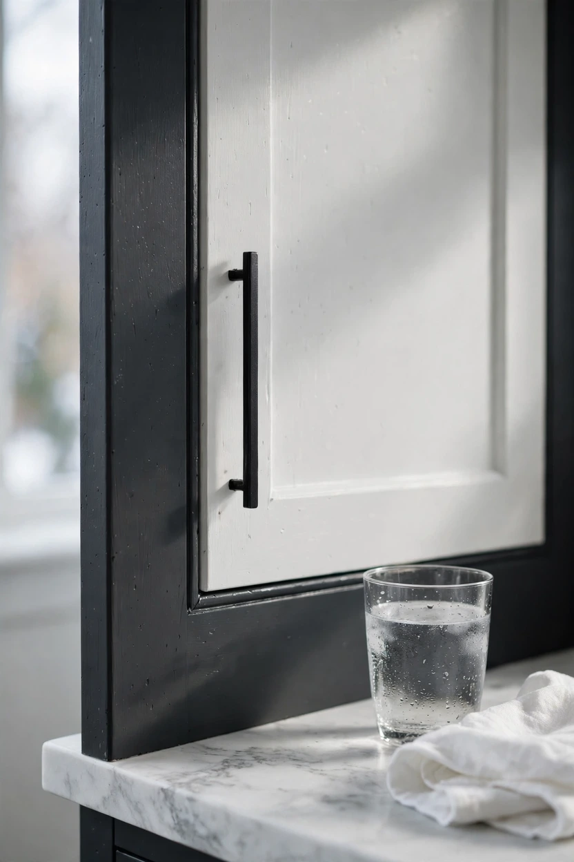
Here’s a subtle take for framed or inset cabinets: paint the cabinet frames one color and the doors another. Black or deep charcoal frames with white doors make each door look like a framed picture. It adds contrast without covering whole cabinets in a dark shade. The detail looks custom, but it takes steady hands along the frame edges, so plan for a careful painter or a patient weekend. Slim black pulls and a pale countertop keep the effect crisp, and it works best on shaker or inset doors with clean lines.
Dusty Blue-Gray Lowers for a Coastal Cottage Feel
Some people love blue but find navy too heavy. Dusty blue-gray is the lighter route. A shade like Farrow & Ball Pigeon leans gray, so it stays soft and calm. It looks fresh against white uppers, white tile, and a wood-top counter. Add rattan stools, a woven pendant, and polished nickel pulls for a breezy cottage look. This pairing suits kitchens with plenty of daylight, since blue-gray can look flat in a dim room.

Muted Brick Red Island with Cream Cabinets
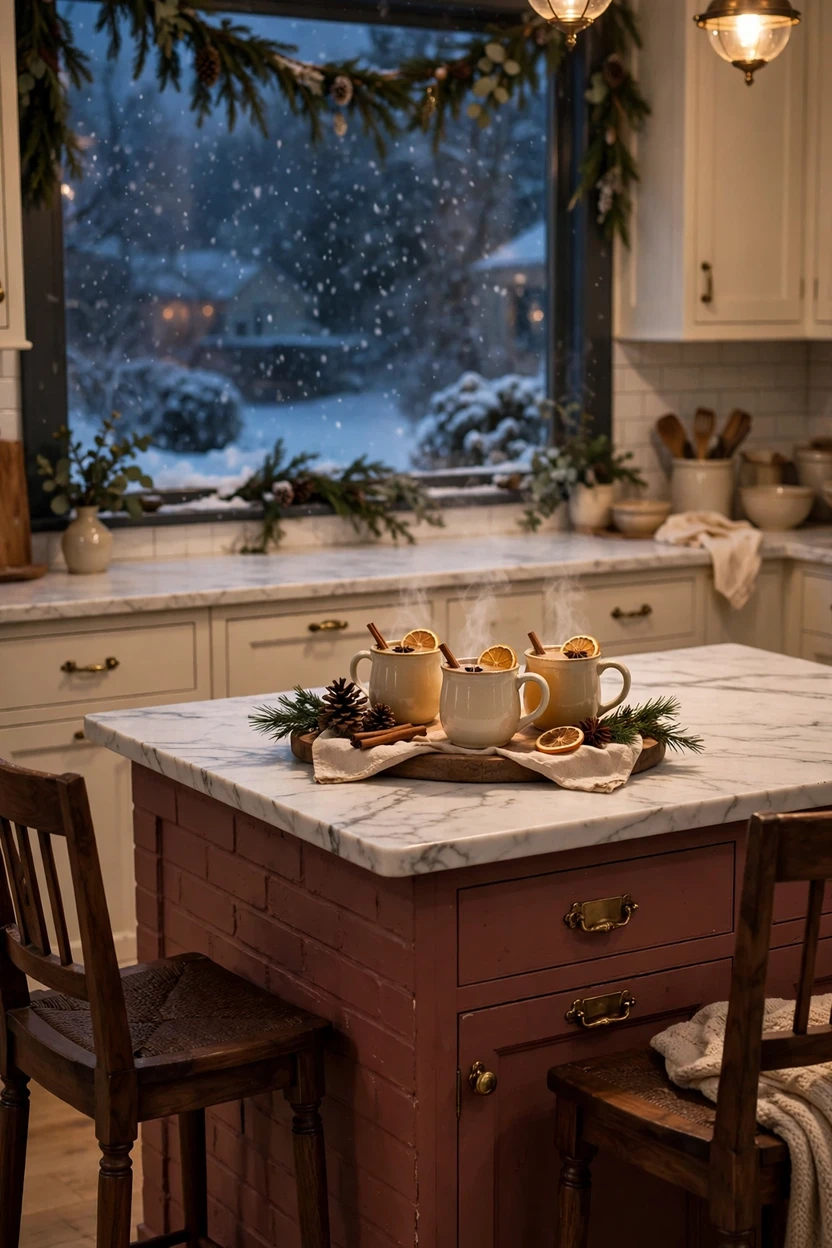
Want a kitchen with personality? Try a muted brick or berry island with cream cabinets around it. Keep the red soft and slightly brown so it feels grown-up and warm instead of loud. One painted island is enough, since bold color works best in small doses. Add dark wood stools, antique brass pulls, and a wood floor to support the warmth. It’s a cozy fit for holiday gatherings, because the island sits right where people gather with a drink in hand.
Styling Tips
Pick your hero color first. Choose the standout shade, then choose a second color to support it. It’s much easier than picking two colors at once.
Put the light shade up and the dark shade down. Dark colors feel heavy, so keeping them low makes a room feel grounded. It’s the classic formula for a reason.
Match undertones. Pair warm colors, like a green with a yellow base, with creamy whites. Pair cool colors, like true blue, with crisp whites. Clashing undertones are a top reason two-tone kitchens look off.
Use the 60-30-10 rule. Aim for about 60 percent main color, 30 percent second color, and 10 percent accent, such as hardware, stools, or a rug.
Repeat both colors somewhere else. A dish towel, a bowl, or a rug stripe will do. Repeating a tone makes both cabinet colors look planned.
Stick to one hardware finish. Use brass on both colors, or black on both. Mixed finishes look accidental.
Let the countertop be the bridge. A neutral counter with soft veining shows off both cabinet colors and keeps one surface across the room.
Keep walls quiet. Warm white or soft greige lets the cabinets lead.
Add layered lighting. Under-cabinet LED strips make dark bases glow, and pendants over the island bring out its color.
Test in real light. Paint a large sample board and check it in the morning, at noon, and under lamp light before you commit.
Practical Implementation Ideas
Here’s a simple order of work that saves time and stops costly do-overs.
Choose where the colors meet. The cleanest breaks sit at an inside corner, the end of a cabinet run, or the island. Avoid splitting one run down the middle for no reason.
Pick the hero shade and sample it. Brush two or three samples on large boards and tape them near the cabinets, the floor, and the backsplash.
Check what stays. Floors, counters, and appliances usually stay put, so choose cabinet colors that work with them.
Prep like you mean it. Remove the doors and hardware, label each door, degrease with a kitchen-safe cleaner, sand lightly, and fill dings. Skipped prep is the top reason cabinet paint peels.
Prime and paint. Use a bonding primer, then a cabinet-grade enamel, such as Benjamin Moore Advance or Sherwin-Williams Emerald Urethane Trim Enamel. Thin coats beat thick ones.
Give it time. Cabinet paint feels dry fast but cures slowly, often over several days to a few weeks, so handle the doors gently at first.
Swap hardware last. New pulls make the new colors look finished. Fill old screw holes if the pull size changes.
Add the finishing layer. Lighting, stools, a runner rug, and a few accessories in your two colors pull everything together.
Ordering new cabinets? The two-tone look usually costs about the same as one color, because you’re mostly choosing two door finishes for the base and wall cabinets.
Common Mistakes to Avoid
Clashing undertones. A cool gray beside a yellow-based cream looks muddy. Hold both samples together in daylight before you decide.
Too many colors. Two cabinet colors, a third wall color, and a loud backsplash add up fast. If you add a third tone, keep it small.
Mixed hardware finishes. Brass on the uppers and black on the lowers looks like a mistake, not a choice.
Two countertop materials. One counter across the whole kitchen keeps the colors from competing.
Going dark up high in a small, dim room. Dark uppers need height and daylight to work.
Skipping the sample step. A color you love on a screen can look totally different on your wall.
Forgetting the floor and backsplash. Check all of them together, not one at a time.
Rushing the prep. Grease, glossy old paint, and no primer lead to chips and peeling.
Random splits. A color change halfway down one run, with no reason behind it, looks like running out of paint.
Chasing a trend you don’t love. Pick colors you can live with for years, not just this season.
Small-Space Alternatives
Small kitchens can handle two tones. They just need a tighter plan.
Stay with two colors total. In a kitchen under about 120 square feet, adding a third cabinet color makes the room feel crowded.
Keep the dark shade low. Put it on the lowers, one island, or a short peninsula, and leave the uppers light.
Try tone-on-tone or matte and gloss. When strong contrast feels heavy, ideas 7 and 12 add depth with a softer hand.
Paint the uppers to match the walls. They fade back, and the ceiling looks higher.
Swap one or two uppers for a short open shelf. It breaks up the wall of doors and adds a second texture.
Choose slim pulls or push-to-open doors. Fewer big shapes means less visual noise.
Keep floors and counters light and consistent. One material from end to end makes a small room look longer.
Add under-cabinet lighting. It keeps dark lowers from shrinking the space after sunset.
Budget-Friendly Alternatives
Paint only the island. It has the fewest doors and gives the biggest change.
Paint only the lowers. If your uppers are already a light color, you may be halfway there.
Replace just the upper doors, or remove a few and add open shelves.
Change the hardware. New pulls in brass, black, or nickel can sharpen both colors for very little money.
Do the painting yourself. Paint, bonding primer, brushes, small rollers, and new pulls often add up to a few hundred dollars for a standard kitchen. A pro painter costs more but gives a smoother, sprayed finish.
Try refacing. Keep the cabinet boxes and order new doors and drawer fronts in two finishes.
Spend where it shows. A good primer and a cabinet-grade enamel matter more than the brand of the brush.
Pro Styling Recommendations
Read your light first. North-facing rooms get cooler, dimmer light, so warm colors like cream, terracotta, and warm green keep them cozy. South-facing rooms handle cool blues and grays well.
Choose a bridge element. A countertop, tile, or rug that holds a hint of both cabinet colors makes the pairing feel planned.
Limit your woods. Two or three wood tones is plenty. More than that and the room starts to look like a furniture showroom.
Let the cabinets lead. With bold cabinet colors, keep the backsplash simple, like white handmade tile or plain subway tile.
Match pendant finishes to hardware. It’s a small detail that makes the kitchen look put together.
Edit the counter. Three items is a good limit: one tool holder, one plant or bowl, one tray.
Pick sheen on purpose. Satin works for most kitchens, matte reads modern, and gloss bounces light in dim rooms.
Think about resale. If you may sell within a few years, white, warm wood, or white with blue are the safest picks.
FAQs
- What are two-tone kitchen cabinets?
Two-tone kitchen cabinets use two colors or finishes in the same kitchen. The most common setup is a lighter color on the uppers and a deeper color on the lowers or the island. You can also mix paint with natural wood.
- Are two-tone kitchen cabinets still in style?
Yes. Designers keep using them, and trend reports point to warm wood, green, and blue as strong cabinet choices. The look has moved from a trend to a regular option, especially wood-and-white and blue-and-white pairings.
- Which color goes on top and which goes on the bottom?
The usual rule is light on top and dark on the bottom. Dark shades feel heavier, so keeping them low makes the room feel grounded. You can flip it in a tall, bright kitchen, but it takes more planning.
- What are the best two-tone kitchen cabinet color combinations?
Popular pairings include navy and white, white oak and warm white, sage green and white, forest green and cream, charcoal and white, and greige and cream. Match undertones for the best result: warm colors with creamy whites, cool colors with crisp whites.
- Should the kitchen island be a different color?
Often, yes. A contrasting island is the easiest way to try two tones because it covers the fewest cabinets and creates a clear focal point. Some designers call an island-only change a lighter version of two-tone, which makes it a good first step.
- Can a small kitchen have two-tone cabinets?
Yes. Keep the dark color on the lowers or the island, keep the uppers light, and stay with two colors total. Tone-on-tone and matte-and-gloss options also work well in small spaces.
- What hardware looks best on two-tone cabinets?
Use one finish across both colors. Brass suits navy and green, matte black suits white and oak, and polished nickel suits blue-gray. Mixed finishes tend to look unplanned.
- Do two-tone cabinets cost more?
Not by much. If you paint, you buy a second paint color. If you order new cabinets, you mostly choose two door finishes, so the price is often close to a single-color kitchen. Custom features, like a wood island or special doors, can add cost.
- Are two-tone kitchens good for resale?
The safest pairings are white with warm wood and white with blue, since many buyers like them. Very bold or personal colors are riskier if you plan to sell soon, so keep the strongest color to the island or a small area.
- What paint finish is best for two-tone cabinets?
A satin or semi-gloss cabinet-grade enamel is the usual choice because it wipes clean and holds up to daily use. Matte looks modern but can show marks more easily. Always use a bonding primer first.
Final Thoughts
Two colors won’t fix a layout that doesn’t work. They will make a good layout feel finished.
The kitchens above share the same quiet logic. One color leads, one color supports, and a few repeating details tie everything together. That might be a brass pull, an oak stool, or a stripe on a rug.
So start small. Pick your hero shade, brush a big sample board, and live with it for a few days. Then decide if it belongs on the island, the lowers, or a whole wall. When you find the combination that makes you pause on the way to the coffee maker, you have your answer. Save your favorites, build your board, and paint that first sample.