18 Minimalist Kitchen Ideas That Look Expensive

Picture it. Morning light slides across a pale oak cabinet wall. The counters are bare except for a wooden bowl of lemons. Nothing hums, nothing glares, and nothing needs to be moved before you can start the coffee.
That is the kind of minimalist kitchen people save by the thousands. And here is the good news: it isn’t about spending the most money. It’s about making a few smart choices and then repeating them.
Most “minimalist” kitchens fail in one of two ways. They go so bare they feel like a showroom, or they hide so little that the clutter wins anyway. The 18 ideas below sit in the middle. They are warm, calm, and practical, with real sizes, finishes, and budget routes so you can copy what works in your own space.
Grab your pin board. You’ll want to save a lot of these.
Table of Contents
What makes a minimalist kitchen look expensive?
Short answer: Fewer materials, better details, and quiet storage. A minimalist kitchen looks high-end when its surfaces agree with each other, its edges are clean, and its clutter has a home out of sight.
Think of three levers:
- Material: real or realistic wood and stone, in matte or honed finishes.
- Detail: hardware, edges, and lighting that look chosen, not default.
- Calm: clear counters and hidden function.
Each idea below pulls at least one of those levers.
18 minimalist kitchen ideas
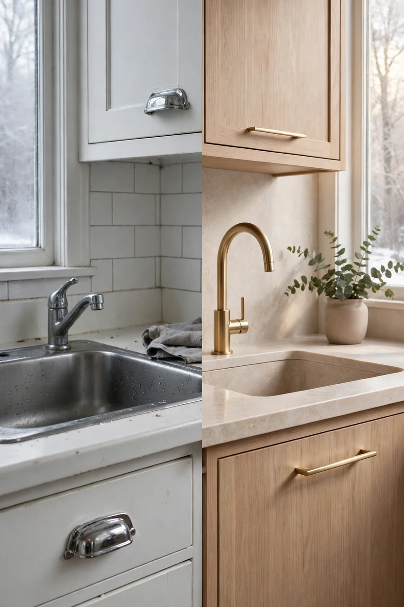
Light oak flat-front cabinets with a matte finish
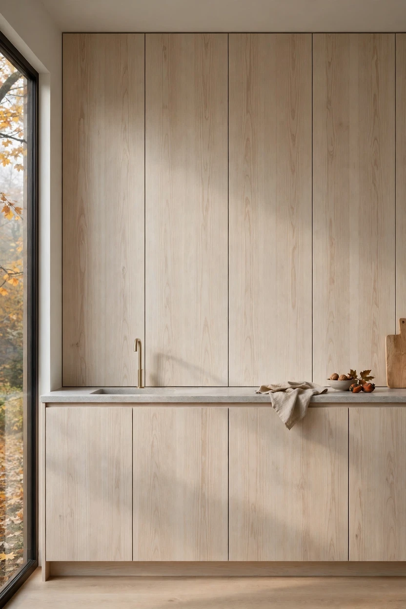
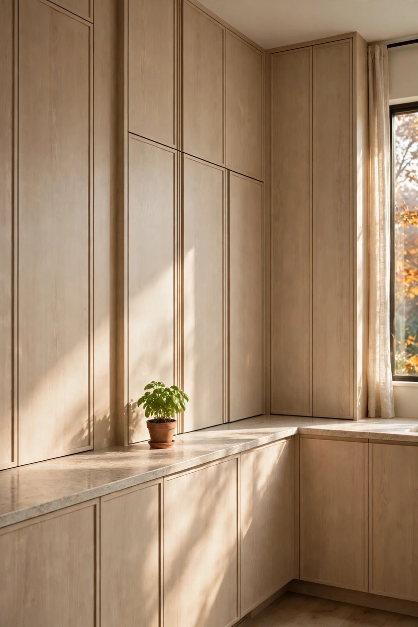
Start with the cabinets, because they cover the most wall. Choose white oak or a pale oak veneer on a plain slab door, finished in a soft matte clear coat. The grain gives the room warmth without any pattern, color, or decoration. Matte also hides fingerprints better than glossy paint and keeps light from bouncing around in harsh spots. When you shop, ask whether the grain runs in one direction across neighboring doors, since that continuous look is a quiet sign of custom work.
Handleless cabinets with a hidden finger pull
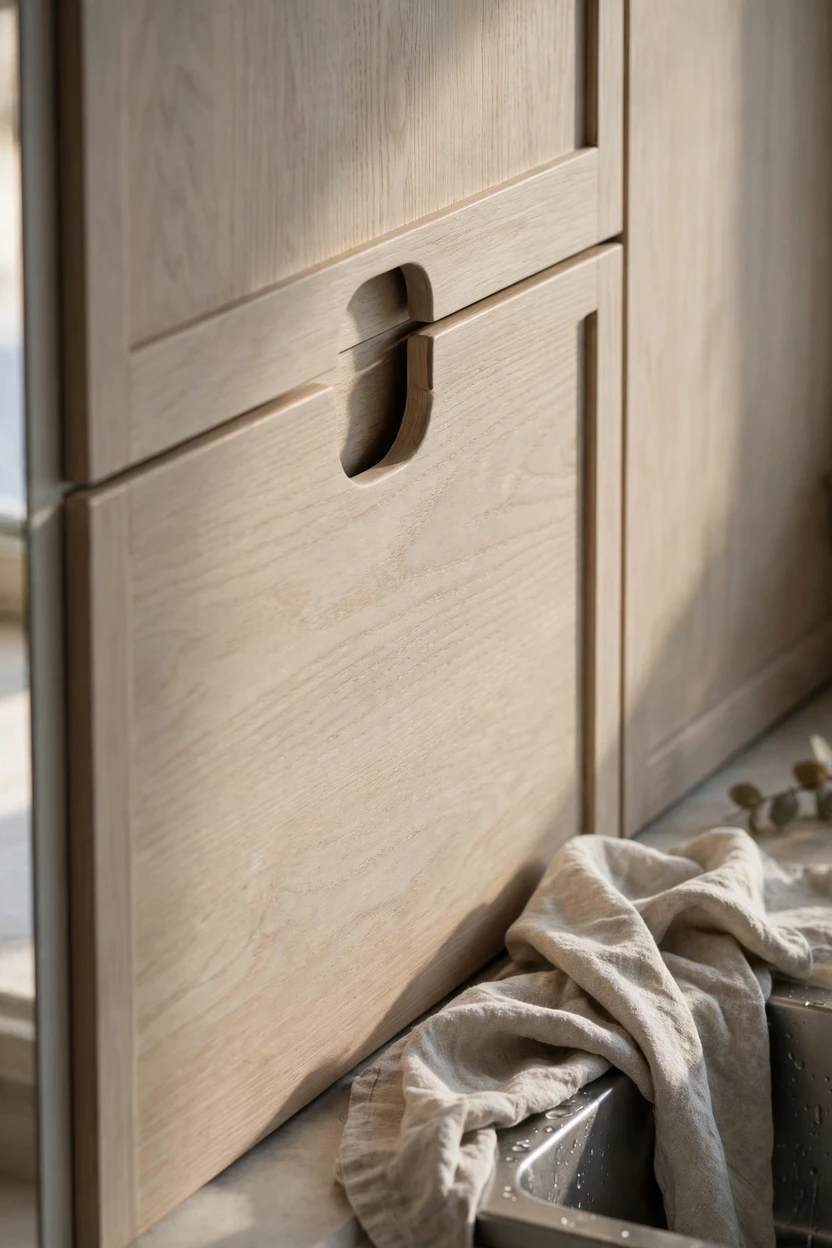
Hardware is the first thing to break up a clean cabinet front. Handleless doors remove it. You can get the look with a routed finger groove, a slim J-shaped edge pull, or a push-to-open latch. The long, uninterrupted fronts make the kitchen look taller, quieter, and more built-in. Push latches can be fussy over time, so a shallow edge pull is the safer pick for a busy family kitchen.
A full-height slab backsplash
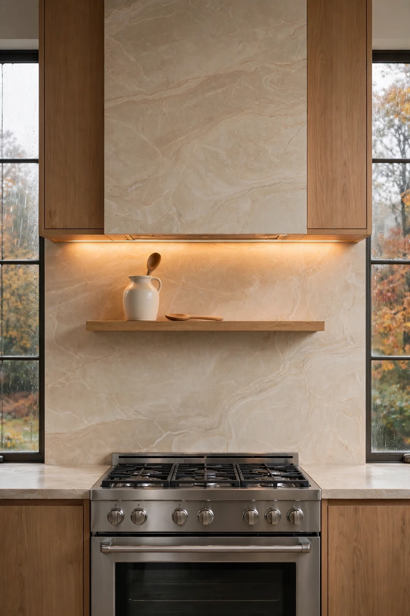
A short, stubby backsplash is one of the quickest ways to make a kitchen look builder-grade. Instead, run one large stone slab or large-format porcelain panel from the countertop up to the ceiling behind the range or sink. Fewer grout lines mean the wall reads as one calm surface. Pick a soft, veined, warm-toned stone rather than bold black and white drama. If a full slab is out of budget, large porcelain panels give a very similar look for much less.
A fridge that disappears behind a panel
The fridge is usually the biggest, shiniest object in the room. A panel-ready fridge takes a cabinet door on its front, so it blends into the wall like a tall cupboard. If that is not in the budget, box in a standard fridge with a cabinet surround and side panels so it sits flush with everything around it. The eye then reads the wall as one clean block instead of “cabinets plus an appliance.” Leave the venting gaps your fridge’s manual calls for so it keeps running well.
An appliance garage or pocket-door coffee station
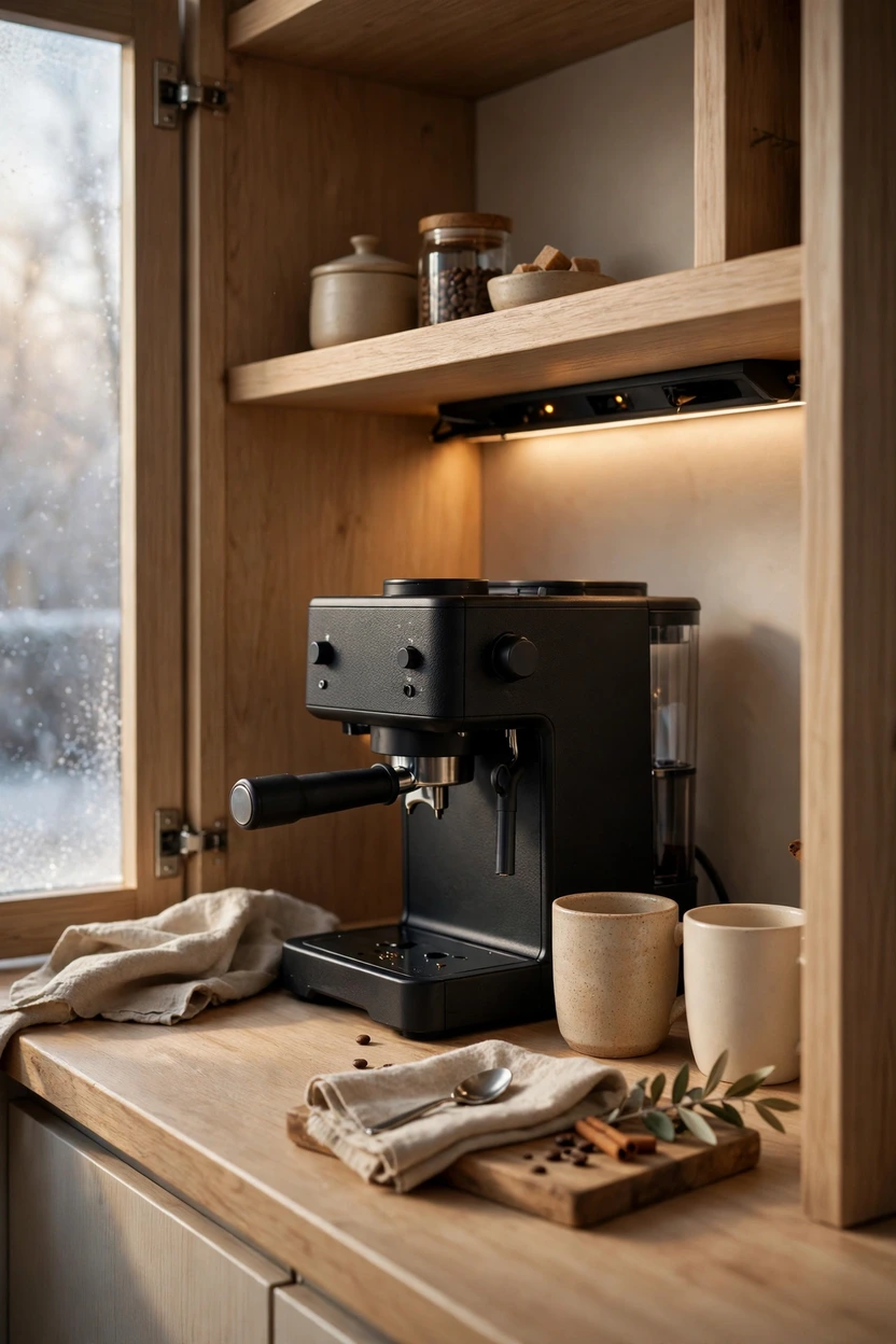
Small appliances are what crowd a counter first. Give your toaster, kettle, and coffee maker a cabinet with a pocket door or a roll-up tambour door. Put an outlet inside, so you can use the appliance without pulling it out. Once the door slides shut, the counter looks bare and the room feels instantly calmer. Make the cabinet at least 18 inches deep, and open the door fully while the coffee maker steams.
Honed, warm-toned stone countertops
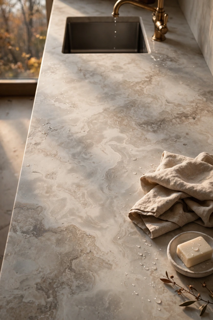
Polished stone shows every scratch and bounces glare around the room. A honed finish is soft and satin, and it looks richer in photographs and in person. Choose limestone, travertine, or a honed quartz in a warm cream, sand, or soft taupe. Natural limestone and travertine need sealing and a gentle cleaner, so be honest about how you cook. If you have a busy family, a honed quartz or porcelain lookalike keeps the same calm look with less upkeep.
A simple waterfall island
A waterfall edge carries the countertop material down the island’s sides to the floor, like a solid block. It is a clean, sculptural shape that suits minimalist rooms. Keep the island a plain rectangle, and keep the edge slim rather than chunky so it feels sharp, not heavy. Plan at least 42 inches of clearance around it for one cook, and closer to 48 if two people cook together. If a true waterfall is too costly, clad just the two ends in the same material for a similar effect.

Soft two-tone cabinets
Two-tone kitchens can feel busy when the colors fight. Keep the contrast soft instead. Try warm oak on the lower cabinets and a creamy off-white or warm greige on the upper cabinets or tall units. The darker, heavier tone sits low, and the lighter tone lifts the eye up, which makes ceilings feel taller. Hold both colors to matte finishes so they look related, not matched.

Layered lighting with warm light strips
Flat overhead light is what makes many kitchens look like offices. Layer it instead. Add a warm LED strip under the upper cabinets, one dimmable overhead source, and one sculptural pendant over the island or table. Choose bulbs around 2700K to 3000K so wood and stone look rich, and look for a high color rendering score (CRI 90 or more) so food looks fresh. Put it all on dimmers, so the kitchen can go from bright prep light to a soft evening glow.

The one-metal rule for hardware and the tap
Matching metals look intentional, and mixing too many looks accidental. Pick one finish, like brushed brass, champagne bronze, or stainless, and use it on pulls, the tap, and the pendant details. Keep the pieces slim and simple. Hardware is the part you touch every day, so it is worth spending a bit more on weight and finish. Note that raw brass darkens with age, while lacquered brass stays bright, so pick the one that matches how much patina you like.
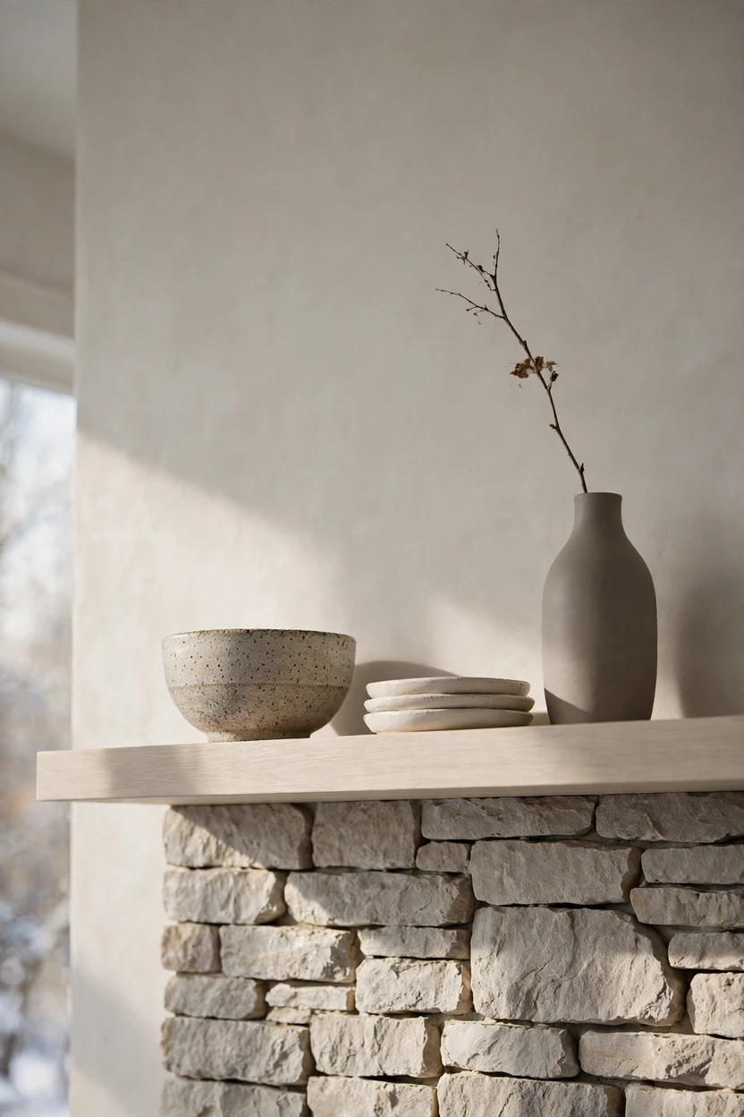
One floating oak shelf, styled with three things
Open shelving gets messy fast. Use one shelf, not five. Make it out of thick oak or stone, and style it with just three objects, like a handmade bowl, a tall vase with a single branch, and a small stack of plain plates. Leave about a third of the shelf empty. That empty space is what makes the shelf look like a gallery wall and not a storage rack.
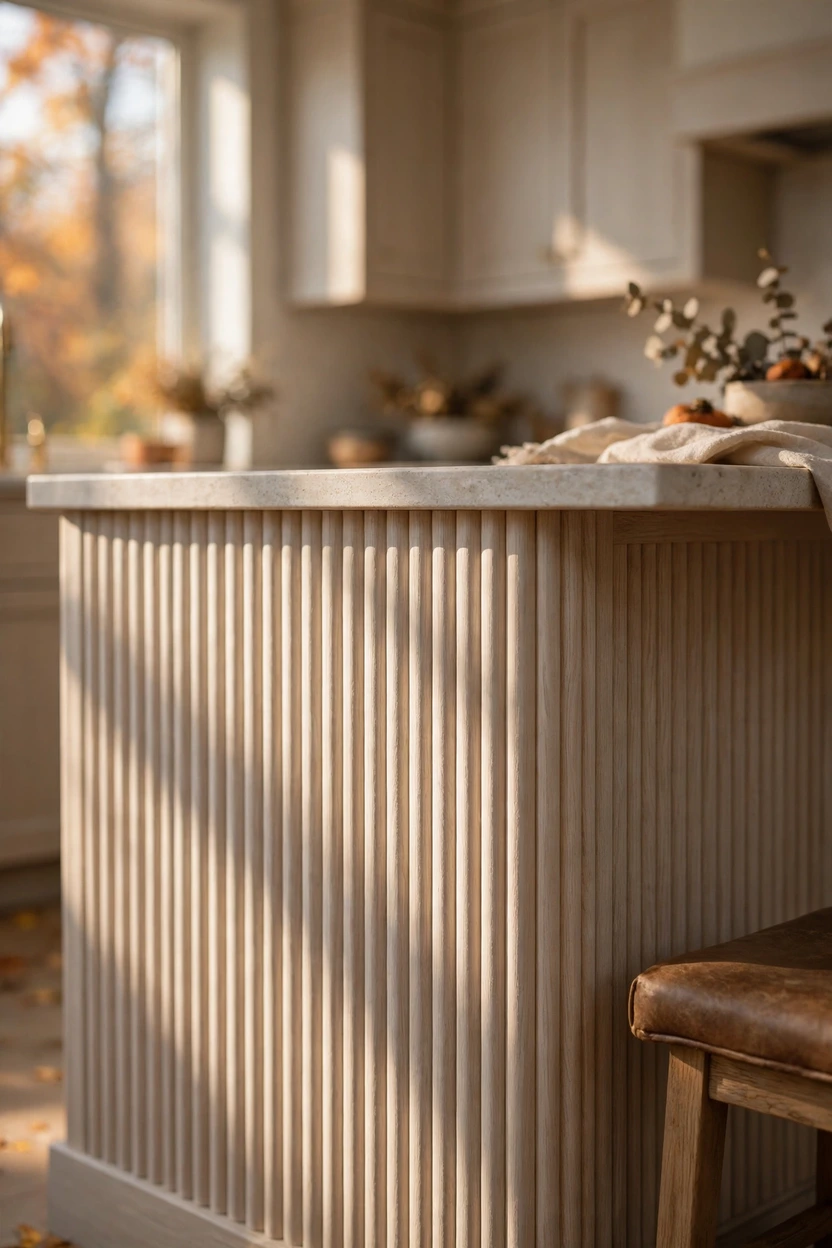
A fluted or slatted island front
Plain flat fronts can feel flat. Vertical ribs add shadow lines that change through the day, so the island gets depth without any pattern or color. You can buy fluted panels, or build the look with thin oak slats over a painted backing. Use it on one surface only, usually the island front, so the rest of the kitchen stays quiet. Wider grooves are easier to wipe clean than very tight ones.
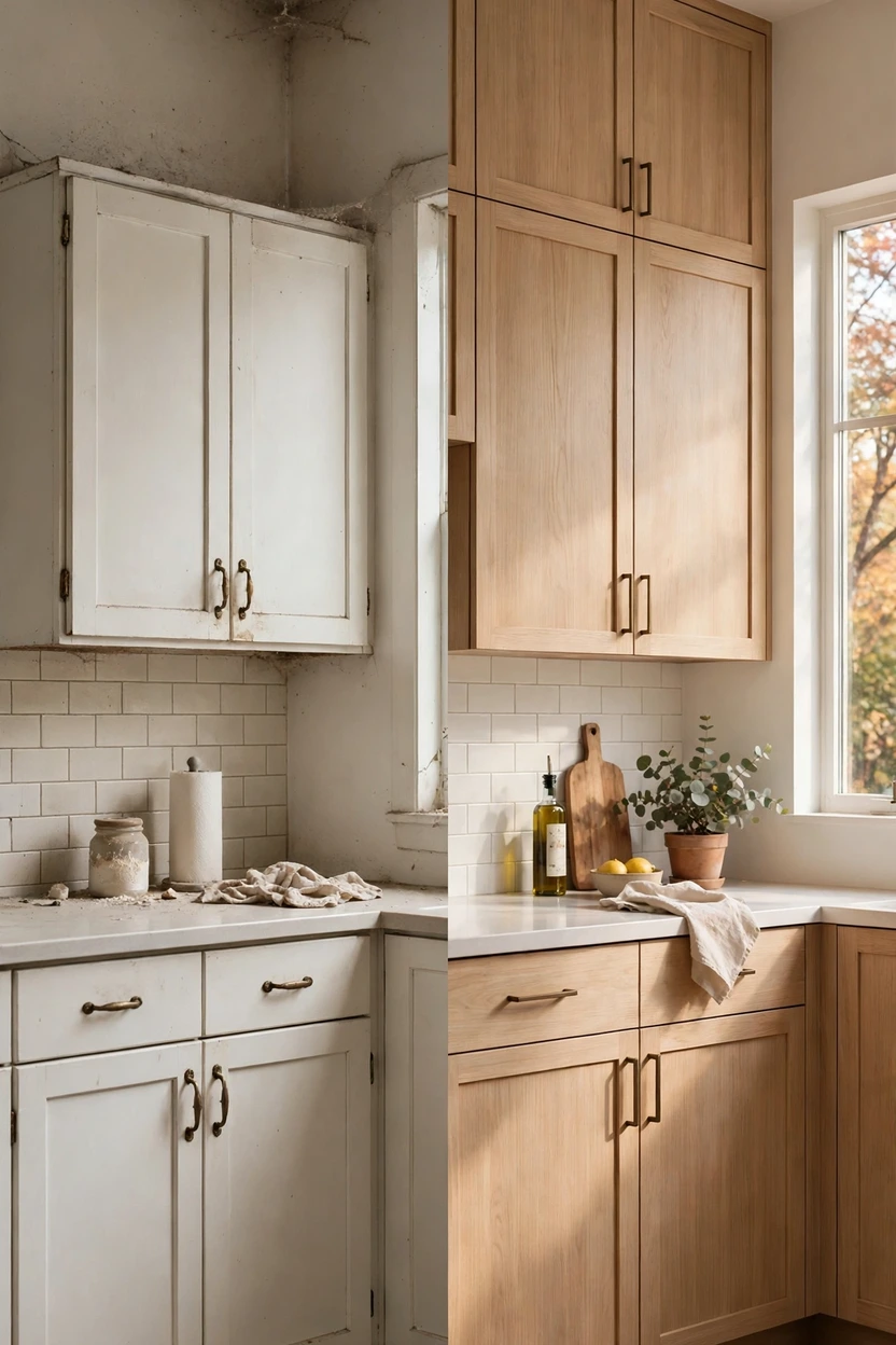
Cabinets that run to the ceiling
Look above your upper cabinets. If there is a gap, it is collecting dust and breaking up the wall. Taking the cabinets all the way to the ceiling, or adding a tall pantry wall with flat doors, makes the kitchen look built-in. The extra top cabinets are handy for things you use once a year, like a roasting pan or holiday platters. Use a small step stool and keep the top doors for light items only.
Deep drawers instead of lower doors
Lower cabinet doors hide a dark cave where pots go to get lost. Deep drawers let you see everything from above. Use them for pots, pans, plates, and bowls, and add simple dividers so each thing has a spot. You also get fewer door lines on the front, which keeps the face of the kitchen calm. Check that your drawer boxes can carry the weight of cast iron before you load them up.

A color-drenched mushroom or greige palette
Painting the walls, trim, and even the cabinets in one warm shade blurs the edges of the room. It makes the space feel wrapped and calm instead of cut up into boxes. Mushroom, soft taupe, and warm greige work well because they pair nicely with oak and stone. Use a scrubbable matte or low-sheen paint made for kitchens. Test big swatches in morning and evening light before you commit, since warm neutrals can shift green or pink.
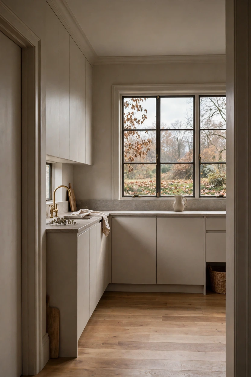
Wide-plank oak or large-format stone-look floors
Floors cover a huge amount of the view, so seams matter. Wide planks in matte oak, or big honed tiles in a warm stone tone, mean fewer lines for the eye to track. That makes the room look larger and calmer. Avoid high gloss, which shows every footprint and spill in a kitchen. Pick a warm mid-tone rather than a gray wash so the floor ties back to your cabinets.
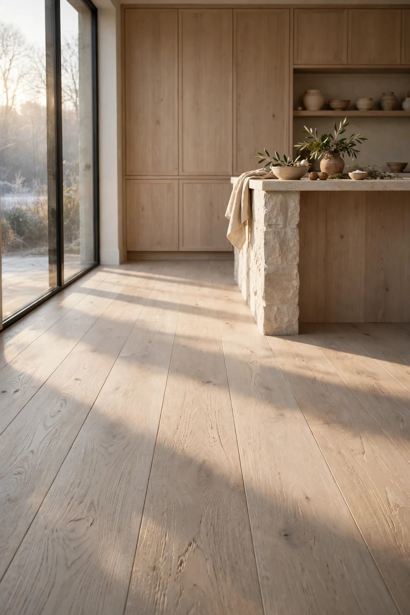
Fewer, better counter stools
Stools can crowd a small island and ruin a clean line. Choose two or three with slim legs, low backs, or none at all, in oak, leather, or woven cord. For a standard 36-inch counter, aim for a seat height around 24 to 26 inches. Tuck them fully under the counter when you are not using them, so the island stays clear. Pick a color and material that match something else in the room, like the cabinets or the floor.
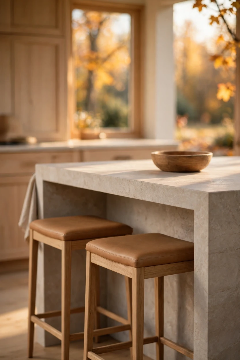
The three-object counter rule
This idea costs almost nothing and does the most work. Keep your main counter to three things: a wooden cutting board, a bowl of lemons or apples, and a folded linen towel. If you want a fourth, add a small pot of herbs by the window. The clear space around them tells the eye the kitchen is cared for. Everything else gets a drawer, a cupboard, or a spot on the pantry shelf.
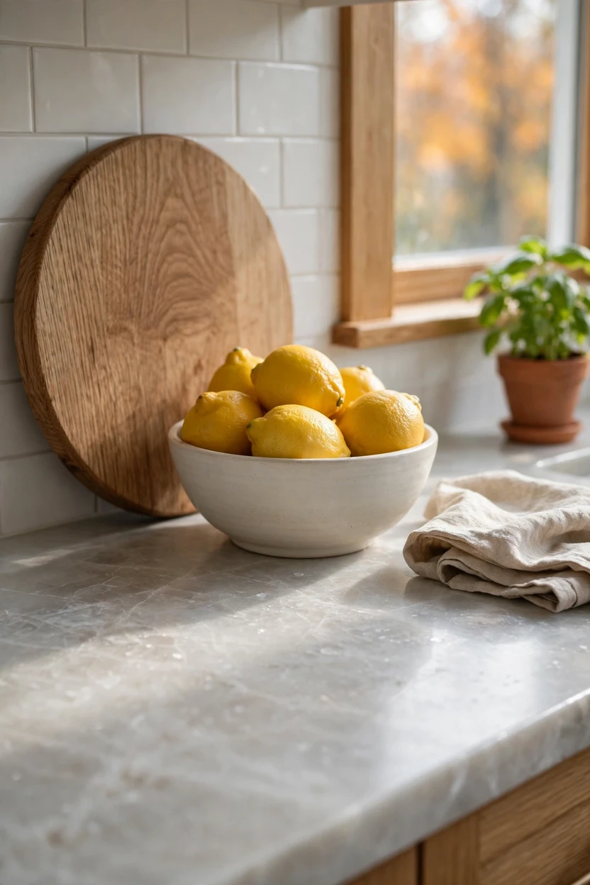
Styling tips
- Repeat a material three times. If you use oak on the cabinets, echo it in a shelf and a stool. Repetition reads as a plan.
- Stay in a color family. Keep to a warm palette of three or four related shades. Then add one dark accent, like a black pendant or tap.
- Add texture, not objects. Linen, ceramic, wood grain, and stone give interest without clutter.
- Edit with the seasons. In fall, swap the lemons for pears or small gourds. In winter, add a single branch of greenery.
- Style in odd numbers. Groups of one, three, or five look natural.
Practical implementation ideas
A smart order if you’re updating in stages:
- Declutter first. Empty the counters and sort by daily, weekly, and rare use.
- Fix the lighting. It is cheap, quick, and changes how everything else looks.
- Swap the hardware and tap. Small spend, big visual change.
- Paint or reface the cabinets. This sets the mood for the room.
- Add storage that hides things. Drawers, pull-outs, and a coffee cabinet.
- Upgrade the big surfaces last. Counters, backsplash, and floors cost the most, so do them once you know the look.
Common mistakes to avoid
- Going all white and cold. Pure white with cool bulbs feels like a clinic. Add wood, stone, and warm light.
- Using icy bulbs. Anything above about 3500K makes wood and food look flat and gray.
- Too much open shelving. More than one or two open shelves turns into daily dusting and constant styling.
- Mixing too many metals. Brass, chrome, black, and copper together look accidental.
- Skipping storage. A minimalist kitchen only stays clear if every item has a home.
- Gloss everywhere. Shiny surfaces show every print and make light feel harsh.
- Buying trends that don’t fit your cooking. A beautiful but fragile counter is stress if you cook daily.
Small-space alternatives
- Protect one clear prep zone. Keep a counter stretch next to the stove totally empty. That one space makes the room feel bigger.
- Go vertical. Run cabinets to the ceiling for extra storage without using floor space.
- Choose a slim fridge or a built-in drawer fridge. It saves width and visual weight.
- Use a single-wall layout with a drop-leaf table. It gives you a work surface and dining space that folds away.
- Pick one light color. A single warm neutral on walls and cabinets makes edges disappear.
- Skip the island. A slim rolling cart or a wall-mounted shelf works better in a narrow kitchen.
Budget-friendly alternatives
- Paint instead of replacing. A matte, scrubbable paint in warm greige or mushroom changes a dated kitchen for very little.
- Swap hardware. New slim pulls and one good tap are the biggest return per dollar.
- Add LED strip lights. Warm under-cabinet strips cost little and add instant depth.
- Use plain flat-front boxes with new doors. Stock cabinet boxes with custom-made fronts give a high-end look for less.
- Use butcher block or honed quartz. They mimic the warm, soft look of stone at a lower price.
- Use large-format porcelain panels. They give you the full-height backsplash look without the slab price.
- Styling is free. The three-object rule costs nothing.
Pro styling recommendations
- Follow the 60-30-10 idea. About 60% main neutral, 30% wood, 10% accent (like a black tap or dark pendant).
- Give every surface one job. One hero (the island), one supporting (the cabinets), and one quiet (the walls).
- Shoot in natural morning light if you are photographing for Pinterest. Turn off overhead bulbs, open the blinds, and clear the counter before the shot.
- Style one corner, not the whole room. A single shelf or counter vignette makes a stronger pin than a crowded wide shot.
- Make vertical pins. A 1000×1500 image with short, readable overlay text gets more saves than a busy collage.
FAQs
What is a minimalist kitchen?
A minimalist kitchen is a simple, uncluttered kitchen with clean lines, few materials, and hidden storage. Everything in it has a clear job and a place to live.
How do I make a minimalist kitchen look expensive?
Use fewer, better materials, add slim hardware, layer warm lighting, and hide small appliances. A taller backsplash and cabinets that reach the ceiling also help a lot.
Can a minimalist kitchen feel warm?
Yes. Warm oak, honed stone, matte finishes, linen, and 2700K to 3000K lighting keep a minimalist kitchen cozy instead of cold.
What colors work best in a minimalist kitchen?
Soft warm neutrals work best: cream, sand, mushroom, greige, and pale oak. Add one dark accent, like a black or bronze tap, for contrast.
Are handleless cabinets a good idea?
They give a very clean look, but they need good drawer boxes and an easy finger grip. If you worry about wear on push latches, choose a routed pull or slim edge pull.
Is a minimalist kitchen easy to keep clean?
Usually yes. Flat-front doors, fewer decor pieces, and clear counters mean less to dust and wipe. Choose honed or matte surfaces that hide fingerprints.
What is the difference between minimalist and Japandi kitchens?
Japandi is a style that blends Japanese simplicity with Scandinavian coziness, using light wood, soft color, and handmade pieces. Minimalism is broader, and Japandi adds warmth and natural craft to it.
How much clearance do I need around a kitchen island?
Plan at least 42 inches for one cook and around 48 inches if two people work together. Tighter than that feels cramped.
How can I get a minimalist kitchen on a small budget?
Paint cabinets in a warm matte color, swap the hardware and tap, add LED strip lights, and clear your counters. These four steps change the look more than most big purchases.
Do I need a full remodel to get this look?
No. Lighting, hardware, paint, and storage changes can get you most of the way. Save the big projects, like counters and backsplash, for when your budget allows.
Conclusion
A minimalist kitchen isn’t about owning less for the sake of it. It’s about deciding what deserves to be seen and giving everything else a quiet place to live.
Start small. Warm up the light, swap one set of pulls, and clear the counters tonight. Then add one bigger move, like the oak cabinets or the full-height backsplash, when you’re ready.
Do that a few times, and one morning you’ll walk in, see the light on the oak, and realize the room finally looks the way you pictured it.