15 Fall Decor Ideas That Actually Follow Design Principles

Picture this. You walk in after a cool evening. A lamp is on. A big branch leans in a corner. A wool throw sits half-folded on the sofa arm. Nothing shouts “FALL!” But the room feels like October.
Now picture the other version. Eleven small pumpkins. Three signs. A garland, a wreath, and a candle in every corner. Same season, very different feeling.
The gap between those two rooms isn’t money. It’s a few design rules that most people never hear about. Scale. Balance. Contrast. Repetition. This guide shows you 15 fall decor ideas, each built on one of those rules, so you know why it works and can repeat it in any room.
Table of Contents
Go Big With One Oversized Branch Arrangement (Scale)
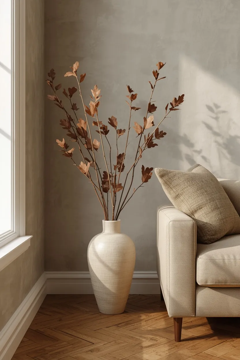
Scale is how large an object feels next to everything around it. Most fall decor goes wrong because every piece is tiny, so the eye has nowhere to land. Pick one tall floor vase, about knee height, in cream, stone, or matte clay. Fill it with three to five long branches of oak, maple, or dried eucalyptus. Set it beside a sofa, console, or fireplace. One large shape does more than a dozen small ones, and it frees you from buying filler.
Use the 60-30-10 Color Rule for Fall (Proportion)

This rule splits a room’s color into three parts. Sixty percent is your base: walls, sofa, rug in cream, oatmeal, or soft taupe. Thirty percent is the support: wood tones, olive, or tobacco leather. The last ten percent is the accent: burgundy, rust, or mustard. Your accent is small by design, so it reads rich instead of loud. This is why a single burgundy pillow and one rust throw beat a room full of orange.
Layer Three Kinds of Texture (Texture and Depth)

A room with one texture looks flat, even in rich colors. Use three: smooth, nubby, and rough. Smooth could be glazed ceramic or glass. Nubby could be wool, boucle, or a chunky knit. Rough could be jute, rattan, or raw wood. Put all three within arm’s reach of your sofa and the room instantly feels inviting. Texture also hides the fact that you used few colors.
Balance a Mantel With Uneven Weight (Asymmetrical Balance)
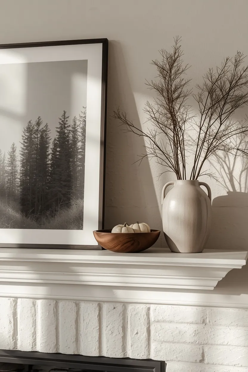
Balance doesn’t mean matching on both sides. It means equal visual weight. Lean a large framed landscape or dark abstract print to the left. On the right, add a tall branch vase that reaches about the same height. Fill the gap between them with one low wooden bowl. Your eye moves across the mantel instead of stopping at the middle. This also looks less staged than two matching candlesticks and two matching pumpkins.
Style Your Coffee Table in a Triangle of Three (Grouping)

Odd numbers feel natural, and a triangle shape keeps the eye moving. Start with something tall, like a slim vase or taper candles in a holder. Add something medium, like a short stack of books. Finish with something low, like a wooden tray or bowl. Leave a few inches of bare table around the group. That empty space is what makes the group look styled instead of crowded.
Repeat One Material Three Times (Rhythm and Unity)

Repetition ties a room together without matching everything. Choose one material or color, like amber glass, brass, or rust ceramic. Place it in three spots: a candle holder on the table, a vase on a shelf, a small dish on the console. The eye follows the repeat from place to place. A room with this quiet thread feels planned, even if each piece came from a different shop.
Add One Dark Piece to a Cream Room (Contrast)

A fully soft room can feel washed out. Contrast gives it an edge to rest against. Bring in one dark object: a walnut stool, a black iron lamp, or a deep brown ceramic bowl. Squint at your room. If everything blurs into one tone, you need a darker shape. A single dark piece makes the cream, oat, and linen around it look warmer.
Make Your Entryway Console Have One Hero (Focal Point)

A focal point is the first thing your eye lands on. Entryways often have six things competing for attention. Pick one hero: a round mirror, a bold lamp, or a big branch vase. Keep the rest to two small supports, like a bowl for keys and a stack of books. This gives guests a clear first impression and gives you a landing spot that stays tidy.
Leave a Third of Your Shelf Empty (Negative Space)

Negative space is the quiet area around objects. A full shelf is hard to read. Fill about two thirds and leave the rest open. Mix book spines, one vintage copper pot, a piece of pottery, and a small framed print. Group by color so the eye can rest. Fall shelves with room to breathe feel calm, and they’re quicker to dust.
Light the Room at Eye Level (Lighting as Design)

Fall means earlier dark, and a bright ceiling light flattens everything you styled. Use lamps and candles at table and eye height instead. Choose warm bulbs, around 2700K, so cream and rust look rich. Add two or three taper or pillar candles for movement. Light is the cheapest fall decor you can buy, and it works in every room.
Vary Heights on the Dining Table (Hierarchy)
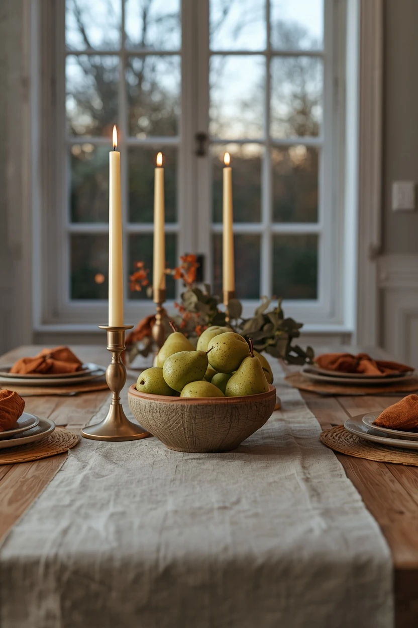
Height variation makes a table look intentional. Run a linen or cotton runner down the center. Add a pair of tall slim candlesticks and one or two low bowls of pears or small gourds. Keep centerpieces low enough to see over, or slim enough to see around, so guests can talk. Use cloth napkins in one muted shade, like rust or olive. The result reads as dinner-party ready without being fussy.
Use Symmetry on the Front Porch (Formal Balance)
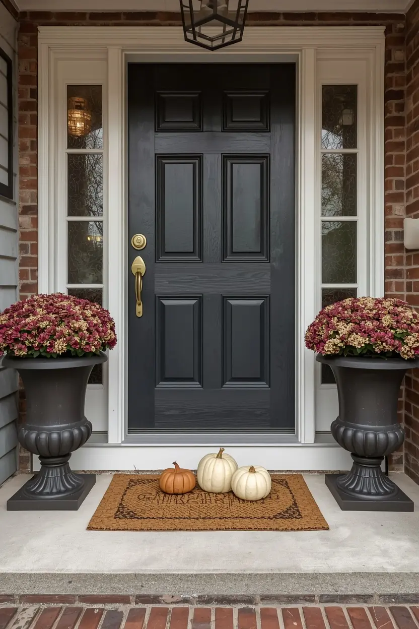
A front door is a formal setting, so matching sides look right here. Place two identical planters of mums or ornamental kale on either side of the door. Choose planters tall enough to reach about a third of the door’s height. Add one cluster of three pumpkins on the step, in cream and soft orange. Finish with a woven doormat. Symmetry reads as neat and welcoming from the street.
Anchor the Bed With One Heavy Layer (Visual Weight)

A bed is the biggest object in the room, so it needs one confident move. Fold a heavy wool or waffle blanket in rust or caramel lengthwise across the foot. Add two standard pillows, one lumbar, and stop there. Keep the base bedding in white or oat. The weight at the foot of the bed grounds the whole room and makes the bed feel inviting after a long day.
Match Fall Swaps to Your Kitchen’s Finishes (Harmony)
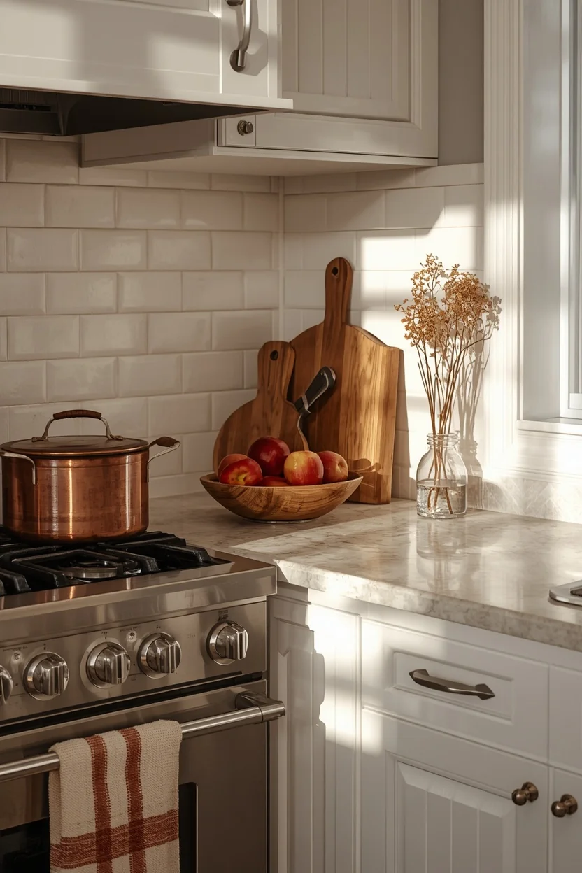
Harmony means new pieces get along with what’s already there. If your fixtures are brass, lean on brass, amber, and warm wood. If they’re black, choose dark stoneware and deep greens. Swap tea towels, add a wooden board, and set out a bowl of apples or pears. Keep it to a few items on the counter so you can still cook. Small swaps look natural and don’t fight your cabinets.
Hang Moody Art in a Tight Grid (Rhythm on the Wall)

Art does a lot of fall work without taking up floor space. Choose prints with forest, harvest, or antique botanical scenes in muted earth tones. Use frames in the same color so the group feels like one piece. Keep the gaps between frames equal, about two inches. Hang the center of the group around 57 to 60 inches from the floor. Even spacing creates a rhythm that makes a plain wall look finished.
Styling Tips
- Start with one big item, then add small things around it.
- Keep your accent color to one or two shades.
- Use odd numbers: three candles, five branches, one hero.
- Match your undertones. Warm creams go with warm rusts. Cool whites can look gray next to them.
- Move existing items first. A shelf vase can become a fall vase with new stems.
Practical Implementation
Day one: Remove summer pieces. Clear surfaces. A clean start shows what you need.
Day two: Swap textiles (throws, pillow covers, a table runner).
Day three: Add one large piece (branches, a big bowl, or art).
Day four: Fix lighting with warm bulbs and candles.
Last: Step back, squint, and remove one thing.
Common Mistakes to Avoid
- Lots of small items spread everywhere
- Word signs and phrases like “Hello Fall”
- Five or more colors fighting each other
- Shiny glitter and neon pumpkins
- Plaid on every surface
- Bright white overhead light
- Faux leaves that look plastic
- Ignoring your existing finishes and furniture
Small-Space Alternatives
- Use vertical space: a tall branch in a slim vase takes up almost no floor.
- Pick one shelf or one table to style, not the whole room.
- Skip big bowls and use a tray to keep items grouped.
- Rely on textiles. A throw and two pillow covers change the mood with zero clutter.
- In a rental, use removable hooks and leaning art.
Budget-Friendly Alternatives
- Cut branches from your yard or a nearby park, where it’s allowed.
- Shop thrift stores for amber glass, copper, and wood bowls.
- Reuse vases and bowls you already own.
- Buy one real mum or small pumpkin group instead of many fakes.
- Pick one new textile, such as a throw, and rotate pillows from other rooms.
Pro Styling Recommendations
- Do a “three-foot test.” Stand three feet from each surface. Can you read the grouping at a glance?
- Check scale first. If a decor piece looks tiny, it probably is.
- Take a phone photo. Seeing it in black and white shows if you need more contrast.
- Edit last. Take away one item per surface before you finish.
- Work with the season outdoors. Match your colors to what your yard looks like in fall.
FAQs
Conclusion
You don’t need a bigger budget to make your home feel like fall. You need a plan. Choose one big piece. Keep your color list short. Add texture, warm light, and a little empty space.
Start with just one idea from this list this weekend. A branch in a tall vase. A heavier throw on the sofa. A lamp turned on at four in the afternoon. Notice how the room changes. Then add a second idea, and keep going until it feels like yours.