22 Colorful Kitchen Ideas That Look Magazine-Worthy
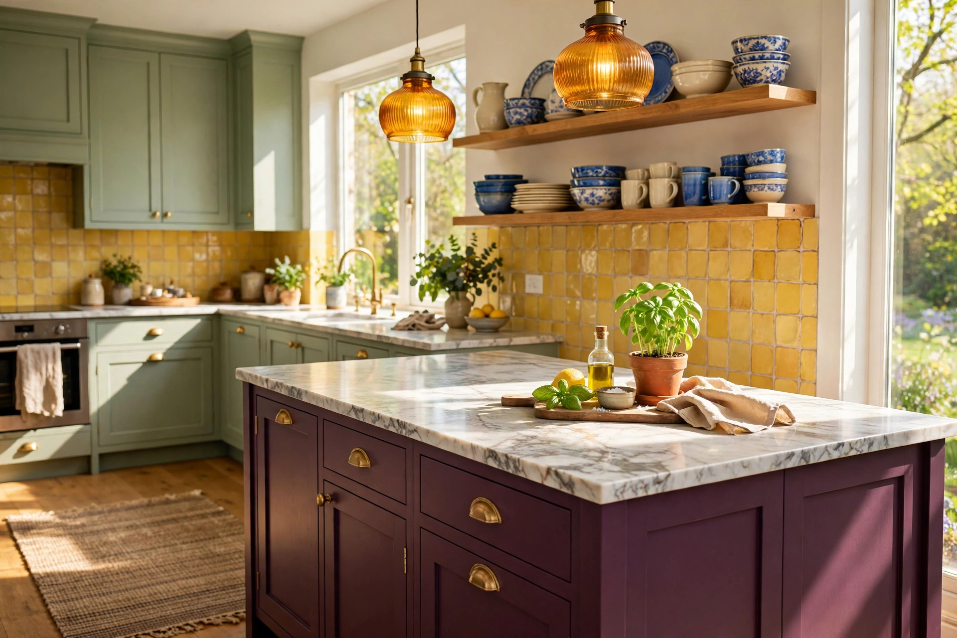
Picture it. Morning sun lands on a sage green cabinet door. The tile behind the kettle glows soft yellow. A bowl of lemons sits on a wood counter, and for a second the whole room feels like a page from a magazine.
Here is the secret: those kitchens are not louder than yours. They are more planned. The color shows up in a few places, repeats on purpose, and sits next to wood, stone, or metal that calms it down.
For years, the safe move was white on white. But more people now want a kitchen that feels like them, and color is the fastest way to get there. You do not need to be bold by nature. You just need a plan.
Below are 22 colorful kitchen ideas you can copy, from one painted island to a full jewel-tone room. Each one explains why it works, so you can adjust it to your own light, budget, and space. Save the ones that make you stop scrolling.
Quick answer: To make a colorful kitchen look magazine-worthy, pick one main color, one supporting color, and one metal. Repeat the main color at least three times, ground it with wood or stone, and use warm layered lighting. Test large paint samples in your own light, and choose satin or semi-gloss for cabinets.
What makes a colorful kitchen look magazine-worthy? A clear color plan, a calm background to rest the eye, natural materials that add warmth, and good lighting. Color is only half the picture. The rest is repetition and restraint.
Table of contents
22 Colorful Kitchen Ideas
1. Start With Soft Sage Green Cabinets and Warm Wood
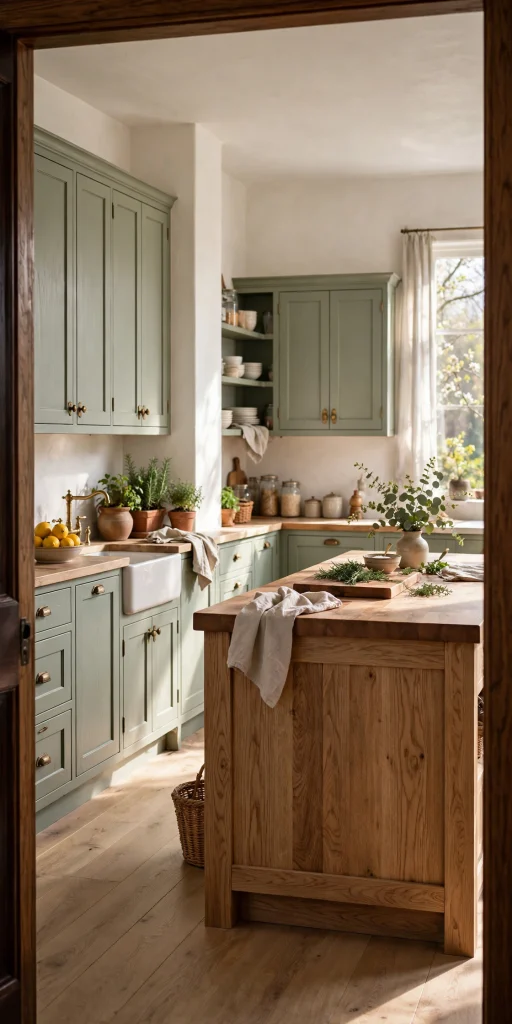
Sage is the easiest first step into color, because it behaves like a neutral. It has gray in it, so it sits quietly next to white walls, oak floors, and brass pulls. Pair it with butcher block counters or an oak island so the green feels grounded and warm. Test the shade in your own light first, since a sage can lean blue in a north-facing room and yellow in a south-facing one. Choose a satin finish, which wipes clean and hides small marks better than a very shiny coat.
2. Try Navy Lower Cabinets With White Uppers
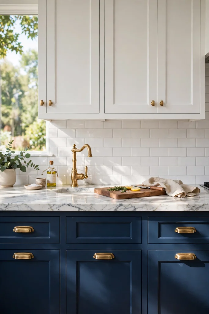
Two-tone kitchens are one of the biggest trends going, and navy on the bottom is the classic way to do it. The dark base anchors the room, while white uppers keep the eye line bright and open. Repeat one hardware finish on every door, such as brushed brass, so the two colors feel connected. White quartz or veined marble counters keep the contrast crisp. This is also a smart choice for a small kitchen, because the heavy color stays low and the walls stay light.
Related: 15 Retro Kitchen Ideas That Look Pinterest Perfect
3. Brighten Things With Butter Yellow Cabinets
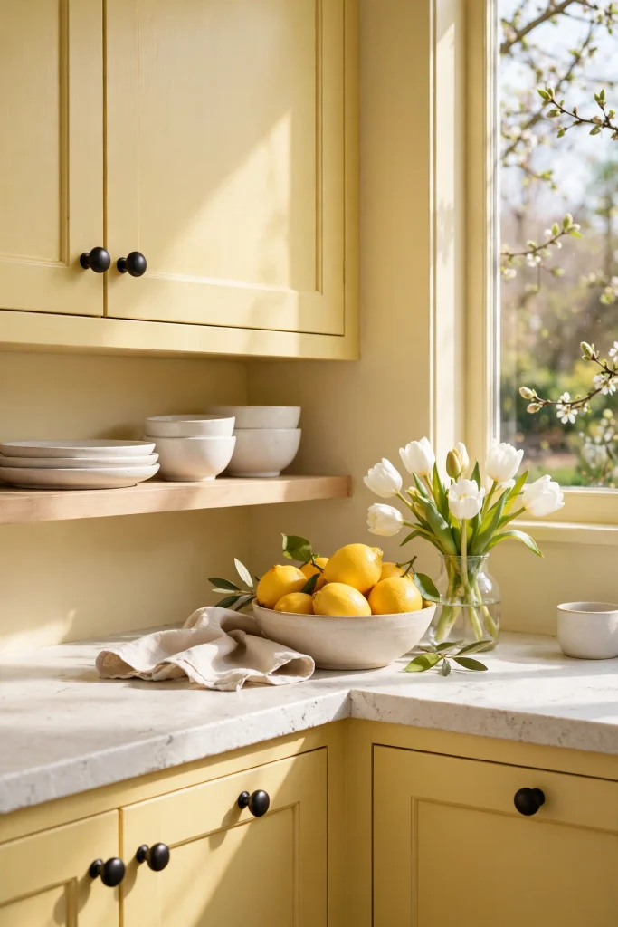
Modern butter yellow is soft and creamy, not loud and sunny. It feels like fresh butter on warm toast. Pair it with white walls, light wood, and black or brass hardware so it looks fresh instead of retro. Creamy yellows are often a smart match for kitchens that get cool north light, since they add the warmth the room lacks. Keep the countertop simple, like white stone or pale wood, and let the cabinets be the star.
4. Warm Up With Terracotta and Persimmon

Clay orange and persimmon bring the warmth of a sunset into the kitchen, and persimmon is one of the colors people have been saving on Pinterest. Use terracotta on the lower cabinets or island, and pair it with creamy plaster-style walls, natural wood, and black iron hardware. These earthy shades work in farmhouse, Spanish-style, and modern kitchens. If you are nervous, start with just the island, or even a set of terracotta bar stools. The warm tone also makes a plain white kitchen feel less cold.
5. Pair Blush Pink Cabinets With a Checkerboard Floor
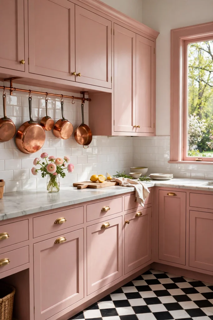
Pink cabinets can look grown-up when the details around them are crisp. Choose a dusty, muted pink, not bubblegum, and pair it with a black and white checkerboard floor and warm white walls. Add copper or brass touches, like a pot rail or cabinet pulls, to give the pink a rich edge. The black in the floor keeps the look from turning too sweet. Pink also flatters skin and food, which makes the kitchen feel welcoming at every meal.
6. Let the Island Be the Color Moment
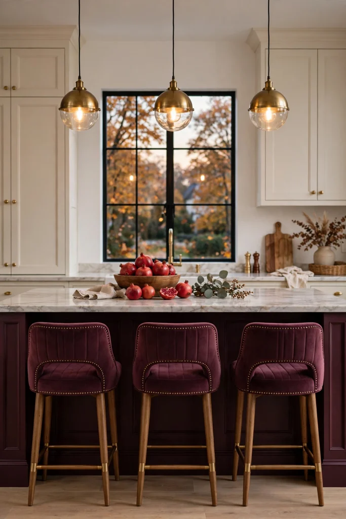
If painting every cabinet feels like too much, put all your color on the island. Designers often suggest limiting bold shades to one feature piece, because it adds personality without dating the whole kitchen. A deep plum or burgundy island on a cream or white kitchen looks rich and confident. Plum noir is one of the shades Pinterest users have been saving. Match the stools to the island, add brass pendants above it, and keep the countertop light.
7. Go Moody With Emerald or Jade and Brass

Deep green cabinets feel like a cozy library for cooking. Jade is another shade people have been saving, and it looks rich next to brass hardware, white marble, and walnut wood. Dark colors soak up light, so add under-cabinet lights and warm bulbs, which keep the room glowing. Choose a satin finish, so the green looks deep without turning into a mirror. This look works best in kitchens with good natural light or plenty of layered lighting.
8. Revive Powder Blue With Marble and Copper
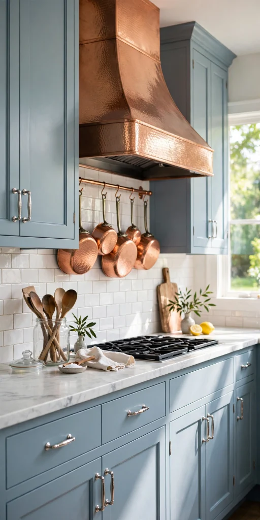
Powder blue is having a comeback, and it feels like a cloudless morning. Pair it with white marble counters, a copper range hood or pots, and simple white tile. Cool blue is also on Pinterest’s color list, so it is easy to find matching ideas. Keep the blue light and airy, and let the copper add warmth. This is a lovely choice for traditional or cottage kitchens that want a fresh feel.
9. Add Handmade Zellige Tile in a Soft Shade
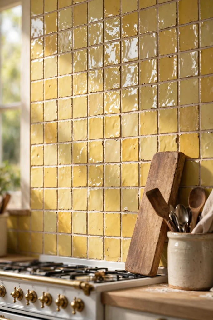
Zellige tile has a slightly uneven, glossy glaze that catches light like water. A backsplash in soft yellow, sage, or pale pink adds color and movement without the weight of painted cabinets. Tile is also one of the easier kitchen upgrades, since it covers a small area. Choose grout carefully: a matching grout looks calm, while a contrasting one makes a graphic grid. Keep cabinets plain, so the tile gets all the attention.
10. Use a Patterned Tile Backsplash With White Shaker Cabinets
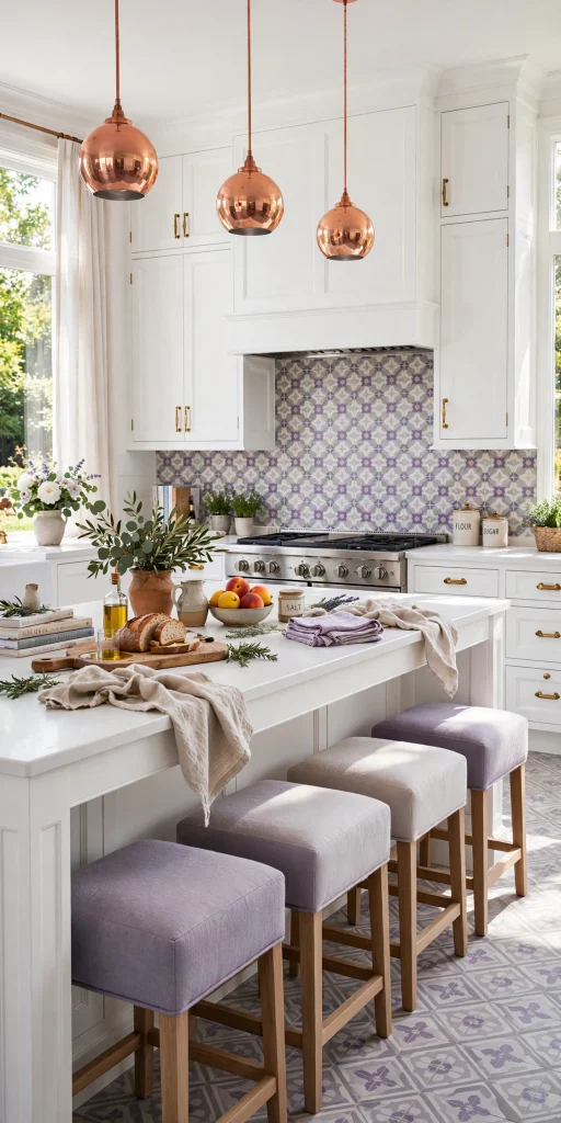
White shaker cabinets make a calm stage for bold pattern. Choose an encaustic-style tile in lavender and gray, or green and cream, behind the stove or sink. Pull one color from the tile and repeat it in a pendant light, a stool, or a bowl so it feels planned. In a small kitchen, keep the pattern to one zone, like the wall behind the range, so it does not overwhelm. Large patterns suit big walls, while small patterns suit narrow ones.
11. Hang Wallpaper or a Mural in the Kitchen
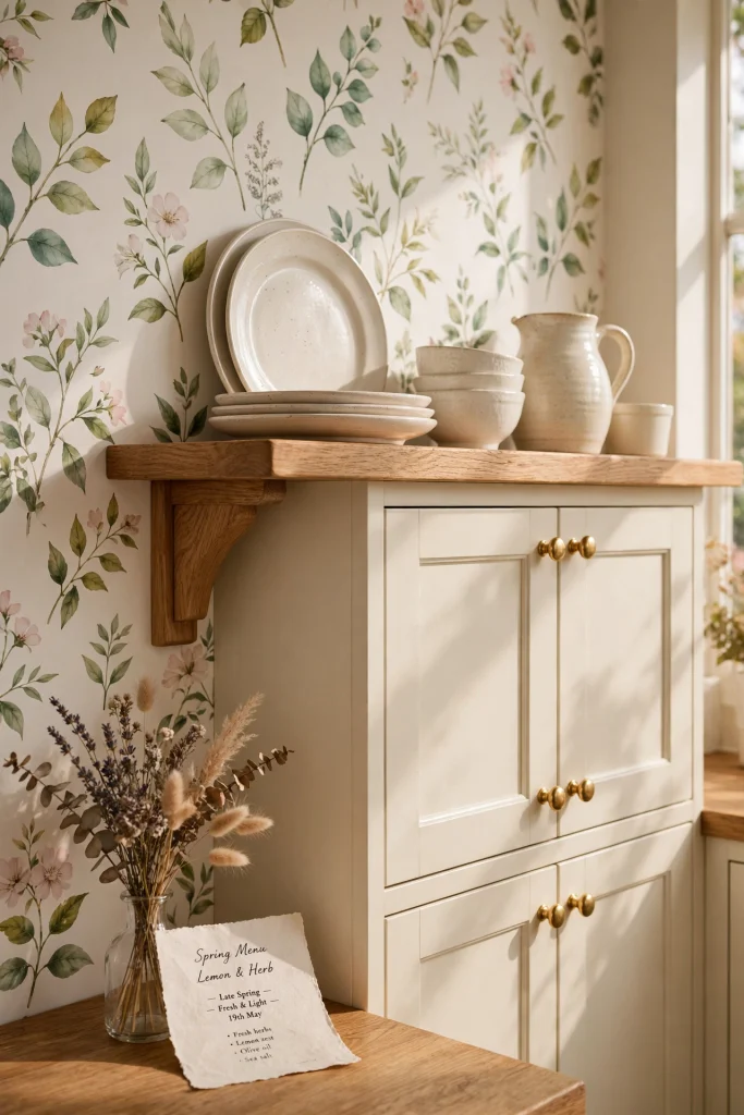
Wallpaper is the quickest way to add color and pattern at once. Choose a botanical or small-scale print on one wall, or line the back of open shelves for a surprise pop. Pick a washable vinyl or wipeable paper, and keep it away from the splash zone behind the stove. Peel-and-stick versions work well for renters and for people who change their minds. Keep the cabinets calm in cream or white, so the pattern is the only star.
12. Paint the Ceiling a Soft Color
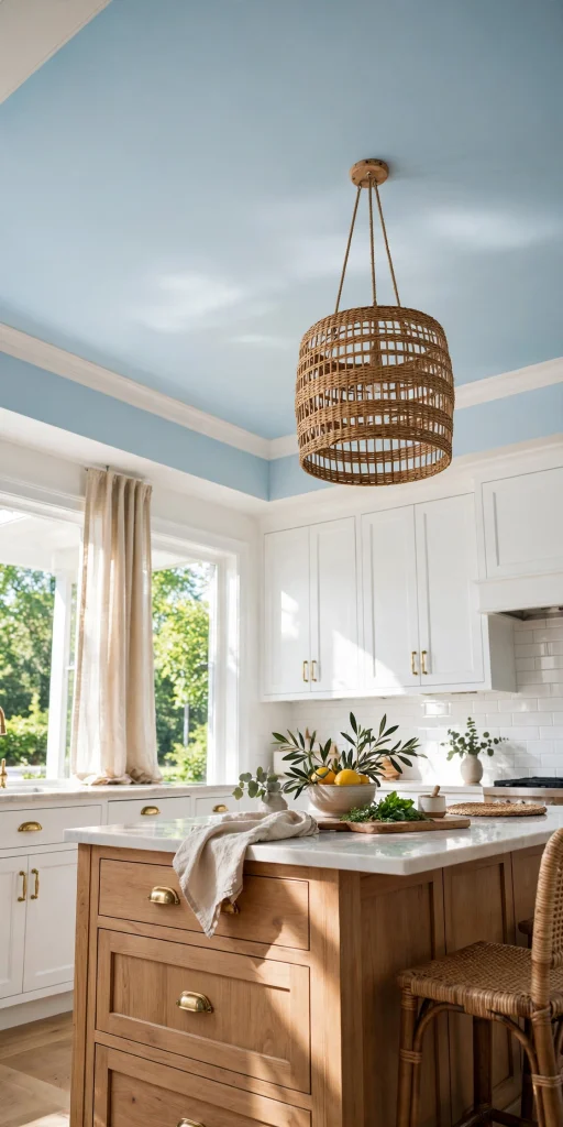
The ceiling is the fifth wall, and most kitchens leave it plain white. A soft blue, pale butter yellow, or warm blush overhead pulls the eye up and gives the room a cozy, finished feel. Use a flat ceiling paint, which hides small bumps and dings. Keep the trim and cabinets light, so the room does not feel low. This idea costs very little and still gets noticed the moment someone looks up.
13. Let the Floor Bring the Color
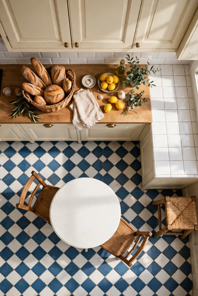
A colorful floor works as a giant rug that never moves. Try a blue and white check, a black and white checkerboard, or a patterned cement-style tile in warm shades. Because a floor covers so much space, keep the cabinets and walls simple, in white, cream, or a soft neutral. Porcelain tile is a durable choice that handles spills and chairs. If you cannot change the floor, a bold runner rug gives you the same pop for a fraction of the effort.
14. Make a Colorful Range the Focal Point

A bright range or a retro-style refrigerator can be the one bold piece that carries the whole kitchen. Choose a green, red, or cream-and-color range, then keep the cabinets neutral so it stands out. Match the knobs or a nearby item, like a kettle, to the same color. Appliances are a big purchase, so be sure you love the shade for years. If you want the look with less risk, try a colored stand mixer, kettle, or toaster as a small pop.
Related: 17 Outdoor Kitchen Layout Ideas Architects Swear By
15. Hang Colored Glass Pendant Lights

Color does not have to live on the walls. Amber, green, or cobalt glass pendants cast a soft colored glow on the counters, and they add a jewel-like detail over an island. Hang them about 30 to 36 inches above the counter, so they are easy to see without blocking faces across the island. Use warm bulbs, which keep the glass glowing instead of looking flat. This is one of the most underrated ways to bring color into a kitchen without paint.
16. Style Open Shelves With Colorful Ceramics

Open shelves let you display color you already own. Group dishes by shade, such as blue bowls, cream plates, and a few yellow mugs, instead of mixing every color together. Stack some pieces and stand others up, so the shelf has height changes. Stick to three colors, and leave a little blank space, so the display looks styled, not crowded. A trailing plant or a small pot of herbs adds fresh green between the ceramics.
17. Mix Color With Warm Wood and Reeded Fronts

Wood keeps color from feeling flat or too sweet. Try olive green cabinets with a walnut island, or sage with reeded wood-front doors. Reeded and cane details add texture, which makes a simple painted color look richer. Stay with one or two wood tones, so the room does not look busy. Natural materials like wood and stone are also easier to live with than a room made only of painted surfaces.
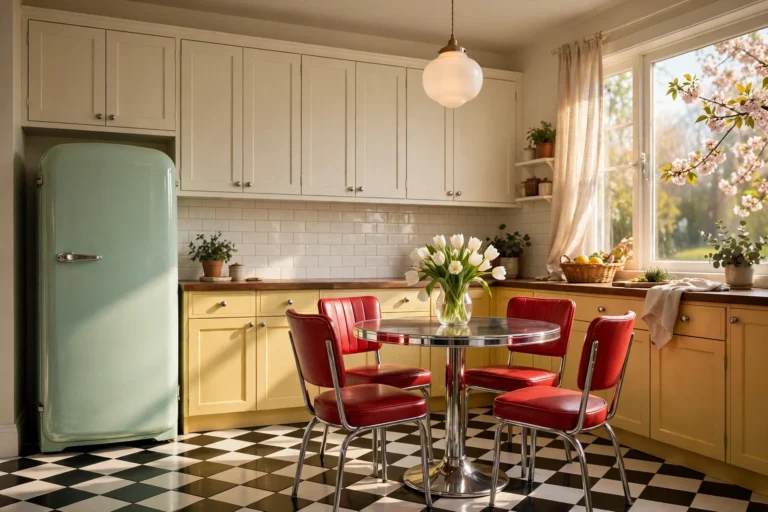
18. Go Retro With Aqua, Cherry Red, and Chrome
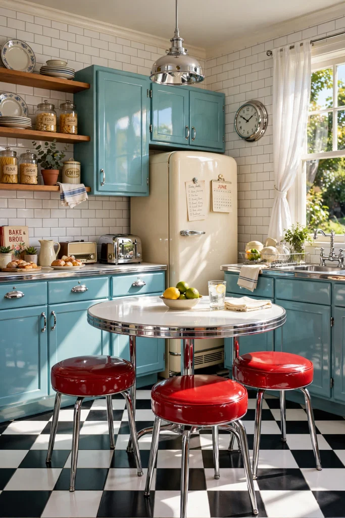
A 1950s-inspired kitchen feels like a happy diner, in a good way. Use aqua cabinets, cherry red stools, cream walls, and chrome trim, and keep the palette to three colors so the nostalgia looks styled, not messy. A black and white floor and a vintage-style refrigerator finish the story. Choose modern materials with a retro look, so the room stays easy to clean and use. Add a single piece of vintage art or a classic clock to complete the scene.
19. Add a Banquette Nook in a Bold Fabric

A built-in bench saves space and gives you a place to add color you can touch. Choose a wipeable performance fabric or vinyl in sage, mustard, red, or forest green. Add a round table, so no sharp corners block the walkway. The bench seat can hold drawers or lift-up storage, which makes it useful as well as pretty. Pick a color that picks up one shade from the cabinets, so it looks connected.
20. Use Color Smartly in a Small Kitchen

Small kitchens can handle color. They just need a few rules. Paint one wall or the lower cabinets, and keep the rest light, since dark color everywhere can make a tight room feel heavier. Add colored hardware or a single strip of tile for a quiet pop. In a galley kitchen with little daylight, soft sage, pale blue, or butter yellow reads fresh without closing in the space. Stay with one main color, repeated three times, so the room feels calm.
Related: 16 Boho Kitchen Ideas That Feel Collected, Not Costume
21. Try a Dopamine Kitchen With the Three-Color Rule

Dopamine decor is all about joy, and it can still look polished. Start with a white or cream base, then choose three happy colors, such as a pink island, yellow stools, and blue dishes. Repeat each color two or three times around the room, so the eye moves in a loop. Keep walls plain and limit pattern to one or two spots. This works because the white base gives the colors room to breathe, so the room feels lively, not loud.
22. Make a Rental Kitchen Colorful Without Painting

No paint, no problem. Use peel-and-stick tile over a plain backsplash, removable wallpaper on one wall, and a bold runner rug to bring in color. Swap cabinet knobs for colorful ones, and keep the originals in a bag so you can put them back. Add a colored kettle, a stand mixer, a few plants, and a piece of art on a rail. Check your lease first, and test any adhesive on a hidden spot.
Colorful Kitchen Styling Tips
These simple rules help any color plan look finished.
- Repeat your main color three times. Put it on cabinets, then again in a stool, towel, or bowl, then once more in art or a rug. Repetition makes color look planned.
- Choose one metal. Brass, nickel, black, or copper. Matching hardware ties every other color together.
- Use the 60-30-10 rule. About 60 percent calm base color, 30 percent your main color, and 10 percent a bold accent.
- Match warm with warm. If your cabinets lean warm, choose warm whites and warm woods. Cool and warm undertones can clash.
- Light it in layers. Use ceiling lights, under-cabinet lights, and a pendant or lamp. Color looks richer with more than one light source.
- Add living green. A pot of herbs or a trailing plant calms bold colors.
- Clear the counters. A few well-chosen items look better than a crowd. Color gets the spotlight when the space around it is quiet.
Practical Implementation: How to Choose and Test Your Kitchen Color
Most colorful kitchens go wrong at the paint chip stage. Use these steps to avoid that.
Step 1: Start with what is not changing. Look at your floor, countertop, and backsplash. Note whether each one leans warm (cream, yellow, red) or cool (gray, blue, green). Your new color should share the same undertone family.
Step 2: Check your light. North-facing kitchens get cooler light; warm shades like creamy yellow, terracotta, and warm sage usually do better. South-facing kitchens get warm strong light and can handle cooler colors like blue and green. East- or west-facing light changes through the day, so check bold shades at night too. Bulbs rated 4000K or higher pull out blue and violet tones; warm 2700K bulbs make yellow and red undertones stronger.
Step 3: Test large samples. Paint a big board or a spare cabinet door, or use large peel-and-stick samples. Leave them up for a few days and check in morning, afternoon, and evening light, next to your counter, floor, and tile.
Step 4: Pick the right finish. Choose cabinet-grade enamel, not standard wall paint. Satin or semi-gloss wipes clean and resists splashes.
Step 5: Prep the surface. Clean off grease, sand lightly, prime, and apply thin coats. Follow the can for cure time.
Easy color pairings to start with:
- Sage green: white or butcher block counters, oak wood, brass or black hardware
- Navy: white marble or quartz, brass or nickel hardware, light wood floors
- Butter yellow: white walls, pale wood, black or brass hardware
- Terracotta: creamy plaster-look walls, natural wood, black iron hardware
- Blush pink: black and white tile, copper or brass, warm white walls
- Plum or burgundy: cream cabinets, light stone, brass fixtures
- Emerald or jade: white marble, walnut wood, antique brass
- Powder blue: white marble, copper, polished nickel
Common Colorful Kitchen Mistakes to Avoid
- Trusting a tiny paint chip. Always test large samples.
- Ignoring your fixed finishes. Warm beige counters fight cool gray-green cabinets.
- Using matte paint on high-touch cabinets. Choose satin or semi-gloss.
- Using too many colors. More than three plus a metal feels chaotic.
- Going dark in a dim, small kitchen with no extra light.
- Mixing metals at random. Pick one main metal.
- Letting walls and cabinets match in tone. Add contrast.
- Chasing a trend on the biggest surface. Try it on an island first.
- Skipping prep. Grease and gloss under new paint cause peeling.
Small-Kitchen Color Alternatives
- Galley kitchen: Paint the lower cabinets and keep the uppers white.
- Studio or open-plan kitchen: Choose a color that also works with your living space. Soft sage, warm cream, and muted blue are good bridges.
- Low-light kitchen: Pick lighter, warmer shades like creamy yellow, pale sage, or warm white with a colorful tile strip.
- Tiny kitchen with no wall space: Use color on the ceiling, the floor, or a rug.
- Kitchen with a small window: Add a bold roman shade and reflect more light with glossy tile.
- Corner or nook kitchen: Use one bright accent like a colored stool or painted shelf.
Budget-Friendly Colorful Kitchen Ideas
- Paint only the island or lower cabinets.
- Swap the hardware for brass, black, or colorful knobs.
- Use peel-and-stick tile over a dated backsplash.
- Paint the ceiling or one wall.
- Thrift bowls, plates, and glass jars for cheap color.
- Add a bold washable runner rug.
- Use produce and plants: lemons, oranges, herbs, trailing plants.
Pro Styling Recommendations
- Check light reflectance value (LRV) on paint chips; higher numbers reflect more light.
- Pick the countertop first, then match paint to it.
- Match grout on purpose: matching grout looks calm, contrasting grout looks graphic.
- Check value contrast with a black and white photo.
- Style counters in threes: cutting board, bowl, plant.
- Add one vintage piece for a collected feel.
- Keep trim consistent in white or cream.
FAQs
Final Thoughts: Pick One Color You Would Happily See at Breakfast
You do not need all 22 ideas. Start with one color you would be glad to see every morning with your coffee. Put it on one thing, like an island, a wall, or a set of stools.
Then repeat it twice. A towel, a bowl, a rug, or a pendant is enough. Add one metal, one natural material, and warm light, and step back.
The kitchens that look like magazine pages are rarely the loudest. They are the ones where every color has a reason to be there.