15 Warm Neutral Kitchen Color Ideas That Actually Work
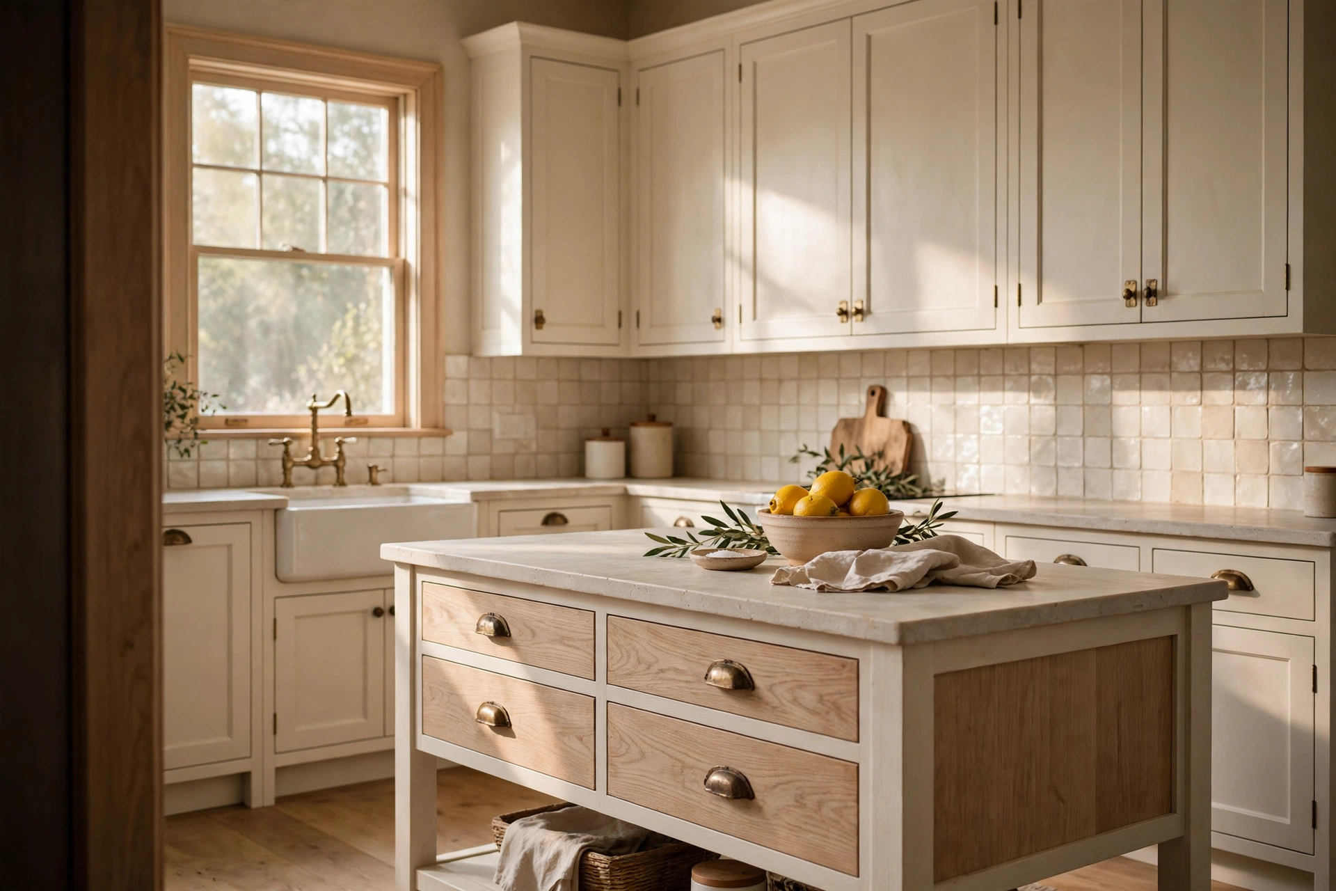
Imagine walking into your kitchen at 7 a.m. The light comes through the window, hits the cabinets, and nothing looks sharp or sad. The room just feels soft, like a mug of tea in your hands.
That is what a good warm neutral kitchen does. The trouble is that the same paint chip can look creamy in the store and yellow, pink, or flat gray at home. Many people repaint twice before they get it right.
This list is built to save you that second can of paint. Each of the 15 ideas gives you the cabinet color, the wall color, the counter and tile partners, and the reason the mix works. Pick the one that matches your light, then borrow the pairings.
Quick answer: A warm neutral kitchen uses cream, warm white, beige, greige, taupe, or mushroom shades with yellow, red, or gold undertones. Choose one undertone, repeat it in the cabinets, counters, and tile, add natural wood and warm metal, and test the paint in your own light before you commit.
What is a warm neutral?
A warm neutral is a soft, low-color shade that leans slightly yellow, red, or brown instead of blue or green. Cream, sand, beige, putty, taupe, and warm greige are common examples. They feel cozy because they echo candlelight, wood, and stone.
Table of Contents
How to choose your warm neutral
Start with light, not with a trend. A north-facing kitchen gets cooler, grayer daylight, so cream, sand, and soft butter shades keep it from feeling dull. A south-facing kitchen gets warm light for most of the day, so a very yellow cream can turn buttery fast and a greige or mushroom often looks calmer.
Then look at what you cannot change: the floor, the counters, and the appliances. Hold your sample next to them. If the floor leans orange, a slightly pink beige will fight it, and a greige or sand shade will usually sit better.
Finally, test the paint. Paint a large sample board and move it around the room, morning to evening. Colors shift with light, so a color that looks right at noon may look different under lamps at night.
15 warm neutral kitchen color ideas
Paint names below are starting points, not promises. Sample every color in your own kitchen before you buy a full can.
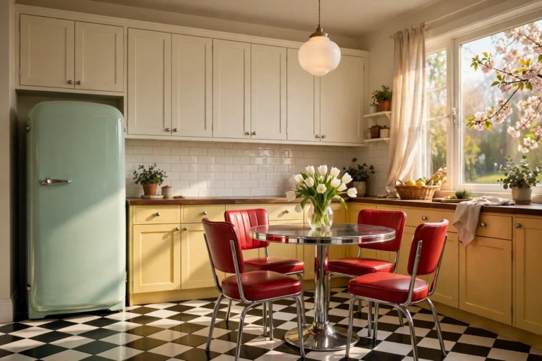
Related: 15 Retro Kitchen Ideas That Look Pinterest Perfect
1. Creamy warm white cabinets with white oak
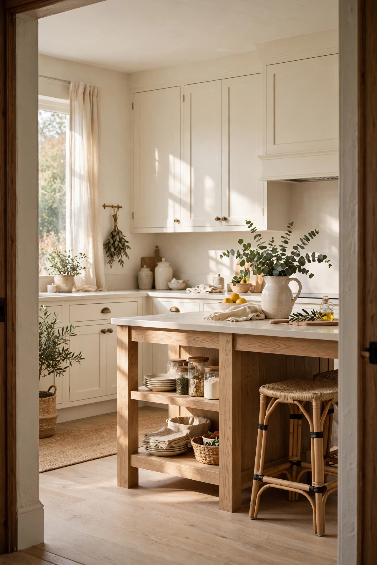
This is the easiest place to start. Paint the cabinets a soft, creamy white like Sherwin-Williams Alabaster (SW 7008) or Benjamin Moore White Dove, then add a white oak island or floating shelves. Keep the walls a touch deeper, such as a pale sand, so the cabinets read bright by comparison. Aged brass pulls and a honed, warm white counter finish the set. The cream bounces light around the room, while the oak grain gives the eye something to rest on, which stops the kitchen from feeling like a clinic.
2. Beige-greige cabinets with brass
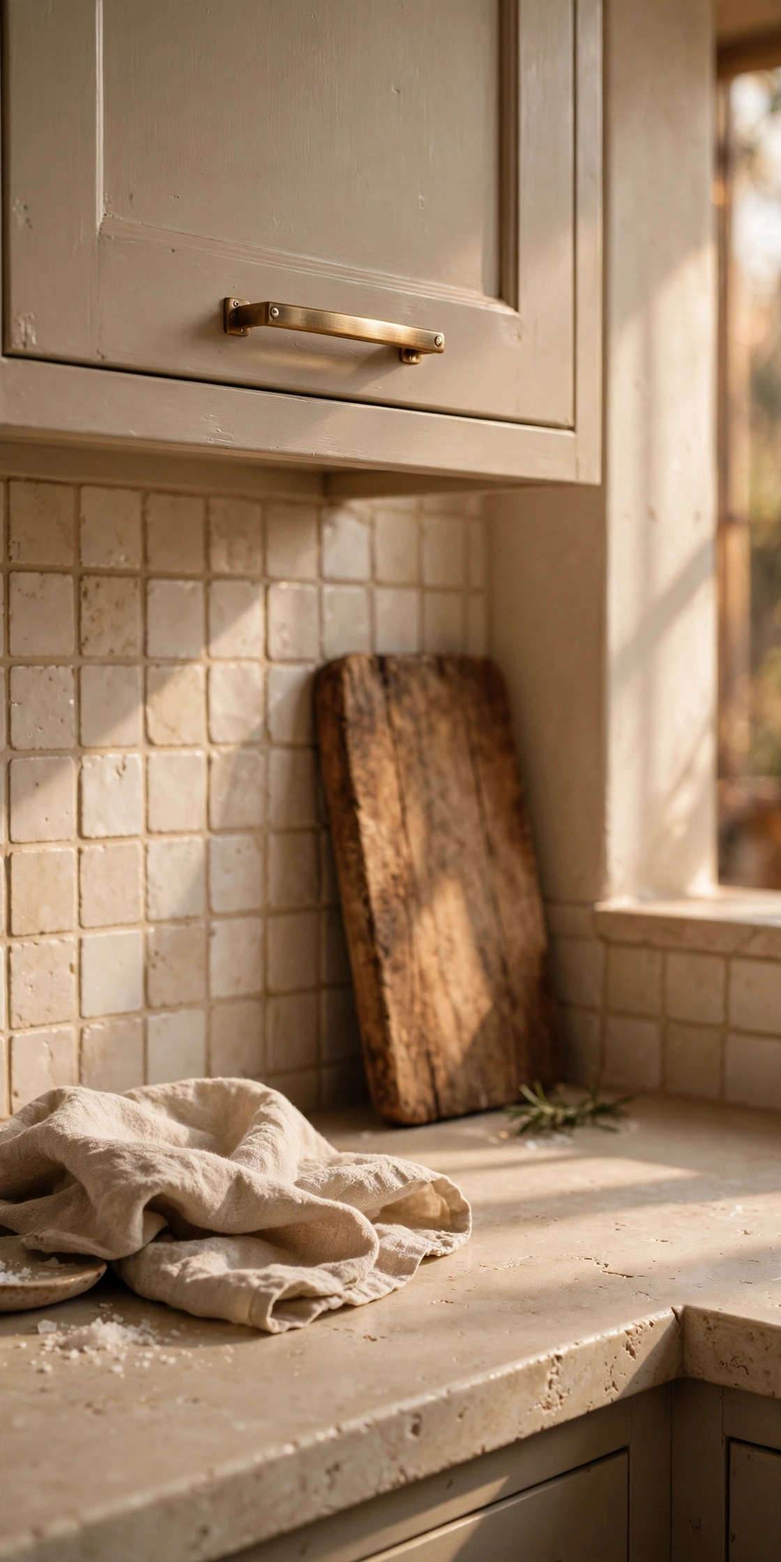
A beige-greige like Sherwin-Williams Accessible Beige (SW 7036) stays warm without turning yellow in most light. Use it on the lower cabinets and the walls, then trim with a soft white such as Alabaster. Add brass hardware, a light oak floor, and a creamy stone counter. Mid-tone neutrals hide smudges and scuffs better than bright white, so this choice suits busy family kitchens. The brass picks up the gold in the beige, which makes the whole scheme feel planned.
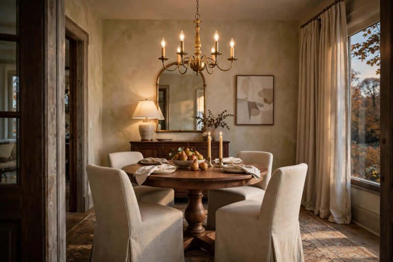
3. Mushroom taupe cabinets with warm white walls

Mushroom taupe is the quiet favorite of the moment. Try a mid-tone like Farrow and Ball Elephant’s Breath on the cabinets and a lighter warm white, such as Joa’s White or Oxford Stone, on the walls. Pair it with honed marble or a soft quartz counter and bronze or matte black hardware. Because the cabinets are darker than the walls, the room gets contrast without leaving the neutral family. The result feels grown-up and calm, and it works well with both modern and traditional doors.
4. Sandy beige walls with cream cabinets
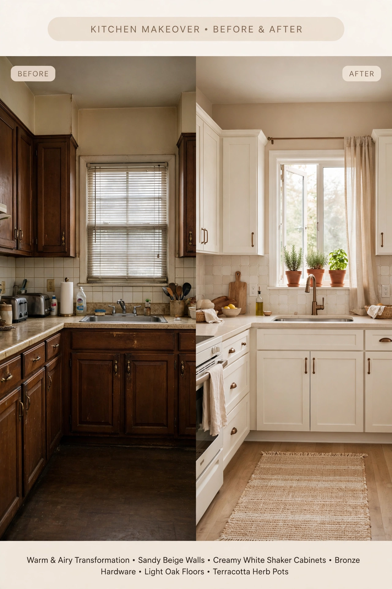
Flip the usual plan and let the walls carry the color. A warm, sandy beige like Sherwin-Williams Kilim Beige (SW 6106) on the walls makes cream cabinets look fresh and bright. Keep the trim in a soft white, pair the room with light oak floors and bronze hardware, and use a pale tile for the backsplash. The sand tone feels like sunlight on a beach towel, so it adds warmth even on gray days. It is also the lowest-risk way to try a warm neutral, since walls are far easier to repaint than cabinets.
5. Tonal layers of cream, putty, and stone
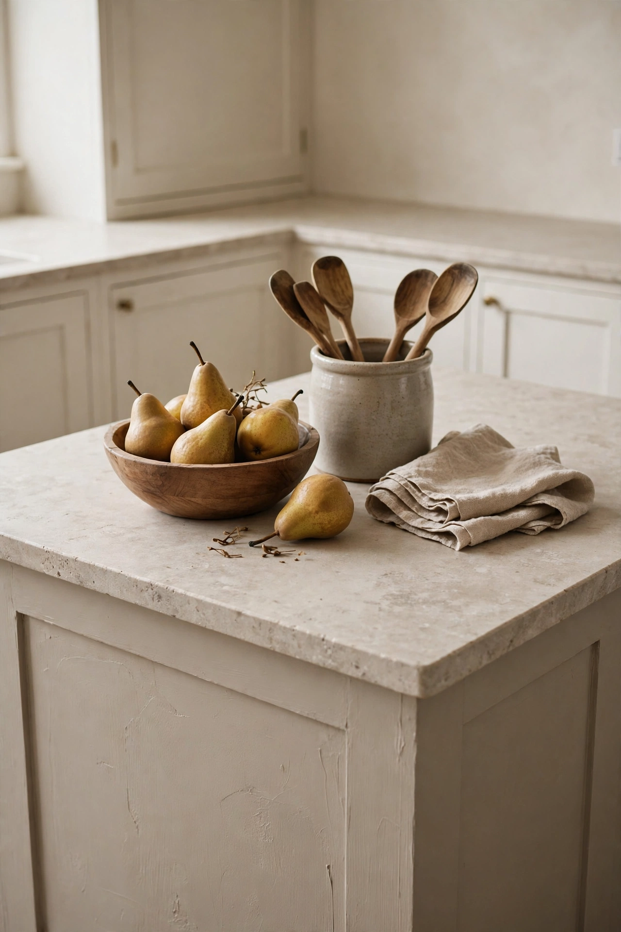
Here you use three neutrals that share one undertone. Paint the perimeter cabinets a creamy white, the island a deeper putty like Sherwin-Williams Softer Tan (SW 6141), and the walls a warm greige-white such as Shoji White (SW 7042). Add a stone counter in a similar family. Layering close shades gives depth without a single bold color, and it looks more thoughtful than one flat tone. Texture does the rest: use a matte finish on the cabinets and a glazed finish on the tile.
6. Putty color-drenched kitchen

Color drenching means painting the walls, cabinets, and trim in one shade. Choose a light putty like Benjamin Moore Pale Oak (OC-20) so the room stays bright. Use a matte finish on the walls and a satin finish on the cabinets and trim, so the surfaces catch light differently. Add a warm white stone counter and unlacquered brass pulls. Without color breaks between cabinets and walls, the eye reads one calm shape, which makes a small or boxy kitchen feel larger and more finished.
7. Walnut brown with plaster-white walls
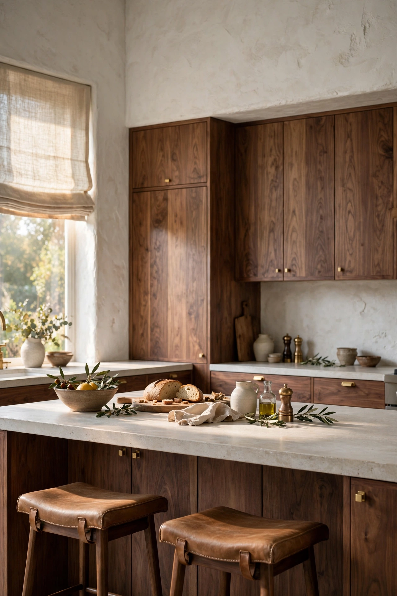
Rich wood can act as a warm neutral too. Choose walnut-stained cabinets or a walnut island and set them against plaster-look walls in a soft chalky white. Add honed stone counters, simple brass hardware, and a linen roman shade. The walnut grounds the room, and the pale walls keep it light. Brown reads as a dark neutral, so it pairs with cream, stone, and brass without any extra color.
8. Khaki cabinets with stone counters
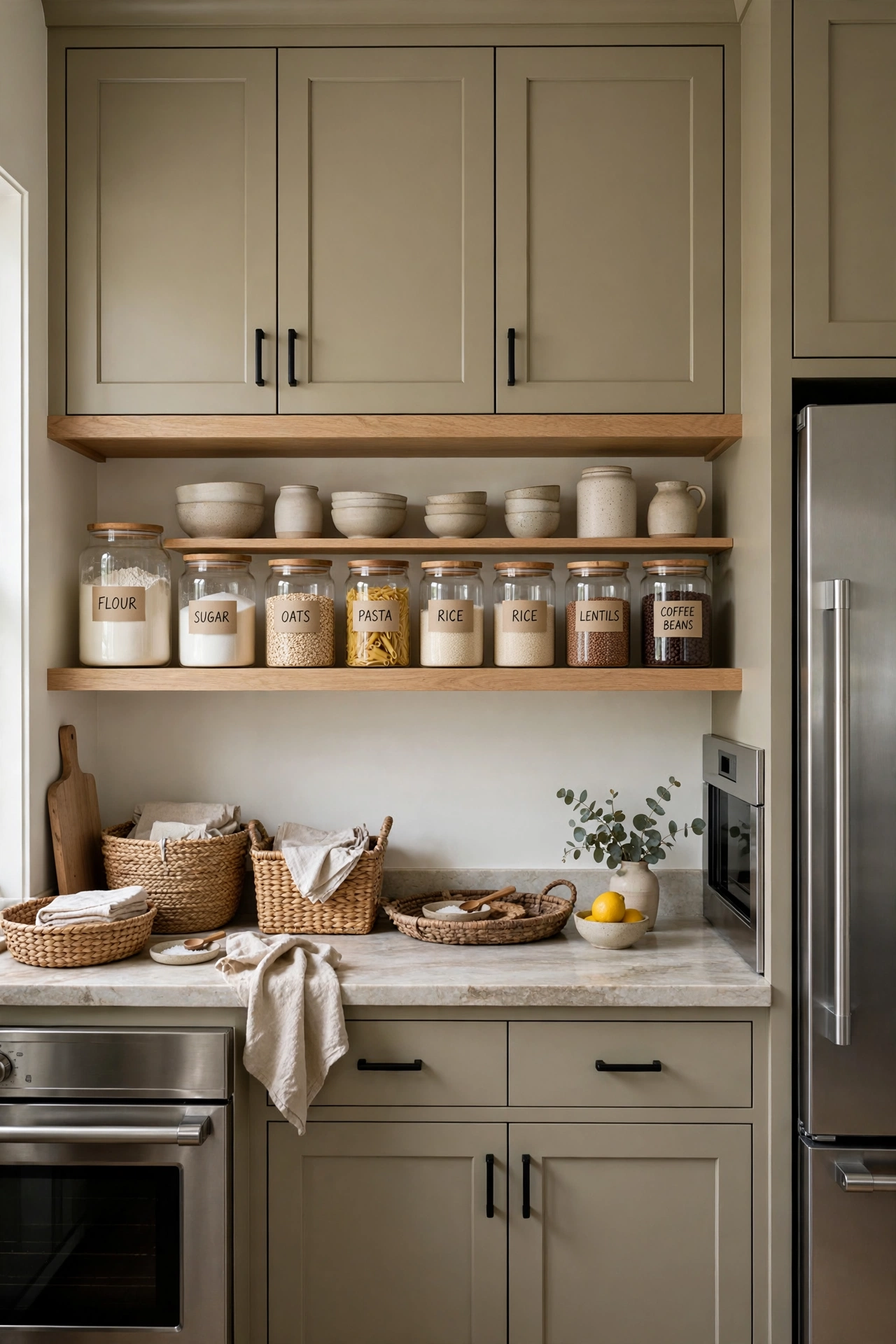
Khaki is a warm tan with a hint of green and brown, so it sits between white and a deeper color. Paint the cabinets in a khaki neutral like Sherwin-Williams Universal Khaki, and keep the walls a pale warm white. Choose a stone counter with soft veining, white oak open shelves, and black or bronze hardware. The shade feels grounded rather than flashy, and it hides daily wear better than white. It also looks good beside stainless steel appliances, which many kitchens already have.
9. Warm beige with a sage green island

Green now counts as a neutral for many designers, and sage sits especially well next to beige. Use warm beige on the perimeter cabinets and a muted sage, such as Sherwin-Williams Svelte Sage (SW 6164), on the island. Cream stone counters, brass fixtures, and a wood stool or two complete the room. The sage has a gray, earthy tone, so it feels calm instead of bright. Keeping the perimeter beige means the green stays a single, easy-to-change feature.
10. Warm greige with black accents
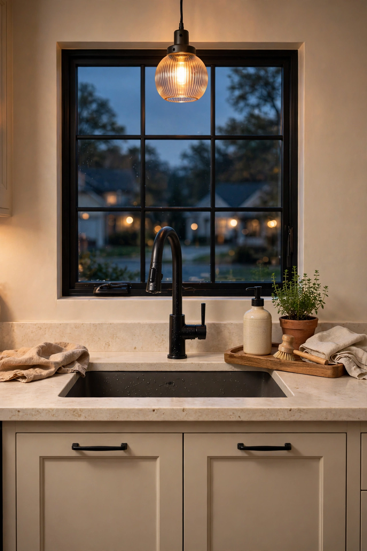
Black gives a warm neutral kitchen a clean outline. Paint the cabinets a warm greige, then add three black details only: the faucet, the pulls, and the light fixtures or window frames. Use a stone counter in cream or soapstone gray, and bring in wood with a stool or open shelf. Limiting the black to a few items keeps it sharp without feeling heavy. Warm bulbs around 2700K stop the black from looking cold at night.
Related: 17 Outdoor Kitchen Layout Ideas Architects Swear By
11. Cream cabinets with handmade tile and antique brass
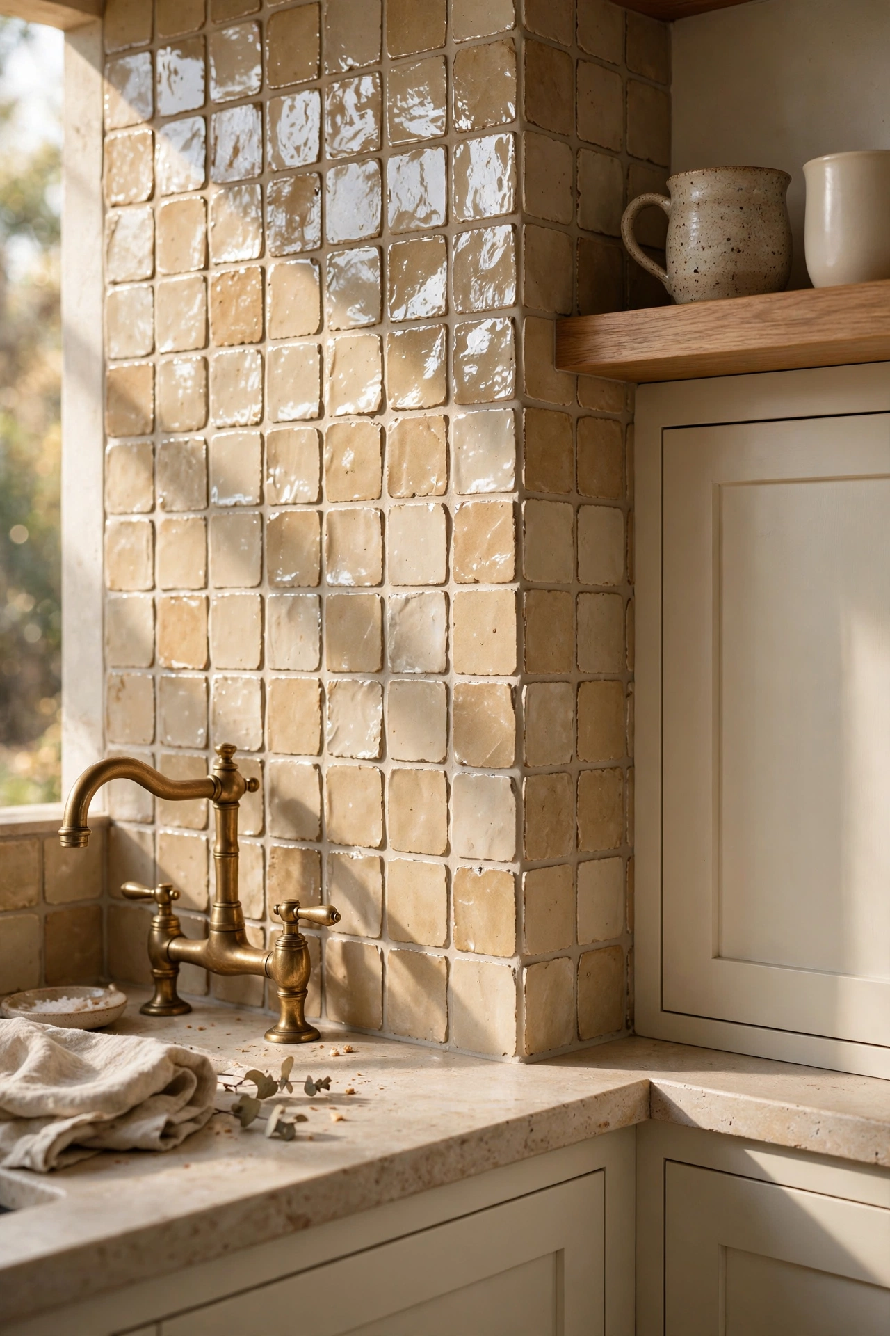
Let the backsplash add the interest. Pair cream cabinets with handmade zellige-style tile in white or oat, where the glaze varies from tile to tile. Add antique brass hardware and a white oak shelf. The uneven glaze reflects light in small flashes, a bit like water, so the wall feels alive even though the color is quiet. This is a smart way to add depth when you want to keep the paint simple.
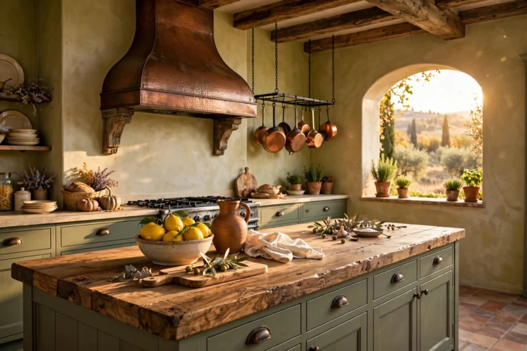
12. Limestone and travertine surfaces

Let natural stone provide the color. Use warm white cabinets, then add a honed limestone or travertine-look counter, a stone slab backsplash, or a stone range hood. Pick a honed finish, since it hides small scratches better than polished stone. Natural stone is porous and can stain, so seal it and wipe up oil and wine quickly. The soft veining and sandy tones give the kitchen an organic look that paint alone cannot copy.
13. Plaster blush neutral

A very soft pink-beige can work as a neutral when it is dusty and light. Choose a plaster-like shade with a gray or tan base so it reads as warm sand, not as pink. Pair it with white trim, antique brass, and a pale wood floor. This color shines in a kitchen with lots of daylight, where it glows softly at midday. In a dim room it can turn flat, so always test it on the wall first.
14. Butter cream for dim or north-facing kitchens
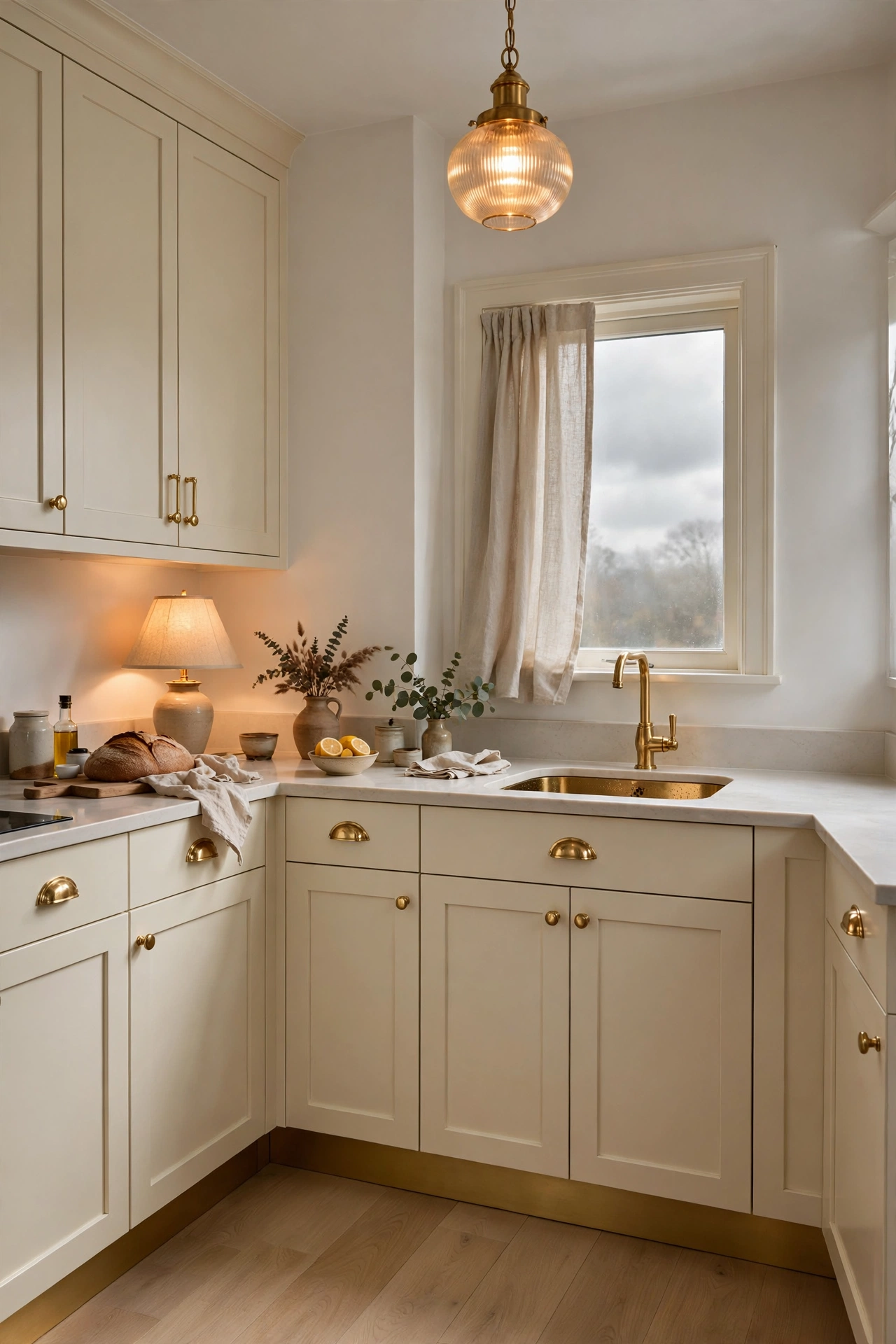
A north-facing or shaded kitchen needs a color that holds light. Choose a cream with a soft golden base instead of a stark white, and keep the trim a clean warm white. Use warm bulbs, reflective brass, and a light wood floor to bounce what daylight you have. Cool daylight can turn white cabinets dull or gray, while a buttery cream stays friendly in that same light. Paint a big sample and check it on a cloudy afternoon before you decide.
Related: 16 Boho Kitchen Ideas That Feel Collected, Not Costume
15. Warm beige with clay accents
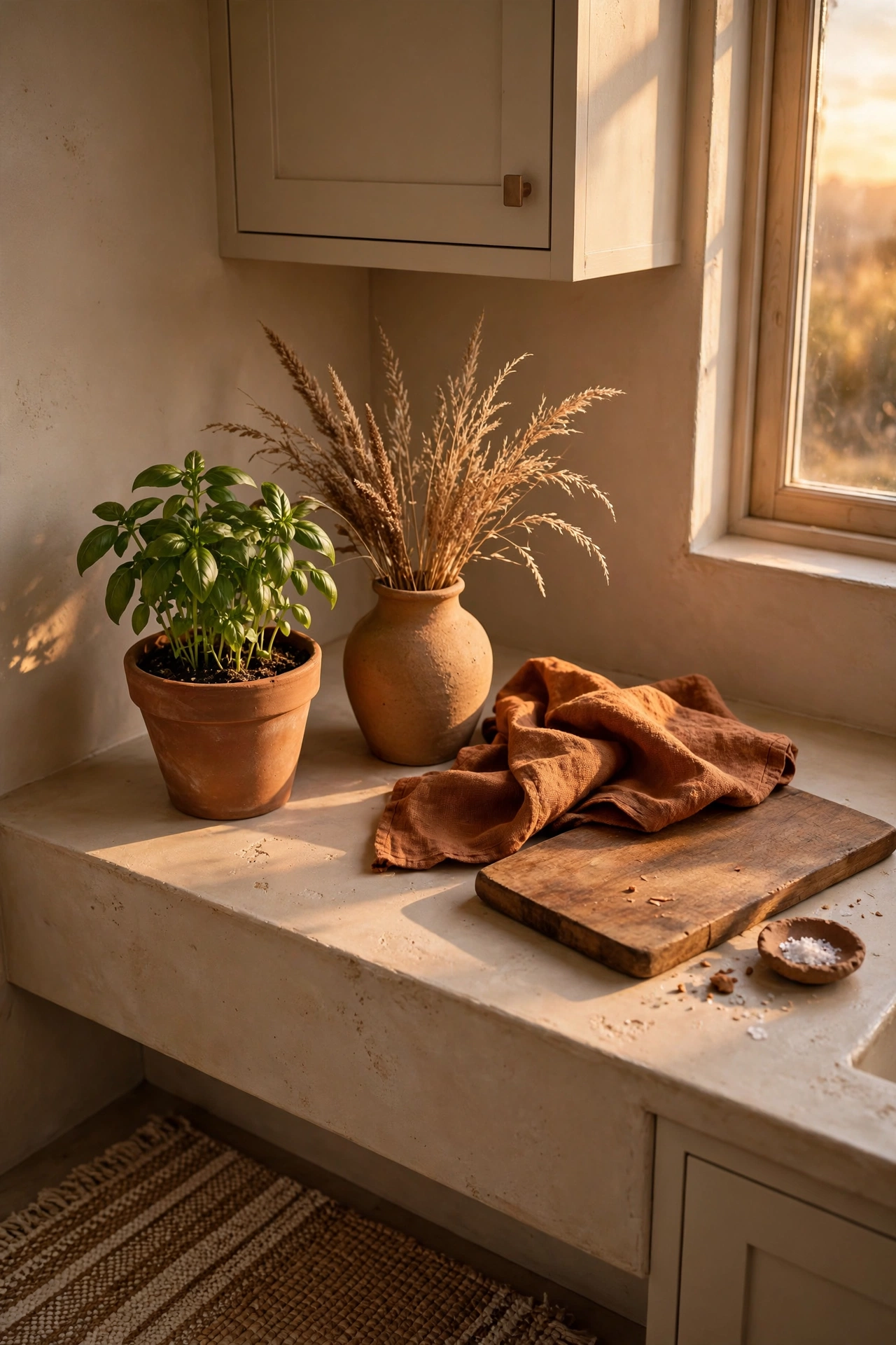
Start with beige cabinets and walls, then add earth tones in pieces you can swap. Think terracotta pots, a clay-colored vase, a rust linen towel, and a woven rug in oat and brown. If you want a bigger commitment, use a clay-toned floor tile or backsplash. All of these shades come from the same family as beige, so nothing clashes. Accessories are cheap to change, so you can test the look before you paint or tile anything.
Styling tips that work in any warm neutral kitchen
- Match undertones. Look at the floor, counter, and tile first. If they lean yellow, pick a yellow-based cream. If they lean gray-brown, pick greige or taupe.
- Add wood. Oak, walnut, or maple on a stool, shelf, or island stops a neutral room from feeling flat.
- Mix finishes. Pair matte paint with glazed tile, honed stone, and one shiny metal so there is texture to look at.
- Choose one metal. Aged brass warms cream and beige. Bronze suits taupe and mushroom. Matte black sharpens greige.
- Keep trim close. Use a soft white that shares the room’s undertone, not a bright blue-white.
- Use warm bulbs. Look for LEDs near 2700K so the cream does not turn gray at night.
- Layer lighting. Add under-cabinet lights, a pendant, and a lamp or sconce so no corner is lit only from the ceiling.
- Repeat the color once. Echo the cabinet shade in a bowl, rug, or towel so the palette feels intentional.
Practical implementation ideas
A short plan avoids the usual repaint. Use this order for a cabinet or wall refresh.
- List the finishes you are keeping: floor, counter, backsplash, and appliances.
- Name their undertone: yellow, pink, or green-gray.
- Pick three paint chips with the same undertone and different depth.
- Paint large sample boards or two-foot squares on at least two walls, two coats each.
- Check them at morning, noon, and evening, with and without the lights on.
- Choose a finish: matte or eggshell for walls, satin or semi-gloss cabinet enamel for doors and drawers.
- Clean, sand, and prime cabinets before painting so the color grips.
- Add hardware and lighting after the paint cures, then style the counters last.
This table shows which direction to lean for each kitchen light.
| Window direction | What the light does | Warm neutral to lean toward |
|---|---|---|
| North | Cool, gray, and soft | Buttery cream, warm sand, golden beige |
| South | Warm and bright most of the day | Greige, mushroom, soft taupe |
| East | Warm in the morning, cooler later | Warm white, light beige |
| West | Cool until late, then golden | Soft greige, putty, warm cream |
Paint labels often list a Light Reflectance Value, or LRV, on a scale from 0 to 100. A higher number reflects more light, so choose a higher LRV for a dim room and a lower one when you want more depth.
Common mistakes to avoid
- Choosing from a tiny chip. A two-inch square lies. Paint a large board and look at it in the room.
- Ignoring undertones. A pink beige next to an orange floor or a green-gray next to cream tile will look off, even if each color is nice on its own.
- Using a cool white trim. A blue-white trim makes warm cabinets look dingy. Match the trim to the room’s undertone.
- Going too yellow in a sunny room. Very yellow creams can glow like butter in south light. Try a greige or sand instead.
- Skipping primer and prep. Cabinets need cleaning, sanding, and primer, or the paint will chip and the color will look patchy.
- Using cool bulbs. Bulbs rated 4000K or higher turn cream and beige gray. Switch to about 2700K.
- Mixing too many neutrals. Three neutrals with three different undertones fight. Pick one undertone and stay with it.
- Forgetting texture. An all-neutral room with no wood, stone, or glaze can look flat. Add at least three textures.
- Painting everything one sheen. Use matte walls and satin cabinets so the surfaces separate.
Small-space alternatives
Small kitchens do well with warm neutrals because they can feel bright and cozy at the same time.
- Drench it. Paint walls, cabinets, and trim in one light shade (idea 6) so there are no hard breaks.
- Go lighter on LRV. Higher-reflectance creams and warm whites bounce more light around a tight room.
- Match the uppers to the wall. When upper cabinets blend with the wall, the room feels taller.
- Add glazed tile. A glossy or zellige-style backsplash (idea 11) reflects light.
- Light every layer. Under-cabinet lights, a pendant, and a lamp on the counter open up corners.
- Limit the accents. One wood item and one metal finish are plenty in a small room.
Budget-friendly alternatives
- Paint the walls only. Idea 4 shows how sandy walls can make existing cabinets look new.
- Change the hardware. Swapping pulls for aged brass or bronze changes the mood for the cost of a few handles.
- Switch the bulbs. Warm 2700K bulbs cost very little and fix cold-looking cream.
- Repaint the cabinets yourself. With proper cleaning, sanding, and primer, a cabinet-grade enamel can last. Take your time on prep.
- Add wood for less. A wooden cutting board, bowl, or stool brings in warmth without a remodel.
- Use renter-friendly changes. Try removable tile stickers, a warm rug, and linen towels in your chosen shades.
- Thrift your brass and ceramics. Secondhand bowls, trays, and candlesticks add depth for a few dollars.
Pro styling recommendations
- Use sample boards. Paint large boards, and move them around the room instead of painting the wall directly.
- Check the photo. Take a phone picture of your samples in black and white. If the shades look the same, add more depth between the cabinets and the walls.
- Space your shades. Keep cabinets and walls about two or three shades apart on the paint strip for a soft contrast.
- Choose grout with care. Pick a grout color close to the tile so the backsplash looks calm.
- Check everything at night. Review the color after dark with your usual lamps and bulbs.
- Bring samples together. Hold the paint, counter, tile, and hardware samples side by side before you buy.
- Repeat once, then stop. Echo the main color in one accent and let the rest of the room rest.
Final thoughts
The best warm neutral kitchen is not the trendiest one. It is the one that still looks calm at 7 a.m., at noon, and under the lamps at night.
Pick a single undertone, choose one of the 15 ideas that fits your light, and test the paint on big boards. Then add wood, stone, and one metal, and let those do the talking.
Save this guide to a Pinterest board now, so your next paint run starts with a plan instead of a guess.