19 Sofa Color Psychology Ideas for Your Living Room
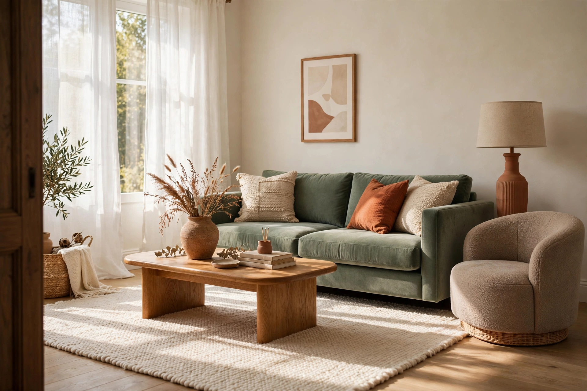
Think about the last time you walked into a room and felt your shoulders drop. Maybe it was a soft, sunny living room with a creamy sofa. Maybe it was a dark green one with a lamp glowing beside it.
Your sofa is the biggest block of color in the room. It takes up the most space, and everyone looks at it. That is why the shade you pick can change how the whole room feels, from airy and calm to cozy and moody.
This guide covers 19 sofa colors, from ivory to mauve. For each one, you will see the feeling it often creates, how to style it, and what to watch for in real life. Save the shades you like, and then use the tips near the end to choose.
Quick answer: In sofa color psychology, warm neutrals like ivory and oatmeal feel open and calm, blues and greens are often linked with calm and nature, warm shades like terracotta and mustard feel friendly and lively, and deep tones like navy and espresso feel grounded and cozy. Pick the mood you want, test the shade in your own light, and match it to how you live.
What the Research Really Says (Read This First)
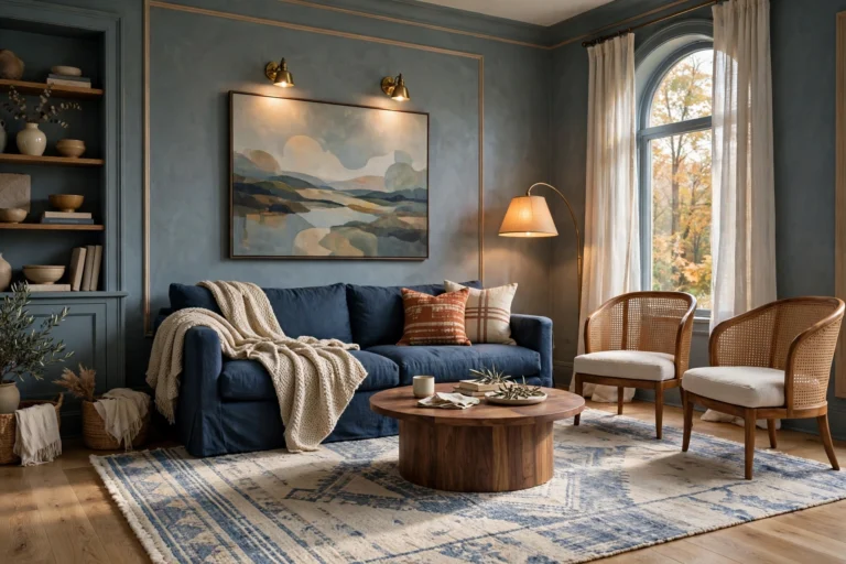
Color psychology is popular online, and it is also messy. Here is the honest version.
Colors carry associations. Many people link blue and green with calm and nature, and red and orange with warmth and energy. Those links are real, but they vary by person and culture.
Studies are mixed. Some research finds that color affects mood and alertness. Other studies find little effect, especially from wall color alone. Results often depend on the exact shade and the setting.
Related: 17 Living Room Wall Art Layering Ideas for a Focal Point
Brightness and saturation matter a lot. A pale, soft color often feels calmer than a very bright, vivid one, even if both are the same hue. Dark, muted shades tend to feel cozier.
Context changes everything. Light, walls, fabric, and your own memories shape how a color feels in a room.
So treat the “moods” here as design guidance, not medical facts. A color will not fix stress. But picking a sofa that fits the feeling you want, and the way you live, is a smart design move.
Quick Mood Picker
| If you want your living room to feel… | Try these sofa colors |
|---|---|
| Open and airy | Soft ivory, oatmeal, dusty blue |
| Calm and restful | Sage green, mushroom taupe, warm gray |
| Grounded and cozy | Espresso, cognac, olive, navy |
| Warm and social | Terracotta, rust, mustard |
| Rich and dramatic | Emerald, burgundy, teal |
| Soft and gentle | Blush, dusty mauve |
| Formal and polished | Charcoal, navy |
Table of Contents
Also covered below: how to choose, styling tips, mistakes to skip, small-space and budget tips, pro advice, and a full FAQ.
1. Soft Ivory Sofa
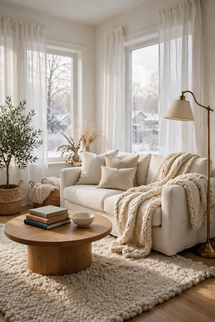
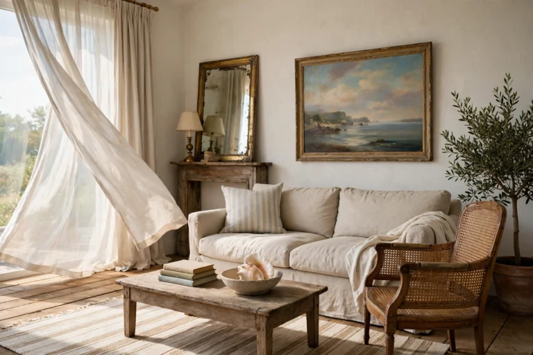
An ivory sofa often reads as open, clean, and gentle, because light colors reflect more light and weigh less on the eye. It suits small or north-facing rooms, where the extra brightness helps. Choose a warm ivory with a creamy undertone, since stark white can feel cold and shows every mark. Layer textures like a chunky knit throw, a wool rug, and a few linen pillows, so the room does not feel flat. Warm wood and brass add depth against all that softness. For real life, pick a performance fabric or a washable slipcover if you have kids or pets.
2. Oatmeal Linen Sofa
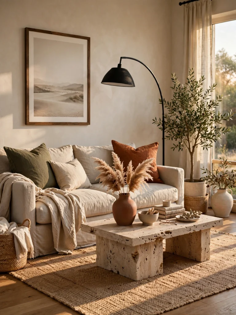
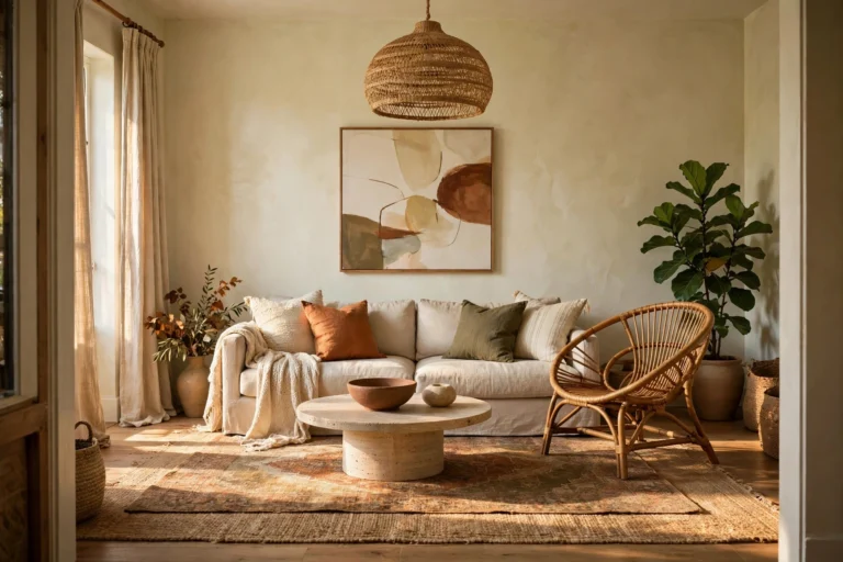
Oatmeal sits between cream and tan, and it feels relaxed, natural, and easy to live with. Linen or linen-blend fabric adds a soft, slightly rumpled texture that looks casual instead of fussy. Pair it with earthy colors, like olive pillows, a terracotta vase, and a jute rug. A black metal lamp or a dark frame adds contrast so the palette does not blur together. The color hides crumbs and light dust better than white, but linen can wrinkle. A slipcover or a tight-weave blend keeps it looking neat.
3. Mushroom Taupe Sofa
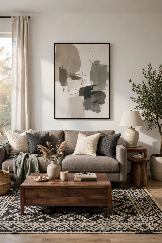
Mushroom taupe is a gray-brown that feels quiet and grounded, like a calm background shade. It is a good pick if you want a neutral that is warmer than gray and darker than cream. The undertone changes with the light, so test a swatch in your room at morning, noon, and night. Pair it with soft white walls, walnut wood, and a rug in cream or soft black. A single accent in muted green or dusty blue keeps it from feeling flat. It hides marks well, which makes it a smart choice for busy homes.
4. Warm Gray Sofa
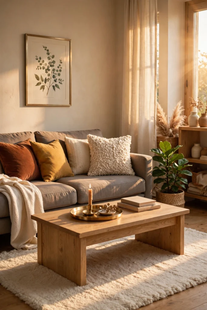
Gray has a reputation for being plain, but a warm gray with a hint of beige feels soft and calm instead of cold. It works as a flexible base that lets pillows, art, and rugs do the talking. Avoid blue-based grays if your room gets little sun, since they can look flat and chilly. Pair a warm gray sofa with cream walls, light oak, and accents in rust, mustard, or deep green. Add texture with a bouclé pillow or a nubby throw. Gray shows pet hair less than black or white, but it does show lint, so keep a roller nearby.
5. Charcoal Sofa
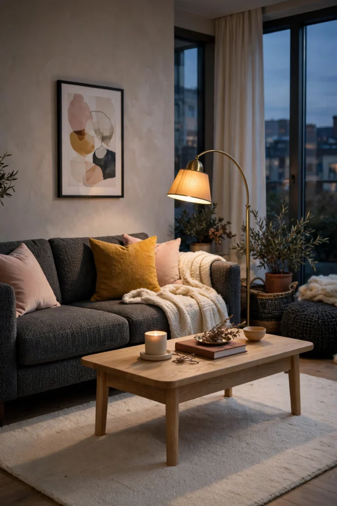
A charcoal sofa feels formal, steady, and a little dramatic, because dark colors carry more visual weight. It anchors a big room well, and it hides stains, pets, and daily wear. In a small or dim room it can feel heavy, so brighten the walls, add a light rug, and use a warm lamp nearby. Pair it with white or soft greige walls, natural wood, and pops of mustard or blush pink. Add a few light pillows so the sofa does not become a dark block. Choose a textured fabric over flat, since texture adds life to a dark color.
6. Navy Sofa
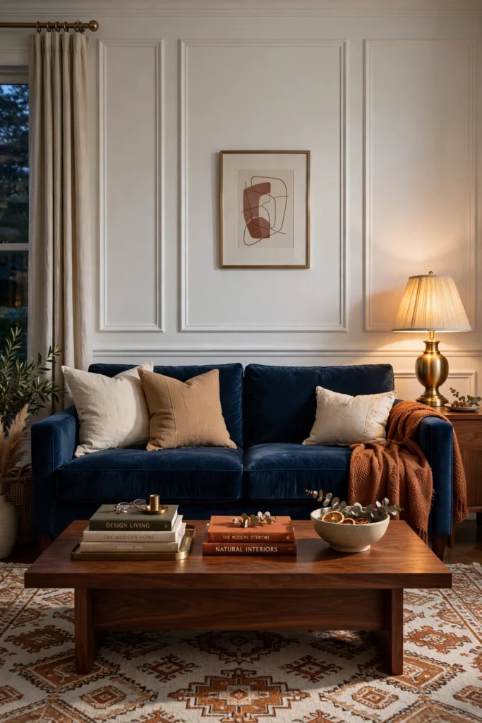
Navy is a deep blue that often feels calm, steady, and trustworthy, and many designers treat it like a neutral. It looks sharp against white walls and warm wood, and it also looks rich in a dark, moody room. Velvet makes navy look deep and glossy, while linen makes it look soft and coastal. Pair it with cream or camel pillows, brass lamps, and a patterned rug in rust or ivory. Keep a light bulb with a warm tone nearby, since cool bulbs can make navy look almost black. It hides spills well, but pale lint and pet hair show up, so keep a lint roller handy.
7. Dusty Blue Sofa
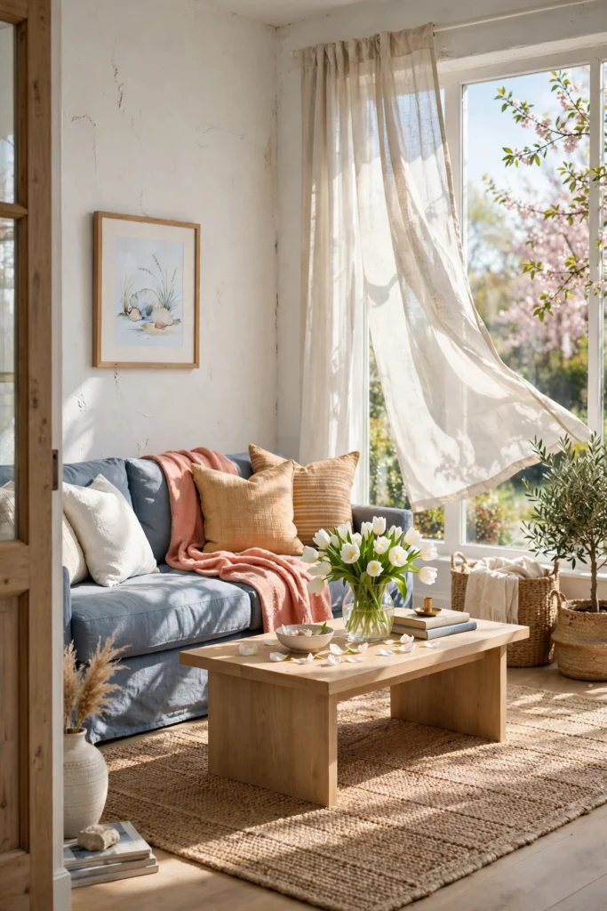
Dusty blue is soft and muted, with a little gray in it, so it feels calm and gentle without being cold. It is a good choice for people who love blue but want a lighter feel than navy. It works well in bright rooms, where it looks fresh and airy, and in coastal or cottage styles. Pair it with white walls, light wood, and warm accents like honey or soft coral, so the room does not feel chilly. A woven basket, a jute rug, or linen curtains add warmth. Check the fabric under your own lamps first, since blue-grays can shift a lot.
8. Teal Sofa
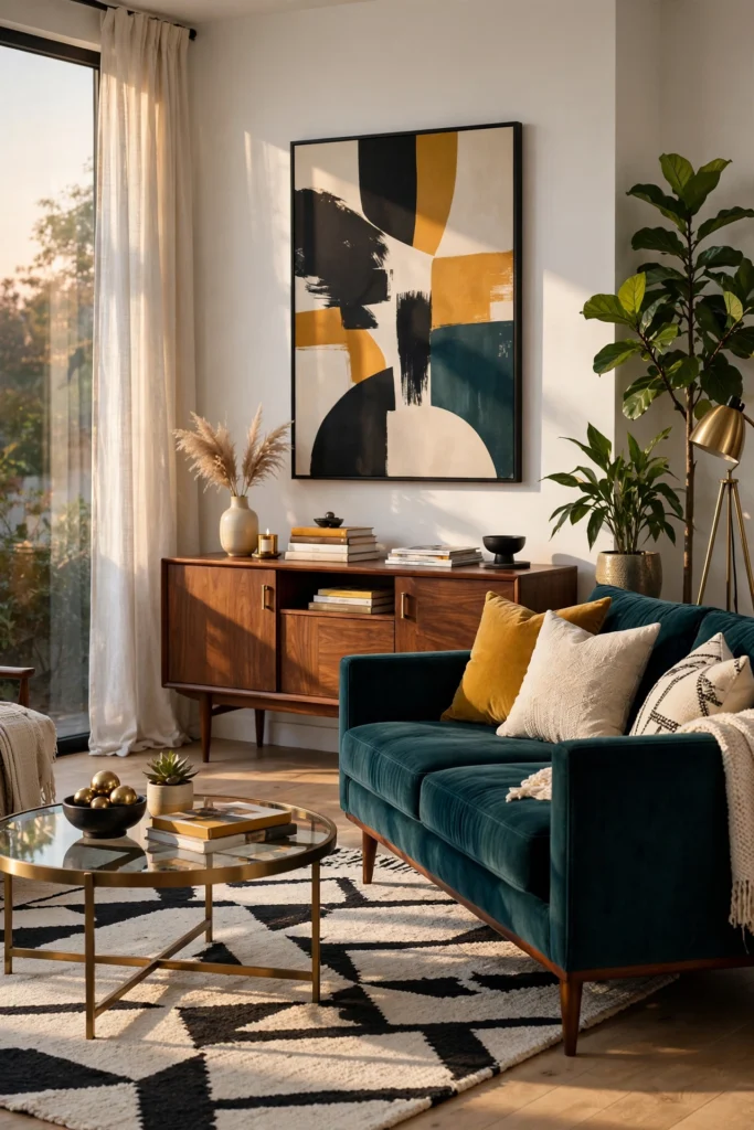
Teal mixes blue and green, so it feels fresh and a little dramatic, like deep water. Designers are using blue-green fabrics because they shift with the light, looking bluer in some moments and greener in others. A deep teal velvet sofa makes a strong focal point, so keep the walls and rug simple. Warm metals like brass and copper balance the cool color, and a rust or mustard pillow adds a lively contrast. Teal suits both modern and mid-century rooms. If your room gets a lot of changing daylight, look at swatches at several times of day before you commit.
Related: 20 Mid-Century Modern Living Room Ideas That Feel Warm
9. Sage Green Sofa
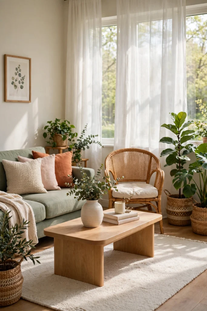
Sage is a soft, gray-green that often feels calm, fresh, and connected to nature. It is one of the easiest ways to bring color into a room, because it acts almost like a neutral and works with wood, white, and warm tones. It suits small or dim rooms, where bolder colors might feel heavy. Pair it with cream walls, natural oak, rattan, and a few pillows in oatmeal, blush, or terracotta. Add a plant or two so the green feels at home. Sage can look gray in low light, so test it in your actual room.
10. Olive Green Sofa
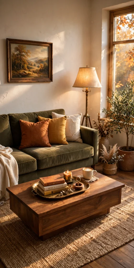
Olive is a warm, earthy green with a touch of yellow, and it feels grounded, relaxed, and a bit vintage. Designers often treat it as a new neutral because it blends with wood, leather, and natural fibers so easily. It looks especially good in a velvet or corduroy fabric, which adds depth to the muted color. Pair it with warm white walls, a jute or wool rug, and accents in rust, mustard, or cream. Brass or aged gold lamps add a soft glow. Olive hides crumbs and light stains well, which helps in a busy household.
11. Emerald Green Sofa
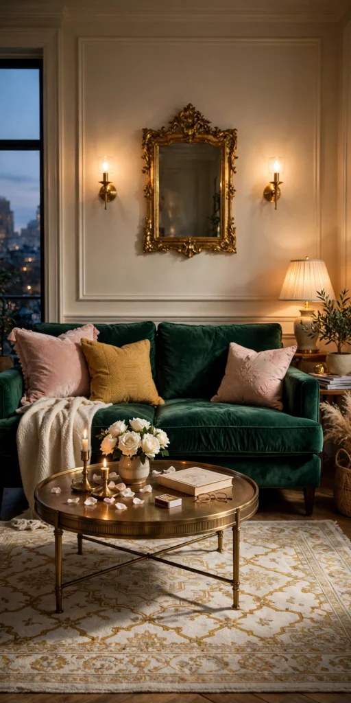
Emerald is a deep, jewel-like green, and it feels rich, bold, and a little dramatic. It makes a strong focal point, so let it be the star and keep the rest of the room simple. Velvet is the best fit, since the pile catches the light and deepens the color. Pair it with brass or gold accents, soft white or warm cream walls, and pillows in blush, navy, or mustard. In a dark room, add warm lamps and a lighter rug so the sofa does not swallow the space. Emerald is a bold choice, so check that you love it by hanging a large fabric swatch for a week.
12. Terracotta Sofa
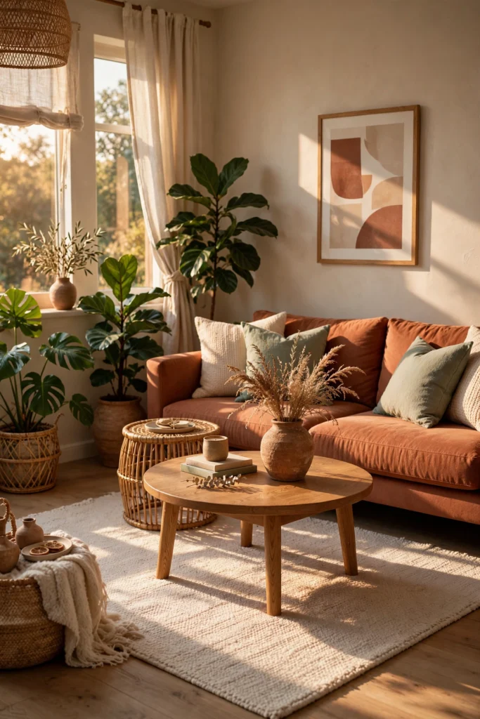
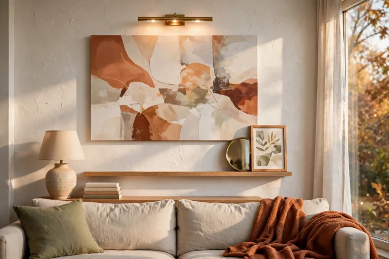
Terracotta is a soft, clay-like orange-brown that often feels warm, friendly, and sun-baked. It is a good way to bring warmth to a room without the loudness of bright orange. Pair it with cream walls, natural wood, and greens such as sage or olive, since green and terracotta sit well together. Add rattan, woven baskets, and dried grasses for an earthy feel. Terracotta works best in rooms with decent light, and in dim rooms it can look muddy, so add warm bulbs. It hides dust and light wear, and it is forgiving for family use.
13. Rust Sofa
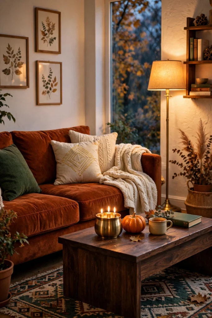
Rust is deeper and redder than terracotta, with a cozy, autumn feel that suits fall and winter. It adds energy and warmth, and it is lively without being loud. Velvet or leather-look fabric makes it look rich. Pair it with deep green, navy, or cream, and let wood and brass add warmth. Keep the walls light, such as warm white or soft greige, so the rust stands out. Rust can overpower a small room, so use it in rooms with good light, or choose a smaller loveseat.
Related: 17 White Living Room Ideas That Prove Minimalism Feels Inviting
14. Mustard Sofa
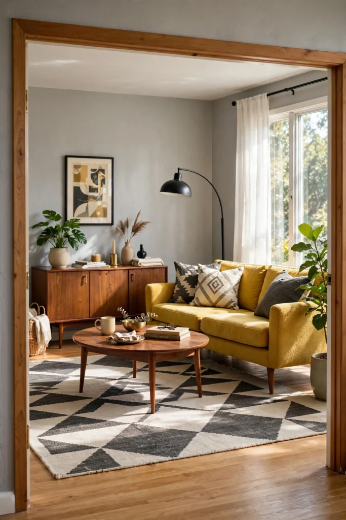
Mustard is a golden yellow with some brown in it, and it often feels cheerful, friendly, and full of personality. It is a classic pick for mid-century rooms, where it looks great with walnut wood and simple lines. Pair it with charcoal, navy, or soft gray so the yellow has a calm partner. Keep the walls neutral, and use only one or two other colors so the room does not feel busy. Mustard can look loud in a small space, so consider a loveseat or a single chair first. A muted mustard looks more relaxed than a bright yellow.
15. Blush Pink Sofa
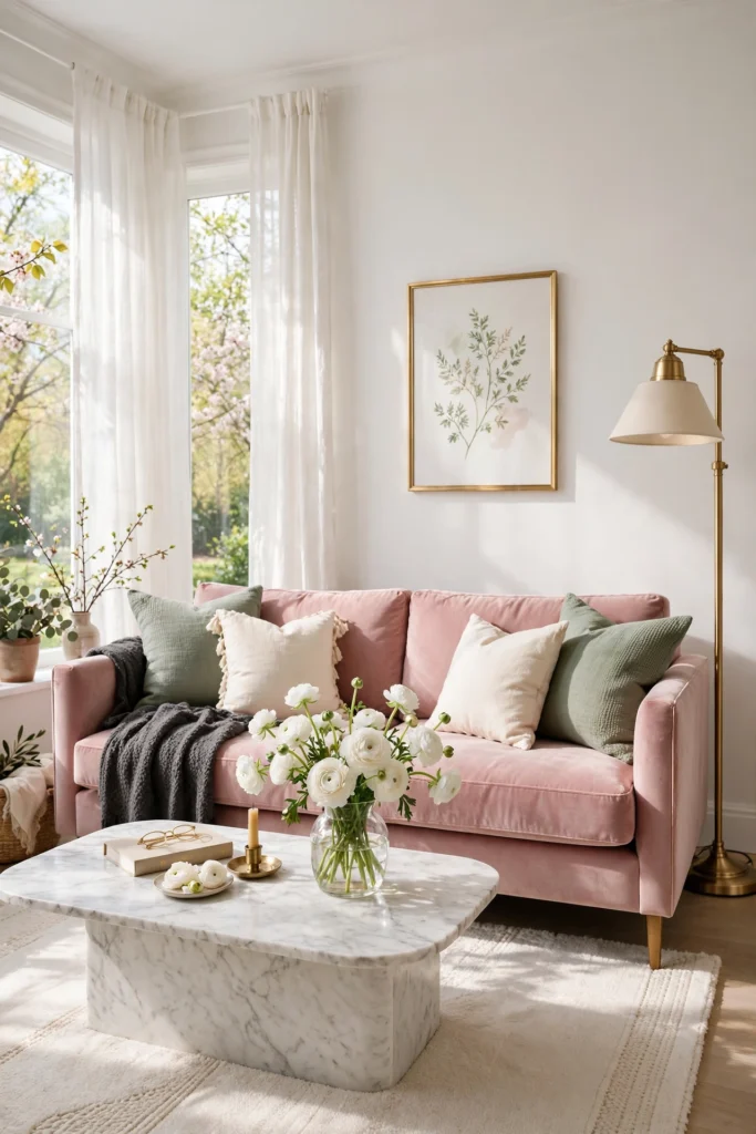
Blush pink is a soft, warm pink that often feels gentle, welcoming, and calm. It adds color without the weight of a dark shade, so it can feel fresh and light. To keep it grown-up, pair it with sage green, charcoal, or warm wood, and avoid pairing it with too many other pastels. A velvet blush sofa feels glamorous, while a linen one feels soft and relaxed. Brass or black metal accents keep the look grounded. Pale pink shows stains more than darker shades, so choose a performance fabric if you have kids or pets.
16. Burgundy Sofa
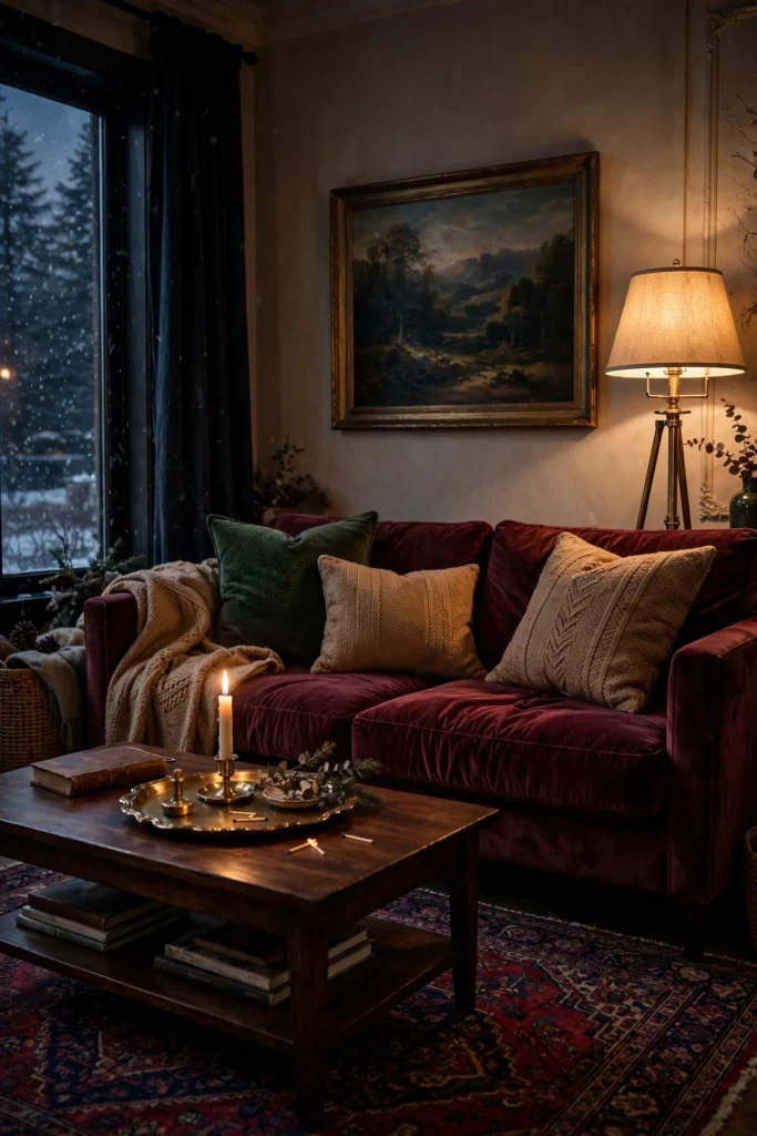
Burgundy is a deep, wine-like red that feels rich, warm, and cozy, with more calm than bright red. It fits traditional, moody, and vintage-inspired rooms, and it shines in velvet or leather. Pair it with deep green, navy, cream, or camel, and let dark wood and brass add polish. Choose walls in warm white, soft greige, or a deep tone if you want a library feel. Burgundy can feel heavy in a small, dim room, so add light curtains and warm lamps. It hides spills well and ages gracefully in leather.
17. Cognac Leather Sofa
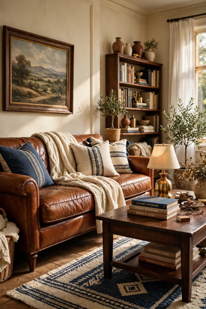
Cognac is a warm, golden brown, and in leather it feels confident, classic, and lived-in. It gets better with age, since leather softens and gains character with use. Pair it with cream walls, deep green or navy accents, wool rugs, and warm wood. A chunky knit throw and a few plain pillows soften the look and keep it from feeling stiff. Leather is easy to wipe clean, but it can stick in hot weather and show scratches. Use a leather conditioner a few times a year, and keep it out of harsh direct sun, which can fade it.
18. Espresso Brown Sofa
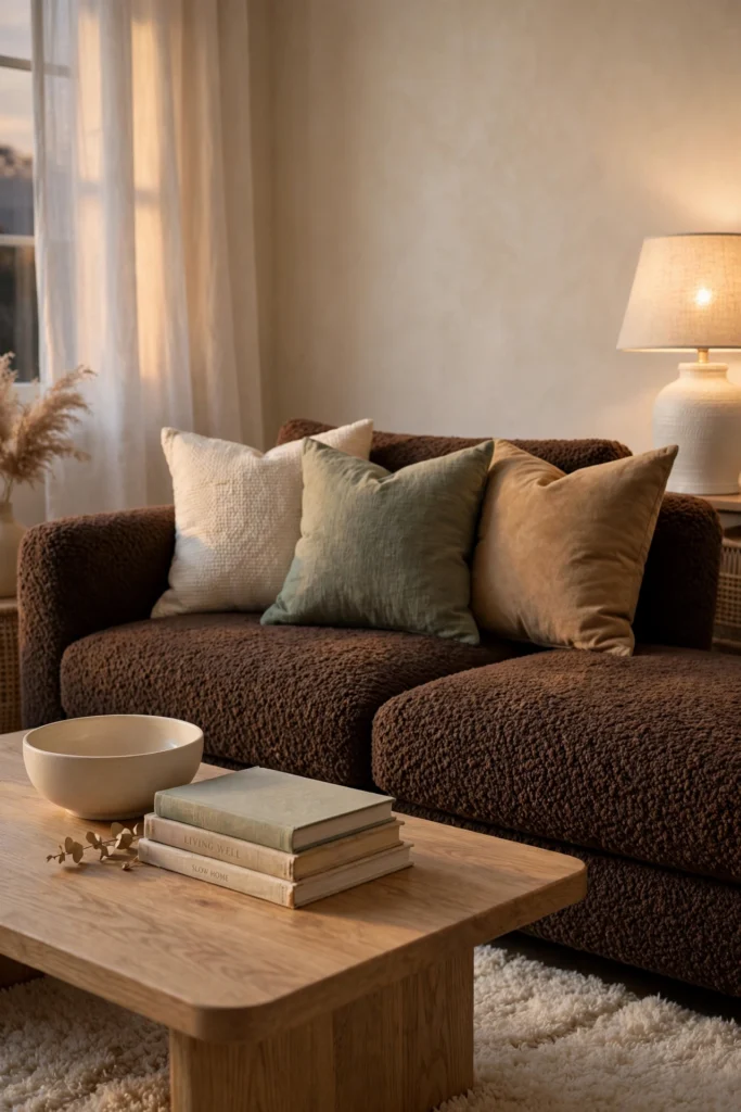
Espresso is a very deep brown, and it feels grounded, calm, and secure, like a warm cocoon. Brown is returning in living rooms, often in bouclé, chenille, and leather, as a warmer alternative to black or charcoal. It hides stains, pets, and wear better than almost any other shade. Pair it with cream walls, a light rug, and accents in sage, rust, or camel to keep it from feeling heavy. Lighter wood, white lamps, and sheer curtains add lift. Add plenty of texture, since a dark brown looks best with some variety.
19. Dusty Mauve Sofa
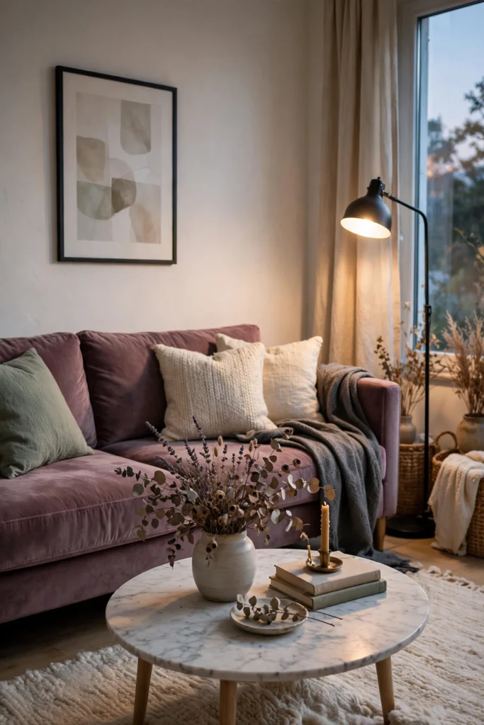
Dusty mauve is a muted pink-purple with gray in it, and it feels soft, thoughtful, and a little unexpected. It is a quieter way to bring in a pastel, since the gray keeps it grown-up. Pair it with warm white walls, sage or olive green, and charcoal for contrast, then add brass or black accents. It looks lovely in velvet, where it takes on a gentle shimmer. Mauve can shift between pink and gray in different light, so test a swatch at different times of day. It is a good choice for a bedroom-like, restful living room.
How to Choose Your Sofa Color: A Simple Method
- Name the feeling. Write down three words for how you want to feel in the room, such as “calm, warm, open.”
- Check your light. North-facing rooms get cooler, softer light, so warm shades help. South-facing rooms get warm, bright light, so most colors work, but strong yellow tones can feel intense.
- Check the undertone. Look at the tiny hint of color inside a neutral. Warm undertones lean yellow, pink, or red. Cool ones lean blue, green, or purple. Match the sofa undertone to your walls and floor.
- Test a big swatch. Tape a large fabric sample on your wall or drape it on your current sofa for several days, and view it in morning, afternoon, and evening light.
- Think about how you live. Kids, pets, snacks, and sun all change what works. See the table below.
- Check the fabric. The same color looks different in velvet, linen, bouclé, and leather.
- Plan the pairings. Choose a wall color, a rug, and two accent colors before you buy the sofa.
Sofa Color and Real Life
| Your situation | Good sofa colors | Why | Watch out for |
|---|---|---|---|
| Kids and snacks | Olive, espresso, charcoal, patterned mushroom | Dark or mid-tone colors and texture hide marks | Pale fabrics that show every spill |
| Pets with light fur | Oatmeal, warm gray, ivory (with performance fabric) | Light fur blends in | Velvet and chenille hold hair |
| Pets with dark fur | Charcoal, navy, espresso | Dark fur blends in | Light fur shows up |
| Lots of sun | Olive, charcoal, mushroom | Muted shades fade less visibly | Strong sun can fade bright reds and pinks |
| Small or dim room | Ivory, oatmeal, sage, dusty blue | Lighter shades reflect more light | Very pale colors that look flat in low light |
| Rental or short-term home | Warm gray, oatmeal, olive | Easy to move and match | Bold colors that clash with future walls |
Pairing Cheat Sheet: Walls, Rugs, and Accents
| Sofa color | Wall ideas | Accent colors | Metal and wood |
|---|---|---|---|
| Ivory, oatmeal | Warm white, soft greige | Olive, rust, black | Brass, light oak |
| Mushroom, warm gray | Warm white, cream | Sage, dusty blue, mustard | Walnut, black |
| Charcoal | White, soft greige | Blush, mustard, camel | Brass, light oak |
| Navy | White, pale gray | Camel, rust, cream | Brass, walnut |
| Dusty blue, teal | White, warm cream | Honey, coral, rust | Brass, light oak |
| Sage, olive | Cream, warm white | Terracotta, blush, mustard | Oak, rattan, brass |
| Emerald | Warm cream, soft white | Blush, navy, mustard | Brass, gold |
| Terracotta, rust | Cream, soft greige | Sage, olive, navy | Oak, rattan |
| Mustard | Gray, white | Charcoal, navy, green | Walnut |
| Blush, mauve | Warm white | Sage, charcoal | Brass, black |
| Burgundy | Warm greige, deep green | Camel, navy, cream | Dark wood, brass |
| Cognac, espresso | Cream, soft white | Sage, navy, rust | Walnut, brass |
Styling Tips for Any Sofa Color
- Use the 60-30-10 rule. About 60% of the room in a main color (often walls and big pieces), 30% in a second color (the sofa, rug, or curtains), and 10% in an accent.
- Echo the sofa color once or twice. A pillow, a vase, or a piece of art in a similar shade ties the room together.
- Mix three textures. Try something soft, something smooth, and something natural, like wool, ceramic, and wood.
- Layer pillows in odd numbers. Three or five pillows look relaxed. Mix solid and patterned, and vary the sizes.
- Add a throw. A throw in a neutral or accent color softens the sofa and gives you an easy way to change the look.
- Pick warm light bulbs. Warm white bulbs (around 2700K) make most sofa colors look richer and more inviting.
- Ground it with a rug. The rug should be large enough that at least the front legs of the sofa sit on it.
- Add something living. A plant or a vase of branches makes any color feel more at home.
Practical Setup: Choose, Test, and Style
- Measure the room and the spot for the sofa, and mark the size with painter’s tape on the floor.
- Pick three finalist colors based on your feeling words and your light.
- Order large swatches and view them for a few days at different times.
- Choose your fabric based on your household: performance, linen, velvet, bouclé, or leather.
- Pick your wall and rug before the sofa arrives, or at least have swatches ready.
- Add pillows and a throw in two accent colors from the pairing table.
- Set the lighting, with at least two lamps at different heights and warm bulbs.
- Live with it for two weeks, then adjust the pillows, rug, or art.
Common Mistakes to Avoid
- Choosing in the store light. Showroom lights are bright and cool. Test the color at home.
- Ignoring undertones. A cool gray sofa on a warm beige wall can look off.
- Buying the trend color in a big piece first. Try a chair or pillows in the color, then decide on the sofa.
- Forgetting the fabric. A color that looks great in velvet may look flat in a different weave.
- Skipping a rug. A bold sofa on a bare floor can feel like it is floating.
- Matching everything. A sofa, rug, and walls all in the same shade can feel flat. Vary the depth and texture.
- Too many accent colors. Stick to two accent colors besides the sofa.
- Not planning for pets and kids. Pale, delicate fabric may not last in a busy house.
- Treating psychology as a promise. Colors can nudge a mood, but comfort, lighting, and layout matter just as much.
Small-Space Alternatives
- Pick light and low-contrast. A sofa close to your wall color blends in and makes the room feel larger.
- Choose a sofa with legs. Visible floor under the sofa makes a room feel more open.
- Try a loveseat or apartment-size sofa in a bold color, so the color is a highlight, not the whole room.
- Use bold color on a chair. An accent chair in terracotta or emerald lets you test the color in small doses.
- Keep walls light if the sofa is dark, and add mirrors to bounce light.
- Use pillows and throws for color if you can’t change the sofa.
- Pick a slim arm and a lower back to keep the sofa visually light.
Budget-Friendly Alternatives
- Add a slipcover. A washable slipcover in a new color is far cheaper than a new sofa.
- Change the pillows and throw. Two or three new covers can shift the mood quickly.
- Buy second-hand and reupholster later. Good frames are often found for less, and you can choose the color and fabric.
- Pick a neutral sofa and use accent chairs for color. Chairs cost less and are easier to swap.
- Use a bold rug. A rug in rust or deep green adds color without a big spend.
- Paint an accent wall behind the sofa in a deeper tone if you cannot change the sofa color.
- Buy fabric swatches first. A few dollars of samples can save you a costly mistake.
Pro Styling Recommendations
- Match mood to room use. A family room needs forgiving, durable shades. A formal sitting room can handle a more delicate color.
- Think in terms of light and depth. Lighter and softer shades feel airy. Deeper, more muted shades feel cozy.
- Consider the long term. A warm neutral or earthy green stays easy to live with for many years. Use trend colors in pillows, throws, and art.
- Use contrast wisely. A dark sofa against a light wall looks crisp. A light sofa against a dark wall feels dramatic.
- Repeat colors across the room. A tiny bit of the sofa color near the TV or bookshelf makes the room feel planned.
- Check how it looks at night. Warm lamps can change a color a lot, so look at your swatch after sunset too.
- Ask for a large swatch. Many stores will send a big sample or let you take a cushion cover home.
Conclusion
Sofa color psychology is not magic, and it is not nonsense either. Color shapes how a room looks, how bright it feels, and what mood people pick up when they walk in. The best choice is the one that matches the feeling you want, the light you have, and the way you live.
Start by naming your mood. Then narrow to two or three shades, test big swatches at home, and plan your walls, rug, and pillows. If you are unsure, begin with a warm neutral or an earthy green and let pillows and throws bring in the bolder colors.
Save this post for your sofa shopping, and pin your favorite shades to a living room board.