20 Luxury Living Room Color Palette Ideas Designers Approve
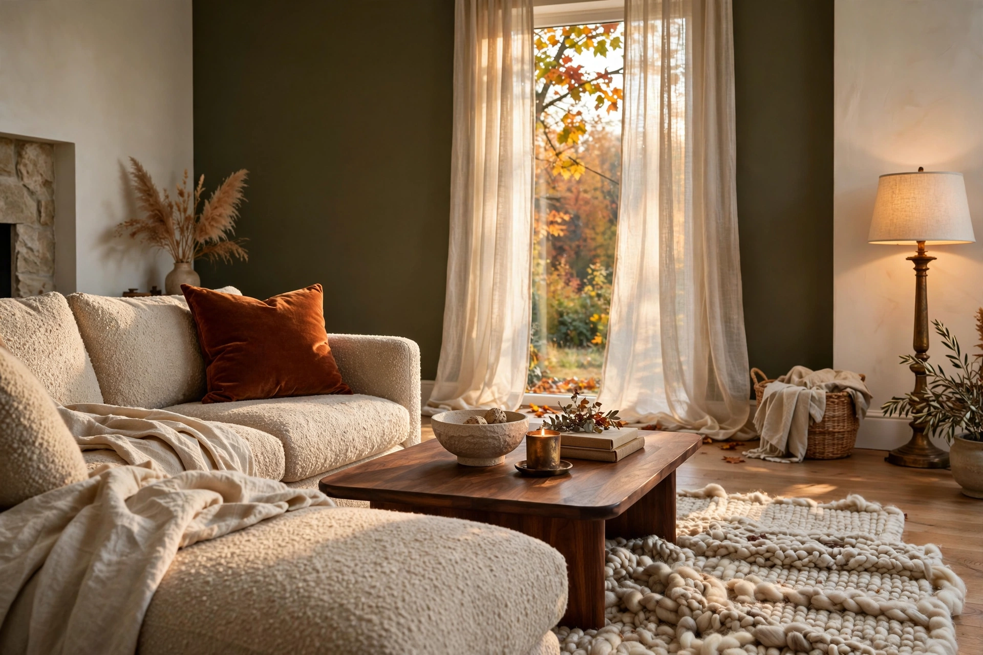
Picture it. It’s 6 p.m., the lamps click on, and your living room turns the color of warm honey. Nothing in it looks showy. Yet the whole room feels like it cost three times what you paid.
That feeling isn’t luck. It’s a color plan.
Designers rarely start with the sofa. They start with a small set of colors that sit well together, then repeat them in the walls, rug, drapes and little decor pieces. Done right, even a budget room looks calm, rich and put together.
Below are 20 luxury living room color palettes with real pairings, texture tips and the reason each one works. Pick one. Copy it. Make it yours.
How Designers Make a Living Room Look Expensive
Quick answer: A luxury living room color palette uses three to five related colors, repeated in different sizes and textures. Most of the room stays calm, one color adds depth, and a small accent adds spark.
Related: 22 Luxury Bedroom Ideas That Skip the Trends (Built to Last)
Here is the simple logic behind it:
- Use the 60-30-10 split. About 60% main color (walls, big rug), 30% secondary (sofa, drapes), 10% accent (pillows, art, metal).
- Match undertones. Warm whites go with warm woods. Cool grays go with cool blues. Mixing them can make a room look off, even if you can’t say why.
- Add texture before color. Bouclé, linen, wool, velvet, plaster and stone make a plain palette look layered.
- Include one dark note. Black iron, deep brown or charcoal gives the eye a place to rest.
- Include one metal. Brass, aged gold or nickel adds a glow, especially at night.
- Test in your own light. A north-facing room reads cooler. A south-facing room reads warmer. Paint a large sample and look at it morning, noon and night.
Pinterest and designers are pointing the same way right now. Warm neutrals are getting richer, and smoky greens, plum, clay and deep red are showing up beside them. Pinterest’s own color picks include Jade and Plum Noir, which tells you people are saving moodier, deeper shades.
20 Luxury Living Room Color Palette Ideas
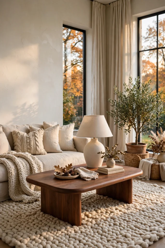
1. Warm White, Oatmeal and Walnut
Start here if you want calm that still looks expensive. Paint the walls a warm white with a creamy base, then add an oatmeal linen sofa and a walnut coffee table. These three shades sit close together, so your eye reads one smooth picture instead of three loud ones. Texture does the heavy lifting, so mix a nubby wool rug, a smooth plaster lamp and slubby linen drapes. Keep every white in the room in the same warm family, because a cool white next to a cream one looks dingy fast.
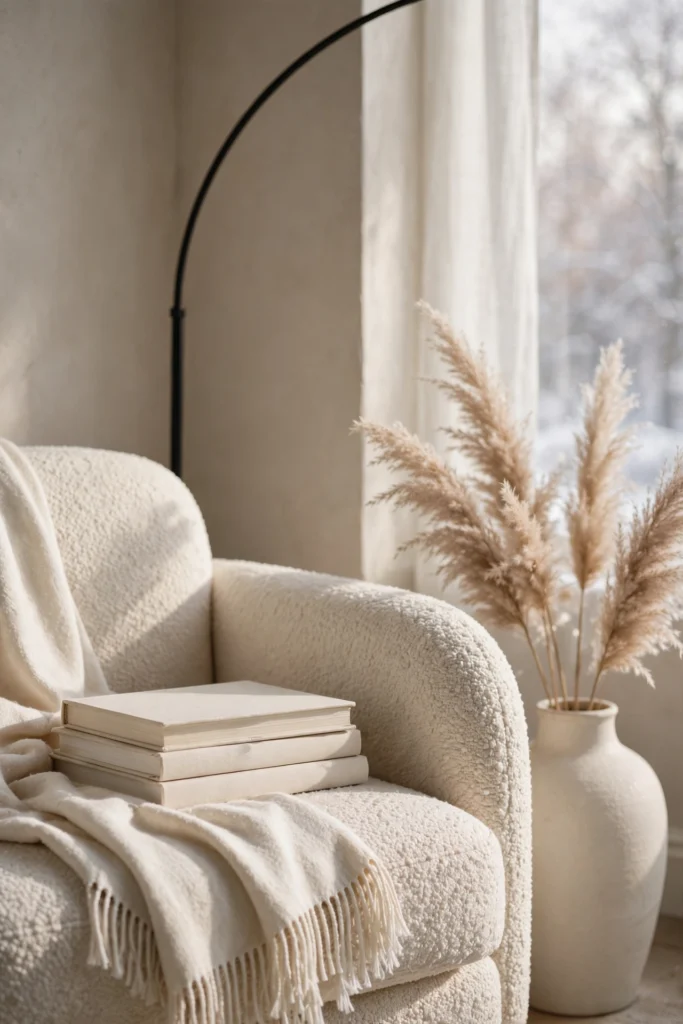
2. Greige, Cream and Black Iron
Greige is the easy middle ground between cozy beige and crisp gray. Use it on the walls, then layer cream upholstery and ivory drapes so the room feels soft instead of flat. The trick that makes this palette look designed is a few thin black iron pieces, like a floor lamp, a window frame or a slim picture ledge. Those dark lines act like eyeliner for the room and give it shape. Skip heavy black furniture here, since a little goes a long way.
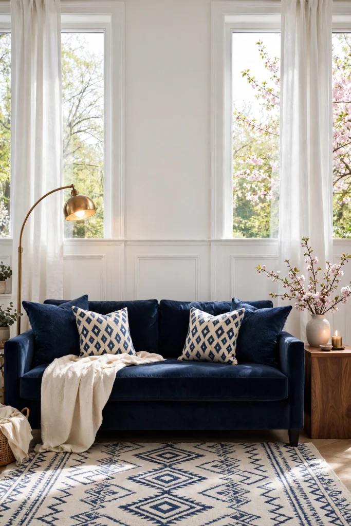
3. Navy, Crisp White and Brass
Navy looks rich because it’s deep but still reads as a neutral. Try it on a sofa, built-in shelves or the lower half of the wall with white paneling above. Crisp white keeps navy from swallowing the room, and brass picks up lamplight so the dark color feels warm instead of cold. Add a walnut or cognac piece to stop the look from feeling like a hotel lobby. If your room gets little daylight, choose a navy with a hint of gray so it doesn’t turn black at night.
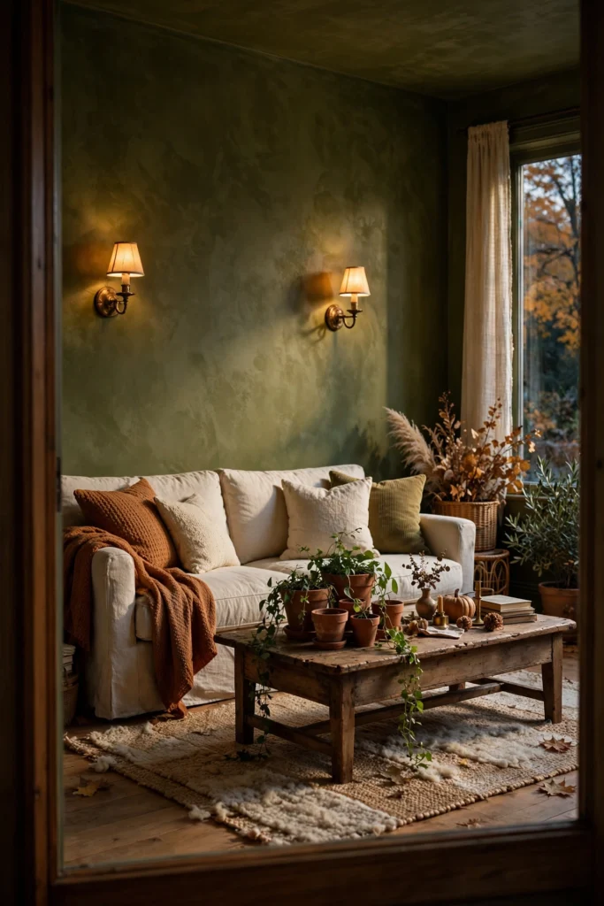
4. Deep Olive, Cream and Aged Brass
Smoky, olive-leaning green is acting like a new neutral, and it’s easy to see why. It feels earthy and grown-up, and it pairs with almost every wood tone. Use a matte or limewash finish on the walls, then add a cream sofa and aged brass accents that look lightly worn rather than shiny. The matte finish soaks up light, so it hides small wall flaws and looks soft in photos. Keep the ceiling a pale warm white to stop the green from closing in.
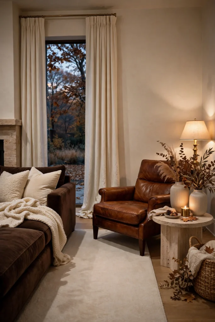
5. Chocolate Brown, Ivory and Cognac Leather
Brown is back, and it looks rich when you keep it soft. Try chocolate suede or velvet on a sofa, ivory walls and drapes, and one cognac leather chair for warmth. Brown works because it’s a deep neutral, so it grounds a room the way black does, only with less edge. Add a cream rug with a low pile and a few ribbed ceramic pieces to keep the look fresh. Avoid mixing several browns of different undertones, since red-brown and yellow-brown fight each other.
6. Charcoal, Bone and Warm Oak
Charcoal gives a room a tailored, gallery feel. Paint built-in shelves or one fireplace wall in a soft charcoal, then keep everything else bone white with warm oak floors and furniture. The warm wood stops the dark color from turning cold, and the bone tone keeps the room bright. Use the dark shelves to show off pale ceramics, books and framed art, since light objects pop against a deep backdrop. This palette also hides TV cords and clutter better than white shelving.
Related: 17 Living Room Wall Art Layering Ideas for a Focal Point

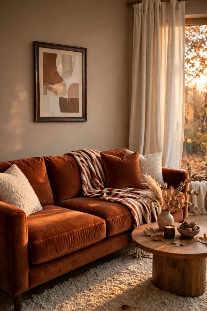
7. Rich Rust, Warm Taupe and Cream
Rust is one of the few bold colors that still feels easy to live with. Use it on a velvet sofa or a pair of accent chairs, set against warm taupe walls and cream drapes. Rust has orange and brown in it, so it blends with leather, wood and wool in a way that cool reds can’t. Repeat the color in small doses, like a pillow, a vase or a striped throw, so it looks planned. A black or dark bronze frame nearby sharpens the whole scheme.
8. Plum Noir, Soft Gray and Antique Gold
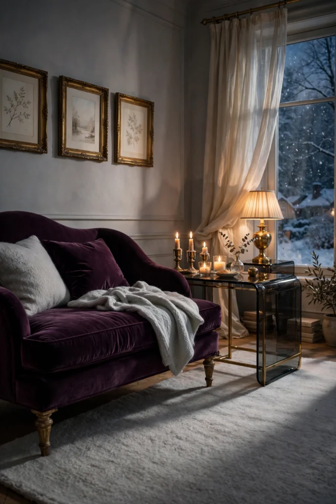
Plum Noir is a deep, wine-dark purple that showed up on Pinterest’s color list, and it looks expensive for good reason. It reads almost like a dark neutral but has more romance than navy. Try it on a velvet chaise, a pair of drapes or one accent wall, then soften it with pale gray walls and antique gold frames. Keep metals warm and slightly aged so the plum glows. Use plum in one or two big moves, not five small ones.
9. Muted Teal, Oak and Brass
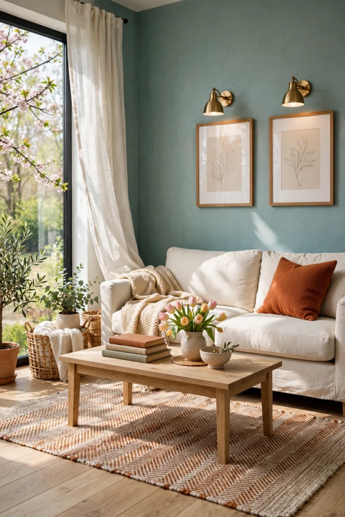
Muted teal feels calm and rich at the same time. On the walls, it wraps the room in a deep, velvety color that looks great against oak floors, woven rugs and brushed brass. Pick a teal with a little gray in it, because bright teal can feel like a spa or a pool. Pair it with cream upholstery and a rust or ochre pillow for a warm counterpoint. This palette is a good fit for rooms with plenty of natural light.
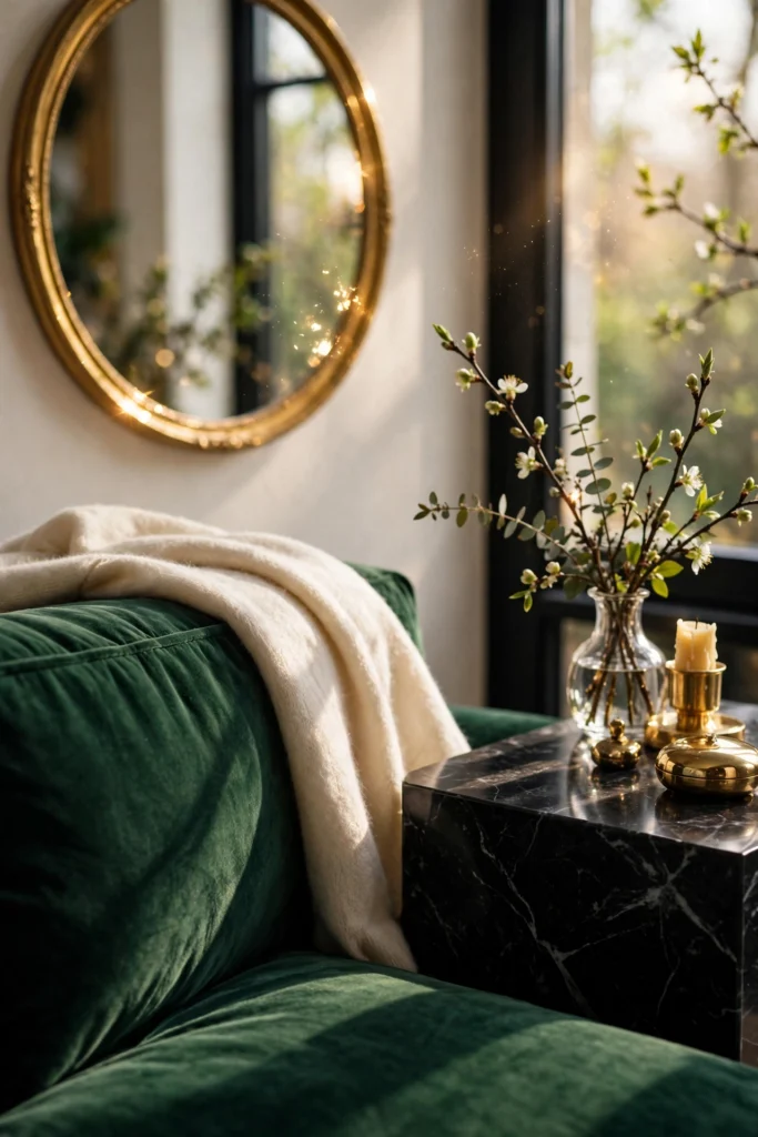
10. Emerald, Black and Gold
Jewel tones look rich because they’re deep and saturated. An emerald velvet sofa is a strong anchor, and black window frames or a black fireplace surround add drama. Gold ties the whole look together in lamps, frames or a mirror. Keep the walls light, like warm white or pale stone, so the green becomes the star rather than the whole show. Limit the palette to emerald, black, gold and one neutral, or it can start to feel like a theme.
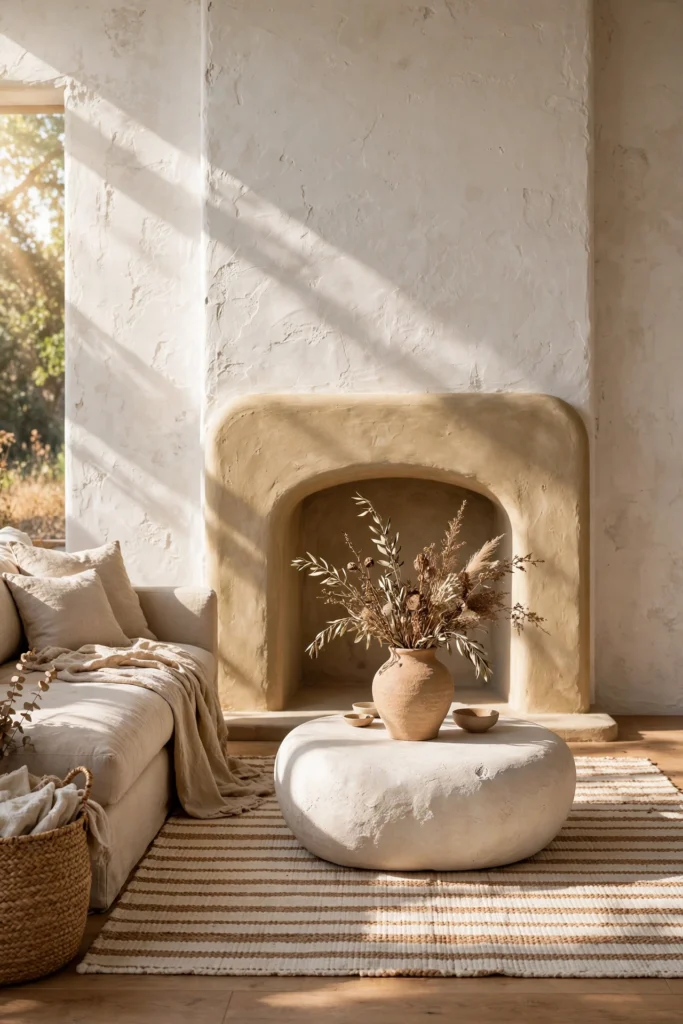
11. Soft Clay, Sand and Plaster White
Soft clay is a warm neutral with a touch of pink and orange, like sun-baked terracotta that has been washed out. Pair it with sand-colored upholstery and plaster white walls for a room that feels sunny even on gray days. Bring the clay in through limewash, a plaster lamp, a ceramic bowl or a rug so the color shows up in more than one texture. The finish matters here. A chalky, uneven plaster look makes the palette feel handmade and costly. Stay away from glossy paint, which can make clay look orange.
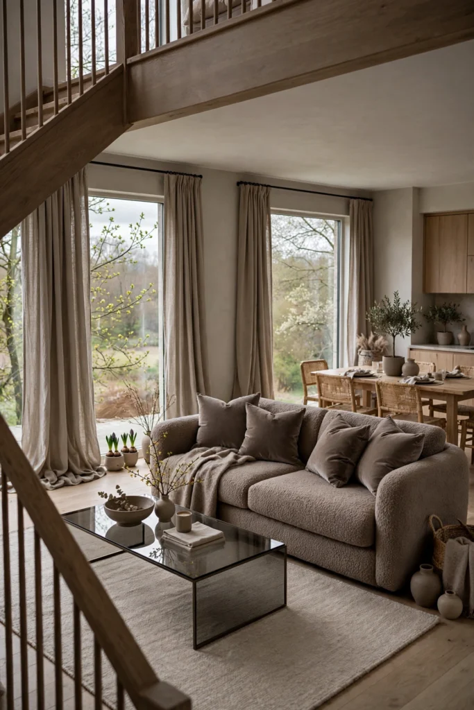
12. Tone-on-Tone Taupe Layers
A one-color room can look very expensive when the shades vary. Pick a warm taupe and use it in three or four depths: a pale taupe on the walls, a mid taupe on the sofa, and a deep taupe in a velvet pillow or curtain. Because everything is related, the room feels calm and quiet, with no color fighting for attention. Add interest with different finishes, such as matte paint, nubby bouclé, silky velvet and a little smoked glass. This approach works well in an open floor plan because it ties the living and dining areas together.
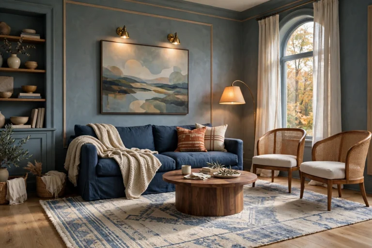
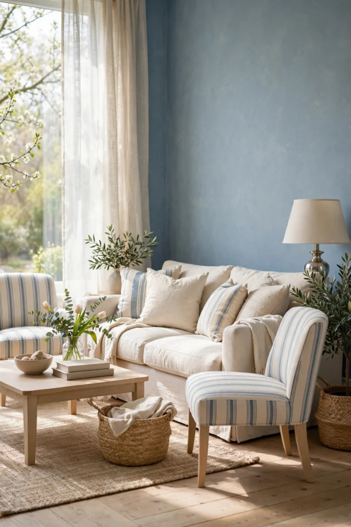
13. Dusty Blue, Cream and Silver Nickel
Dusty blue is lighter than navy and softer than bright blue, so it feels polished without feeling heavy. Use it on the walls or on a pair of accent chairs, then add cream upholstery and a pale wood table. Silver nickel hardware and lamp bases give the look a cool shine that suits blue’s mood. Warm it up with a cream rug and a woven basket so the room doesn’t turn chilly. This palette works well in bright rooms where you want calm instead of drama.
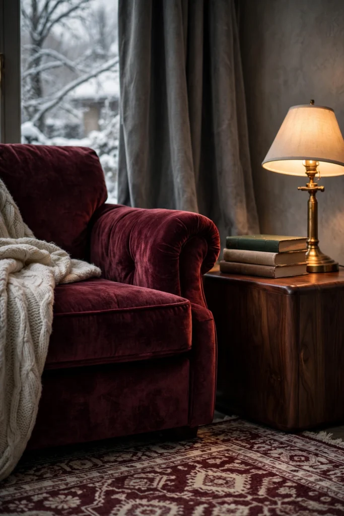
14. Burgundy, Warm Gray and Walnut
Deep red is making a comeback, and burgundy is the easiest version to live with. It feels like red wine and leather-bound books, so it fits cozy rooms, reading corners and snug living spaces. Keep the main walls warm gray and add burgundy on a velvet armchair, a rug or drapes. Walnut wood and a touch of brass give the color a grown-up, library feel. Use burgundy as the star of one corner, not every surface.
15. Black, White and Natural Stone
Black and white is a classic that looks clean and bold when stone is added. Think of white walls, a black sofa or black window frames, and a marble or travertine coffee table that brings in veins and warmth. The stone breaks up the high contrast, so the room looks designed instead of stark. Add one natural wood or rattan piece to keep it from feeling cold. Keep the black in two or three spots, like frames, a lamp and a chair, and let white lead the room.

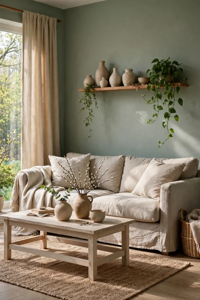
16. Sage, Stone and Linen
Sage green is a quiet way to bring color into a living room. It leans gray, so it feels calm and soft, like a fresh herb garden on a cloudy morning. Pair sage walls with a stone-colored sofa and linen drapes in a slightly warmer shade. Natural materials do a lot of work here, so add a jute rug, a pale ash wood table and a few ceramic pieces. This is a smart choice if you want green but fear a dark room.
17. Camel, Cream and Espresso
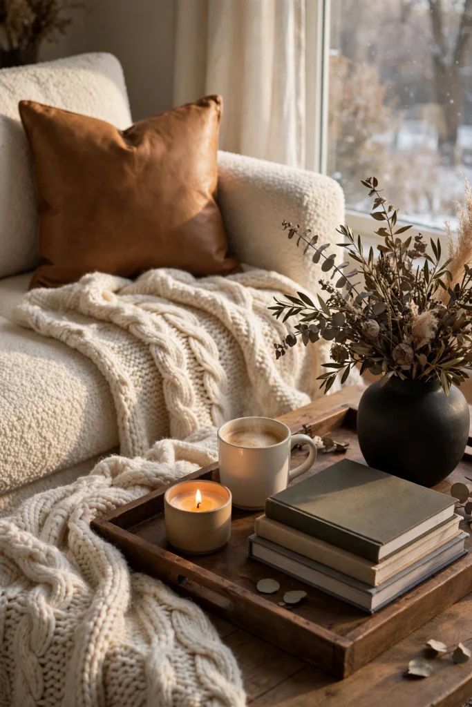
This is the coffee-shop palette, and it never feels loud. Use camel leather or a camel wool throw, cream walls and a sofa, and espresso brown on a coffee table, picture frames or curtain rods. Three tones from the same family give you a layered look without any color clash. A bit of black in a lamp or vase gives it a modern edge. It’s a smart fit for people who want a warm, classic living room that still feels fresh.
Related: 20 Mid-Century Modern Living Room Ideas That Feel Warm
18. Deep Green Color Drench
Color drenching means painting the walls, trim and even the ceiling in one shade. It sounds bold, but it looks smooth and rich, because no hard lines break up the color. Choose a deep green with a bit of gray in it, then use cream furniture, brass lamps and plenty of lamplight to stop the room from getting heavy. This works best in rooms with large windows or tall ceilings. If your room is dark, try it on just the trim and built-ins first.

19. Ivory, Champagne and Blush Taupe
If you want glam without glitter, this is it. Use ivory walls, champagne metals, and a sofa or chair in blush taupe, which is a soft mix of pink and brown. The colors reflect light in a gentle way, so the room glows at all hours. Add a mirror, a silk or satin pillow and a glass lamp for sparkle. Keep patterns small and soft, and avoid hot pink, which can make the palette look sweet instead of refined.

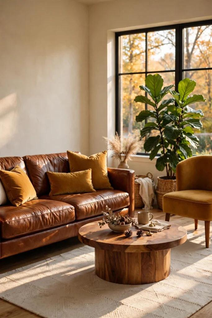
20. Ochre, Chestnut and Cream
Ochre and chestnut bring back that warm, retro feel without looking dated. Use cream walls, a chestnut leather sofa and a few ochre pillows or one ochre chair. The yellow adds light, and the brown adds weight, so the two balance each other well. Add a wood coffee table and green plants for a fresh, living-room-in-a-magazine look. Keep the ochre muted, like dried mustard seeds, because bright yellow reads cheap.
Styling Tips That Make Any Palette Look Richer
- Repeat each color three times. If you use rust on a chair, echo it in a vase and a book spine across the room. Repetition makes it look planned.
- Match your metals. Pick one main metal, like aged brass, and let a second metal show up only once or twice.
- Mix textures, not patterns. Bouclé, linen, velvet, wool, stone and wood add depth without busy prints.
- Layer your lighting. A floor lamp, a table lamp and a wall light give warm pools of glow. Overhead light alone flattens even the best palette.
- Hang drapes high and wide. Mount the rod near the ceiling and extend it past the window frame. It makes ceilings look taller and rooms look finished.
- Use art to bring in a bridge color. One piece of art that holds two of your palette colors helps connect them.
- Pick a finish on purpose. Matte and limewash look soft and deep. Eggshell is easier to wipe clean in busy rooms. High gloss works best on trim or ceilings.
Practical Ways to Use Your Palette
- Start with what you can’t change. Floors, a big sofa, a fireplace or kitchen counters visible from the living room all have undertones. Match your palette to them first.
- Choose your wall color last. Pick the rug, sofa and drapes first, then paint. It’s easier to match paint to fabric than the other way around.
- Sample big. Paint two large patches, about two feet square, on different walls. Look at them in the morning, at midday and with the lamps on.
- Build in this order. Walls and large furniture first. Then rug and drapes. Then lamps and metals. Then pillows, art and objects.
- Take a photo and look again. Your phone camera often shows color clashes your eyes skip over. If something looks off in the photo, adjust one item at a time.
- Edit before you add. Remove two small decor pieces before you buy a new one. Luxury rooms usually have more breathing space than you think.
Common Mistakes to Avoid
- Mixing warm and cool undertones. A yellow-cream wall next to a blue-gray sofa looks muddy. Hold each paint chip up to your sofa and floor before you buy.
- Using too many accent colors. Stick to one or two. Three bold colors can make a room look like a showroom.
- Skipping the ceiling. A stark white ceiling can make a deep wall color look harsh. Try a softer white, or a lighter tint of the wall color.
- Going dark without lighting. Deep colors need warm lamps. Without them, a rich room just looks dim.
- Choosing a color from a small chip. Paint chips are tiny, and colors look different on a big wall. Always sample large.
- Forgetting the floor. A rug that fights your palette can ruin the whole effect. Choose a rug that picks up at least two palette colors.
- Making everything match exactly. Rooms look flat when every item is the same shade. Vary the depth, finish and texture.
- Copying a palette without checking light. A palette that glows in a sunny south-facing room can look gloomy in a north-facing one. Adjust the undertone to your light.
Small-Space Alternatives
A small living room can still look rich. It just needs a tighter plan.
- Pick a light base with one deep note. Warm white walls, a pale sofa and one dark accent, like a charcoal chair or an olive pillow set, add depth without shrinking the room.
- Paint the ceiling a softer shade of the wall color. It blurs the edges and makes the room feel taller.
- Go tone-on-tone. Palette 12 (taupe layers) and Palette 1 (warm white and walnut) keep the eye moving instead of stopping at sharp color breaks.
- Use mirrors and glass. A round mirror and a glass coffee table bounce light around the room.
- Choose furniture with legs. A sofa raised off the floor shows more floor space, which makes the room look bigger.
- Try a dark wall in a nook. Palettes 4, 6 and 18 work well on one small wall or a built-in, even if the rest of the room stays light.
Budget-Friendly Alternatives
You do not need new furniture to try a new palette. Start small.
- Paint first. A gallon of paint is often the cheapest way to change a room’s mood. Try one wall or a bookcase before you commit to the whole room.
- Swap your pillow covers. Fabric covers cost far less than new sofas. Rust, olive, plum and ochre covers can change the whole look.
- Use thrifted brass and wood. Lamps, frames and trays in warm metal or walnut add depth for very little money. A coat of matte spray paint can unify mismatched pieces.
- Try a neutral rug in a bold pattern. A cream and black or cream and rust rug can tie colors together in one move.
- Add a throw instead of a sofa. A camel, cream or chestnut throw brings in a palette without a big spend.
- Renting? Use removable wallpaper, large framed art in your palette colors and floor-length curtains in a rich shade.
- Save the splurge for what you touch most. Spend on the sofa fabric and the paint quality. Save on side tables and decor.
Pro Styling Recommendations
- Pick your “hero” first. Choose one thing that holds the palette, like a rug or a piece of art, and pull your colors from it.
- Follow an undertone chart. Hold a white card next to your paint chip. Does it look yellow, pink, green or gray next to the card? That clue tells you which wood tones and fabrics will match.
- Check LRV on the can. LRV stands for light reflectance value. Higher numbers reflect more light and feel brighter. Lower numbers feel deeper. Dark rooms often benefit from a mid-range LRV rather than a very low one.
- Light your palette at night. Warm bulbs (around 2700K) make golds, rusts and browns glow. Cool bulbs can turn the same colors flat.
- Pair a dark color with a pale color of equal warmth. Olive with cream. Navy with white. Plum with soft gray. Equal warmth keeps the pair calm.
- Edit your shelf colors. Group books by tone, add a few ceramic pieces in your palette and leave some empty space. It reads as intentional.
- Think in seasons. Keep the big pieces steady, then swap pillows, throws and florals as the season changes. Rust and plum in fall. Sage and dusty blue in spring.
Final Thoughts
A luxury living room isn’t about price tags. It’s about a few colors that agree with each other, a handful of rich textures and lamps that make everything glow at night.
Pick one palette from this list that made you stop scrolling. Buy a sample pot. Paint a big patch and live with it for a few days. If it still makes you happy in the morning light and under the lamp at 9 p.m., you’ve found your color story.
Save the pins, start with one change, and let the room grow from there.