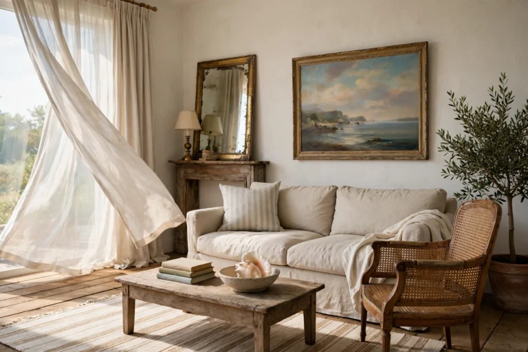
16 Colorful Living Room Ideas: Bold Color That Feels Calm

Think of the last living room that made you smile when you walked in. The color probably wasn’t a throw pillow. It was a ceiling the color of warm clay, a sofa the shade of ripe plum, or a bookcase the deep blue of ink.
Now think of the opposite: a gray room with one orange cushion looking lost. Both rooms used color. Only one used it with a plan.
Color works best when it does a real job. It can wrap a room, frame a window, anchor a sofa, or pull your eye toward something you love. Below are 16 ideas, each with the reason it works and the numbers to use, so you can try color with confidence and without a repaint.
Quick answer: what makes a colorful living room work? A colorful living room works when color has a clear job on big surfaces, like walls, ceilings, sofas, and rugs, and follows a ratio such as 60-30-10. Each color should show up at least three times in different places, and every shade should share the same undertone, warm or cool.
Table of Contents
1. Drench the Room in One Rich Color

When walls, ceiling, trim, and even the door share one shade, the hard lines that chop a room into pieces disappear. The room reads as one calm shape instead of a busy box, and it feels wrapped like a soft coat. Mid-tones such as clay, sage, and dusty blue work best because they stay readable in daylight and at night. Use a matte finish on the walls and satin on trim and doors, so the same color shows two depths. Add a sofa a shade lighter or deeper in the same family, and the whole room settles.
2. Paint the Ceiling, Not an Accent Wall
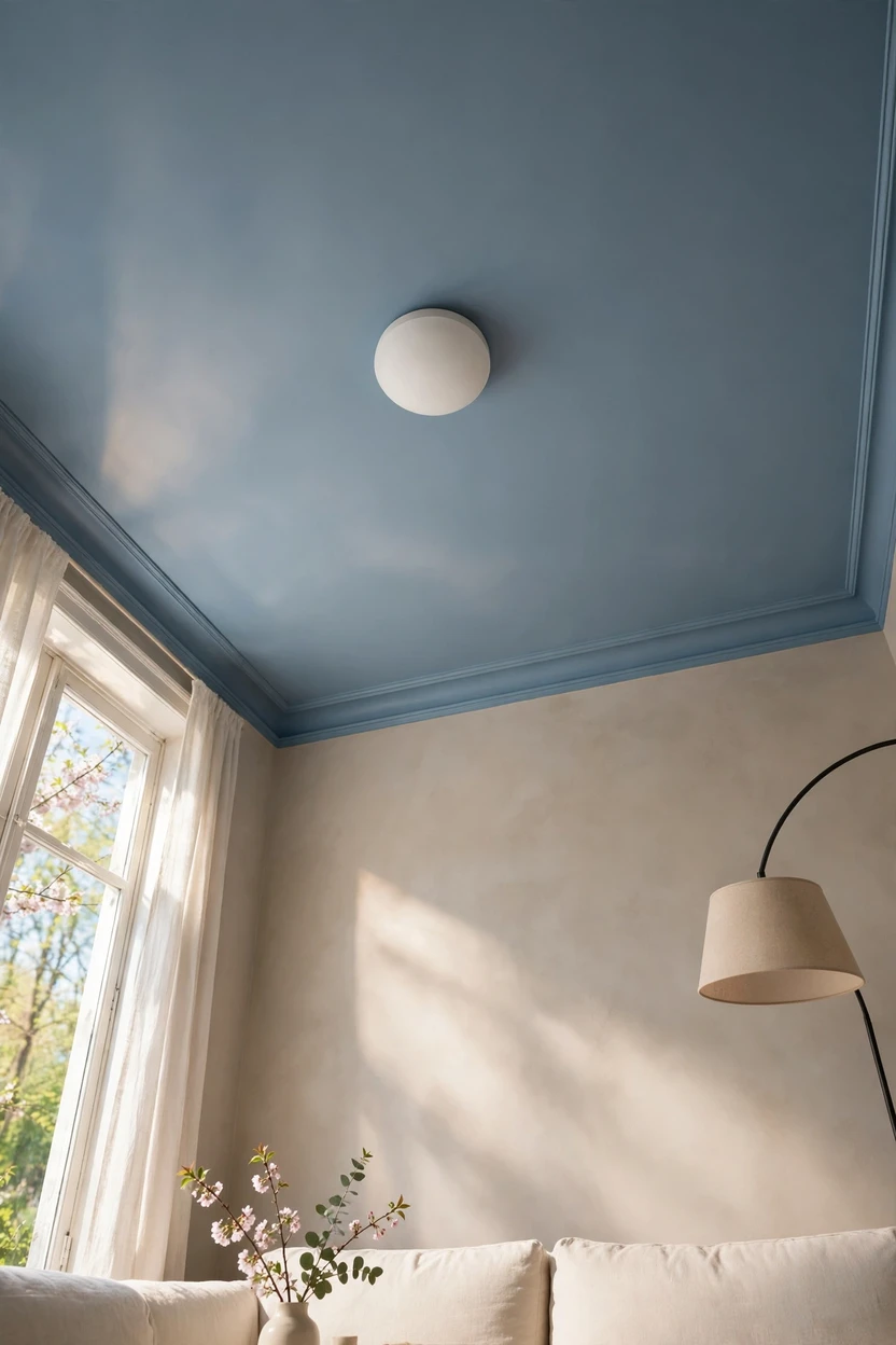
An accent wall drags the eye to one side and leaves the rest of the room unsure what it wants to be. A colored ceiling pulls the eye up, so the room feels cozy and tall at the same time. Pick a shade one step lighter or deeper than the walls, from the same color family, so it reads like a fifth wall and not a lid. The color also bounces down softly, which gives the walls a free glow. Choose a flat finish to hide bumps and cut glare, and keep the light fixture plain so it does not argue with the paint.
3. Start With the Undertone, Not the Color Name

Two blues can look nothing alike beside the same floor because of what hides underneath: a touch of yellow, red, or gray. Hold a paint chip next to your floor, sofa, and wood trim before you decide anything. If the wood leans orange, choose warm undertones like terracotta, olive, and butter; if it leans pink or gray, cooler greens and blues will sit better. Paint sample patches about 2 feet square on two different walls and look at them in morning, midday, and evening for three days. This step costs one sample pot and often saves a full repaint.
4. A Deeply Colored Sofa as the Anchor

A large sofa in plum, forest green, rust, or cobalt carries color without touching the walls. It makes up a big share of the room’s visual weight, which is the 30 in the 60-30-10 rule. Velvet and tight-weave performance fabric hold deep color well and wipe clean more easily than loose weaves. Keep the walls calm with a warm white, greige, or a very pale tint of the sofa color. Repeat the sofa color two more times in small items, like a pillow and a vase, so it looks planned.
5. Paint the Built-Ins and Leave the Walls Light

Bookcases and alcoves are natural frames, and deep color makes them glow. Ink blue, bottle green, or oxblood on the shelves makes books and objects pop as if they are on a small stage. Paint the back panel, sides, and shelf fronts the same shade so the whole unit reads as one solid block. Use satin or semi-gloss for the wipeable finish that shelves need. Keep the walls around it light so the room stays bright, and add a thin LED strip or picture light inside to bring out the color at night.
6. Let a Colorful Rug Set the Palette

A rug works like a color map because it hands you three or four shades to borrow. Pick the rug first, then pull the sofa, curtains, and pillows from its colors. Flat-weave wool and kilim-style rugs hold color for years and handle foot traffic. Size matters: the front legs of the sofa and chairs should rest on the rug, so an 8 by 10 feet rug suits most seating groups. Patterns with a mid-tone background hide crumbs and dirt better than pale solids.
7. Five Shades of One Color

Pick one color and use five tones of it, such as mist, sky, denim, navy, and ink blue. The different tones give the room depth, so it never looks flat or flat-out boring. Change the texture as well: linen, velvet, wool, and glossy ceramic all drink light in different ways, so one color looks like five. Keep one small neutral, like oak or cream, to rest the eye. This is the safest way to go colorful if you are afraid of clashing, because everything already belongs together.
8. The 60-30-10 Rule, Including the Part People Skip

The rule says 60 percent of the room is your dominant color, 30 percent is a second color, and 10 percent is an accent. Walls, floor, and big rugs usually make up the 60, a sofa, chairs, and curtains make up the 30, and pillows, art, and lamps cover the 10. Most people forget the 10, but that small share is where your bright or surprising color lives. A simple example is 60 warm cream, 30 olive green, and 10 tomato red. In a one-color room, use light shades as the 60, mid-tones as the 30, and dark shades as the 10.
9. Pair a Color With Its Opposite

Colors across from each other on the color wheel, like terracotta and teal or plum and mustard, make each other look richer. The trick is to keep the two unequal. Let one color lead and give the other a smaller supporting role, such as a teal sofa with terracotta pillows and a terracotta vase. Soften the pair with a warm neutral like cream or oak so the eye has a place to rest. Equal amounts of two strong colors tend to compete and feel loud.
10. Paint the Door, Arch, and Window Frames

Doors and frames are small surfaces with a big effect, because they outline the room like a drawing. A deep green door, a blush archway, or window trim in warm charcoal gives color without covering a whole wall. Use satin or semi-gloss so the paint wipes clean and catches light along the edges. Pick one color and use it on every frame in the room so it looks like a decision. This is also a safer first step for anyone nervous about color, since a door is easy to repaint.
11. Colored Lamps and Glass for Evening Color

Lamps and glass bring color that glows, which paint cannot do. An amber glass lamp, a blush linen shade, or a cobalt vase in front of a window all add a little color to the room after the sun goes down. Use bulbs around 2700K with a CRI of 90 or higher, because poor bulbs make rich colors look muddy. Place lamps at different heights, such as one on a table and one on the floor, so light and color spread across the room. This also works well for renters, since nothing is permanent.
12. One Big Painting to Pull the Palette

One large artwork acts as a color guide for the whole room. Choose a piece with three or four shades you want to repeat, then pick the sofa, rug, and pillows from it. Hang it with the center at about 57 to 60 inches from the floor, and keep it 6 to 10 inches above the sofa or console. Aim for a width about two-thirds the width of the furniture below. A single big piece looks bolder and calmer than a crowd of small frames.
13. Mix Patterns Inside One Color Family

Patterns feel calm when they share a palette. Try a wide stripe, a medium check, and a small floral, all in shades of blue and cream. Vary the scale: one large, one medium, one small, so the patterns do not shout at the same volume. Add one plain solid, such as a velvet pillow, to give the eye a break. Keep the same undertone across all pieces, whether warm or cool, and the mix will look gathered over time rather than bought in one trip.
14. New Neutrals as the Base

A colorful room does not have to start with bright paint. Olive, chocolate brown, mushroom, terracotta, and deep burgundy now work as the new neutrals because they behave like beige but carry more warmth. Use one as your base, then add a single bright shade, like mustard or cobalt, for energy. These earthy colors pair easily with wood, leather, and wool, so the room feels grounded. They also hide wear better than pale colors, which is helpful in a busy family room.
15. Curtains in Color

Curtains are the fastest way to add a large block of color without paint. Floor-length panels in rust, deep green, or dusty pink fill a big vertical space and soften the sound of the room. Hang the rod close to the ceiling, and choose panels that are one and a half to two times the window width so they look full. Velvet gives deep, rich color, and linen gives a lighter, airier look. Match the curtain color to a sofa or rug so it feels connected and not random.
16. One Unexpected Bright Piece
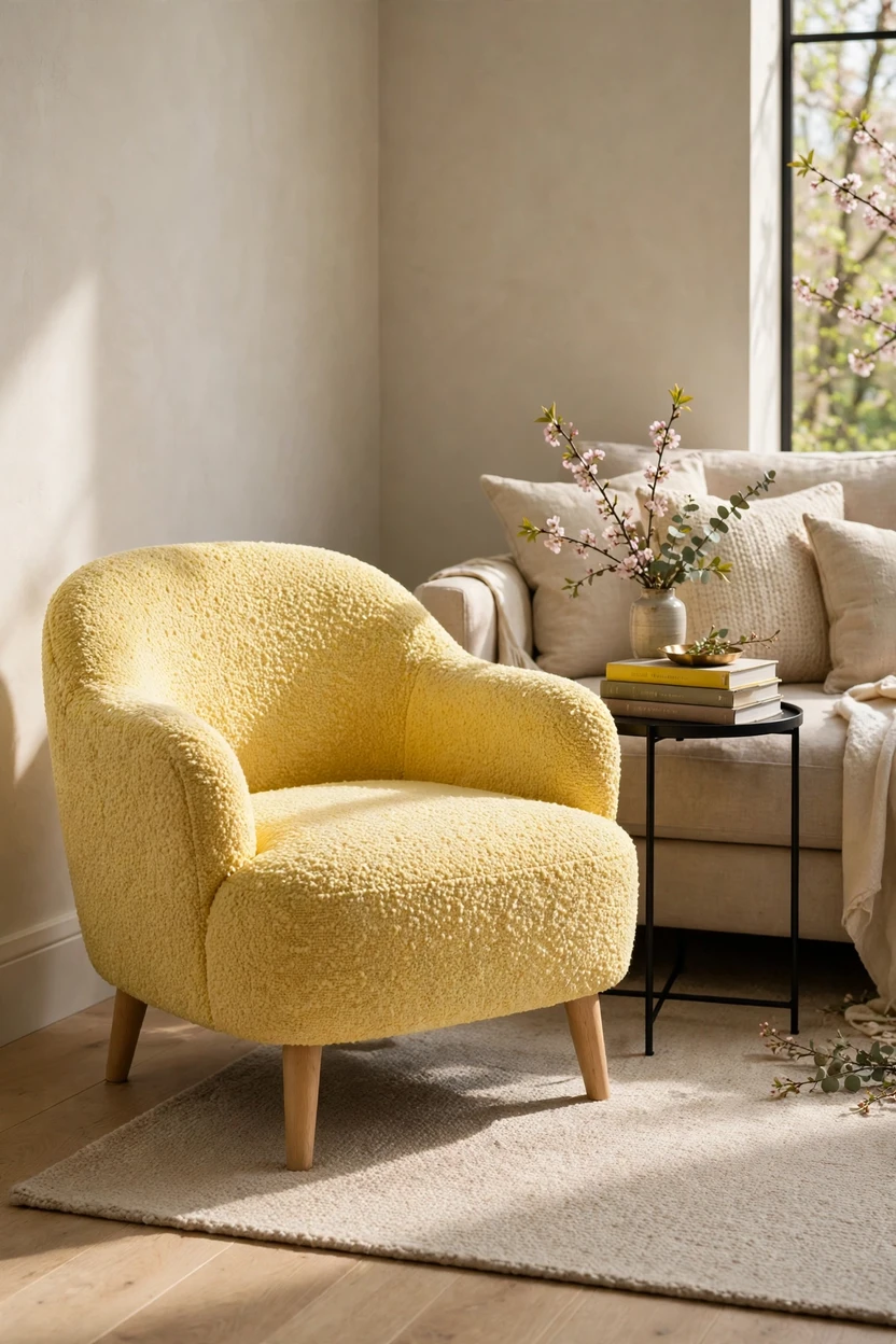
In a calm room, one bold piece becomes the thing everyone remembers. Try a lemon-yellow accent chair, a cobalt side table, or a hot-pink stool against quiet walls and a neutral sofa. Place it where the eye lands first when you walk in, and echo the color once more in a small item, like a book spine or a candle. Keep to one piece only, because two competing bold pieces cancel each other out. This is also the easiest way to test a color you love before you commit to a larger piece.
Styling Tips That Keep Color Looking Planned
- Repeat each color three times. A color that appears once looks like an accident, and three times looks like a plan.
- Match undertones. Keep all your colors warm or all cool.
- Mix finishes. Pair matte walls with satin trim and glossy ceramics for depth.
- Group by threes. Odd numbers look relaxed, and three items are easy to arrange.
- Add one neutral rest area. A cream rug or oak table gives the eye a break.
- Take a photo in black and white. If the room still looks balanced in gray tones, your color values are working.
- Edit in rounds. Add color slowly, one big piece at a time.
Practical Implementation Ideas
A one-weekend color plan
- Friday night: Choose your base color and check its undertone against your floor and sofa.
- Saturday morning: Paint 2-foot sample squares on two walls. Look at them at three times of day.
- Saturday afternoon: Swap bulbs for 2700K with CRI 90 or higher and move furniture to leave clear walkways.
- Sunday: Paint your chosen surface, then add the rug, pillows, and one lamp in matching tones.
Measurements to keep handy
- Rug: front legs of sofa and chairs on the rug; 8 by 10 feet suits most groups
- Coffee table gap: 14 to 18 inches from the sofa
- Art center height: 57 to 60 inches from the floor
- Art above furniture: 6 to 10 inches
- Curtain width: one and a half to two times the window width
- Bulbs: around 2700K, CRI 90 or higher
- Sample patches: about 2 feet square, checked over three days
- Ratio: 60-30-10
Common Mistakes to Avoid
- Choosing paint from a tiny chip. Small chips mislead. Always test large patches.
- Ignoring undertones. A cool blue beside orange-toned wood can look off.
- Painting one accent wall and stopping. It cuts the room in half. Try ceiling, trim, or all surfaces instead.
- Using equal amounts of two strong colors. Let one lead.
- Skipping the neutral rest area. Too much color without a break tires the eye.
- Using cool white bulbs. They flatten warm colors and make rich shades look dull.
- Buying everything in one shade at once. Layer over time so you can adjust.
- Forgetting the ceiling and floor. They are big color surfaces and should work with your palette.
Small-Space Alternatives
- Drench a small living room in one mid-tone, since matching walls, ceiling, and trim removes visual cuts and can make the room feel more cohesive.
- Use color on the floor first with a bold flat-weave rug, which draws the eye down and out.
- Choose a light, bright ceiling shade that matches the wall color family to add height.
- Pick a sofa with slim legs and a color near the wall tone to avoid chopping the room.
- Hang curtains high and wide in a color that matches the walls, and add a colored lamp instead of a bulky chair.
- Limit the palette to three colors and repeat each one three times.
Budget-Friendly Alternatives
- Paint a ceiling or a door. A single can goes a long way.
- Swap the pillow covers. Covers cost far less than new pillows or a new sofa.
- Thrift glass and ceramics. Look for colored vases and lamps at secondhand stores.
- Use a large fabric panel as art. A framed piece of patterned fabric works like a painting.
- Paint an old side table. A scuffed table can become the one bright piece.
- Layer rugs. A smaller colorful rug over a plain large one adds color at a lower cost.
- Try removable wallpaper on one small section, such as inside a bookcase back panel.
Pro Styling Recommendations
- Choose the biggest color moment first, such as paint, sofa, or rug, then build around it.
- Test samples next to your floor and curtains, not on a blank wall.
- Look at the room in the evening with your actual lamps on before you finalize a color.
- Use sheen to create depth: matte for walls, satin for trim, gloss for small accents.
- Keep cords and cables hidden or painted to match the wall.
- Photograph the room each week. Photos show clutter and color balance faster than your eyes do.
Conclusion
Color does not have to be loud to be brave. It just needs a job and a plan: one place where it leads, a few places where it echoes, and a calm spot where your eye can rest.
Pick one idea from this list and try it this week. Paint a door, test three samples, or swap in a rug that speaks in two or three colors. Sit in the room that evening with your lamps on, and let the color tell you what it wants next.